Hi everybody,
What you are going to start this week at home is the beginning of our final project.
You may use
my color scheme if you wish, you may use
your own that you submitted to me, or you may
develop another one. The choice is up to you. The rest, you must follow exactly as I direct you.
I will give you input next week on the color schemes that you submitted to me and I will look at the work that you produce for me this week as homework. I will let you know what I think of your color schemes and how you might improve upon them.
Each week we will produce a part of the project, which you will complete as homework. You will get a homework grade each week according to how much of the week's work you completed. If you complete it all, then, and at the end of the next four weeks, you should have most of the project completed.
For this week's class we began to create the
template that we will use for all the pages of the project. Like the mid-term, each page will begin with this template so that all pages will look identical. This will make certain that the most important information, as well as the links, remain in the same place on every page.
P.S. When you get to the part in the assignment steps below regarding the images that you must create, please make sure that you change the year to 2008 and the other image from 7 to 8.
Carter-
- TOPICS:
- Final Project;
- LINK Content Requirements;
- LINK Technical Requirements;
- LINK Design Requirements;
- Classwork:
- Review:
- LINK Creating a simple table;
- LINK Modifying the table with Colspan;
- LINK NOTE:change table from class by Adding anonther Rowspan&8212extending another cell downward using the rowspan attribute;
- LINK Adding CSS styles—using an embedded stylesheet for the background color, margins, and links.
- LINK NOTE:change table from class by Adding Links—typing text and hyperlinks temporarily to various external sites.
- Introduce:
- LINK Creating Repeating Background Images
- LINK Inserting Images
- LINK Using CSS Class Selectors;
- LINK More CSS Classes;
- LINK CSS Inline Styles;
- HOMEWORK—Final Project, Part I: Starting this week, the homework for each class is part of the final project. Each part will be do one week from the time that it was assigned. This means that the assignment for this week will be due in the next class. Each week I will assign a new part to the website. If you produce these assignments on time each week, you will have accumulated HALF THE POINTS for the final.
The site that we are going to produce accompanies a book that has already been published that highlights some of the best web-designs of last year. It will have four main parts: the home page, six about pages (six versions of the page, each one for a different language), two gallery pages, and a contact page that will include a form for submitting personal information.
- Due in class next week: you must complete the steps in this week's blog posting in order to complete the homework! To do so, you must follow the directions here in this blog.
- Due in class next week: when complete, you must make nine (9) additional copies of this file (copy & paste them) and give them the following names: abt_eng.html, abt_esp.html, abt_deu.html, abt_fra.html, abt_por.html, and abt_ita.html, gal_1.html, gal_2.html, and con.html. For the homework due this week, you need not make any changes to these documents until further instruction in the next class. As a result, all the pages will be exactly alike for the time being.
- Due in class next week: Over the weekend I am FINALLY going to be sending you comments on your midterm projects. Along with those comments and grades, I will also be commenting on your color schemes. You must make a revised color scheme according to my suggestions for next week. One good and very simple rule of thumb to go by is that easy to match color pairs are as follows: red and orange, orange and yellow, yellow and green, green and blue, blue and purple, or purple and red. Your colors will also be reflected in the template that we created in class. If you are unhappy with your choice of colors in class, then you may change them as part of your homework.
- FINAL PROJECT
- The site that we are going to produce accompanies a book that has already been published that highlights some of the best web-designs of last year. It will have four main parts: the home page, six about pages (six versions of the page, each one for a different language), two gallery pages, and a contact page that will include a form for submitting personal information. Please read the information provided.
- CONTENT REQUIREMENTS:
- Part 1: TEMPLATE & HOME PAGE—this page includes some kind of appropriate imagery of your choice. In this page, you should establish the color scheme that you will use throughout your design for this site. ÔThe LookÕ will be established in part by what we do in class together. The rest is up to you, such as the colors, the fonts, and the particular imagery that you will choose.
***More on the HOME PAGE at the end of this postin.***
- Part 2: ABOUT PAGES—these pages will all look identical. Each will include some imagery of your choice and the text about this book in six (6) different languages (to be furnished at a later time). The main thing you need to know about him right now to start your site is that this is a book about the state-of-the-art web design.
- Part 3: CONTACT PAGE—This page includes an image of the cover of the book, publication information, and book-availability information. It will also have a form for the visitor to submit his/her personal information so as to be a part of the mailing list.
- Part 4: IMAGE GALLERY PAGES—I will provide a series of links to the various sites that you must include in this web-page. You must create thumbnail images of the main page of each site by doing a screen capture. Each thumbnail will also provide a link to the relevant site that will open up in a separate windown when clicked on.
- DESIGN REQUIREMENTS:
- Color Scheme—you must choose a color scheme for your web-site that you can show to me or describe to me. My suggestions are to keep it simple, easy, non-complicated. Keep in mind who your audience is and what the subject matter is.
- Page Layout—you must use CSS and/or tables to lay out all pages in a pleasing way. If you are not certain how to do this, consult our past classes and me for assistance.
- TECHNICAL REQUIREMENTS:
- XHTML—ALL CODE for this site must be typed using STRICT XHTML standards. This means the following:
- that all tags and their attributes must be typed in lower case;
- that all attribute values must be typed in quotes and with units;
- that the DTD for strict XHTML must be typed at the top of the document;
- that all empty tags must be typed with the slash at the end, such as with the <br/> tag;
- that none of the deprecated inline tags are to be used, such as the <font>, <b>, <u>, or <i> tags;
- and, in addition, that the <tbody> and the <thead> tags, as well as the height attribute for the <table> and <td> tags, are not permitted.
If you are uncertain about something, you can consult the requirements at the w3schools site (LINK), or you may ask me. Furthermore, the use of DreamWeaver is permitted; however, please note that DreamWeaver does not create strict XHTML. Therefore, you will have to go through the code and edit it yourself to make certain it follows strict standards.
- CSS—ALL STYLING must be done using CSS. We have used it extensively in this class, so it is a requirement that this site use CSS for the styling of the page. All three levels of styles may be, and are encouraged to be used. Please consult me if you need additional assistance with this.
- INTRODUCE—As has been the case during 5 of the last 6 weeks, we started last Wednesday's class with a review of a now familiar topic, HTML tables. This was the sixth class that we have worked on tables, and I hope that fact alone indicates their importance to creating effective, and well-designed web-pages. I will not discuss the topic at much length this time, however, and instead will demonstrate examples of code and the resulting tables.
LINK Click here
LINK and here for a more thorough introduction, discussion and demonstration on the topic of tables.
- A Simple Table—We shall begin the class be creating a simple table of seven (7) rows with three (3) cells in each row:
And here is the code for this table (if you wish to view this table, temporarily use the border attribute, which we will eventually delete):
<table border="1px">
// below here is row 1
<tr>
<td> </td>
<td> </td>
<td> </td>
</tr>
// below here is row 2
<tr>
<td> </td>
<td> </td>
<td> </td>
</tr>
// below here is row 3
<tr>
<td> </td>
<td> </td>
<td> </td>
</tr>
// below here is row 4
<tr>
<td> </td>
<td> </td>
<td> </td>
</tr>
// below here is row 5
<tr>
<td> </td>
<td> </td>
<td> </td>
</tr>
// below here is row 6
<tr>
<td> </td>
<td> </td>
<td> </td>
</tr>
// below here is row 7
<tr>
<td> </td>
<td> </td>
<td> </td>
</tr>
</table>
- Modifying the Table—Next, I add colspan and rowspan to alter the table. Rows 1, 2, and 6 get a rowspan of three to stretch the cell all the way across the table. Cell 2 of row 7 gets a rowspan of two, and cells 2 and 3 of row 3 get a rowspan of 3 to push the cells downward through three rows:
<table border="1px">
// below here is row 1
<tr>
<td colspan="3"> </td>
<td> </td>
<td> </td>
</tr>
// below here is row 2
<tr>
<td colspan="3"> </td>
<td> </td>
<td> </td>
</tr>
// below here is row 3
<tr>
<td> </td>
<td> </td>
<td rowspan="3"> </td>
</tr>
// below here is row 4
<tr>
<td> </td>
<td> </td>
<td> </td>
</tr>
// below here is row 5
<tr>
<td> </td>
<td> </td>
<td> </td>
</tr>
// below here is row 6
<tr>
<td colspan="3"> </td>
<td> </td>
<td> </td>
</tr>
// below here is row 7
<tr>
<td> </td>
<td colspan="2"> </td>
<td> </td>
</tr>
</table>
- Changing Table—To complete the table modifications, I want all of you to add another rowspan attribute to cell 2 of row 3. After this, you will also have to delete one cell from rows 4 and 5:
<table border="1px">
// below here is row 1
<tr>
<td colspan="3"> </td>
</tr>
// below here is row 2
<tr>
<td colspan="3"> </td>
</tr>
// below here is row 3
<tr>
<td> </td>
<td rowspan="3"> </td>
<td rowspan="3"> </td>
</tr>
// below here is row 4
<tr>
<td> </td>
<td> </td>
</tr>
// below here is row 5
<tr>
<td> </td>
<td> </td>
</tr>
// below here is row 6
<tr>
<td colspan="3"> </td>
</tr>
// below here is row 7
<tr>
<td> </td>
<td colspan="2"> </td>
</tr>
</table>
- Adding CSS Styles—To begin to design the page, I will add some styling to the page using an embedded stylesheet. Recall, that an embedded stylesheet are CSS styles that are defined within the HEAD SECTION of the document, between a pair of <style> tags. To see further discussion on the topic of CSS, please see last week's posting. Please note, that I am adding styles right now to design the various link states even though we have not put any links into the table yet:
<style type="text/css">
<!--
// sets styles for entire document window
body
{background-color:#ffffff;
margin-top:0px;
margin-bottom:0px;
margin-left:0px;
margin-right:0px;}
// sets styles for entire table
table
{width:100%;
border-collapse:collapse;}
// un-clicked links
a:link
{font-family:Arial Black;
font-size:10pt;
color:#ffffff;
line-height:8pt;
text-decoration:none;}
// already clicked links
a:visited
{font-family:Arial Black;
font-size:10pt;
color:#cccccc;
line-height:8pt;
text-decoration:none;}
// as links are being clicked
a:active
{font-family:Arial Black;
font-size:10pt;
color:#ff0000;
line-height:8pt;
text-decoration:underline;}
// as the mouse passes over links
a:hover
{font-family:Arial Black;
font-size:10pt;
color:#ff0000;
line-height:8pt;
text-decoration:underline;}
//-->
</style>
Since we have styles for links, we are going to turn the text in the table, the words home, about, contact, galleries into links. You can make them link to anything you want for now:
<table border="1px">
// below here is row 1
<tr>
<td colspan="3"> </td>
</tr>
// below here is row 2
<tr>
<td colspan="3"> </td>
</tr>
// below here is row 3
<tr>
<td><a href="http://www.yahoo.com" target="_blank">home</a></td>
<td rowspan="3"><a href="http://www.amazon.com" target="_blank">galleries</a></td>
</tr>
// below here is row 4
<tr>
<td><a href="http://www.google.com" target="_blank">about</a></td>
</tr>
// below here is row 5
<tr>
<td><a href="http://www.msn.com" target="_blank">contact</a></td>
</tr>
// below here is row 6
<tr>
<td colspan="3"> </td>
</tr>
// below here is row 7
<tr>
<td> </td>
<td colspan="2"> </td>
</tr>
</table>
- Background Images—Using background images has long been a staple of webpages with conventional HTML, despite the fact that the repeating images when done well became little more than wallpaper. However, with the advent of XHTML and CSS, the possibilities of background imagery vastly expanded.
With expanded control over how and where the images were to repeat, if they were to repeat at all, a whole new variety of effects became possible, from custom gradients to a whole variety of vertical and horizontal stripes. Moreover, the CSS programmer could not only now halt the repetition of the images altogether to a single instance, but position the image as well. Furthermore, given the property of background images to repeat, we can create images of minimal dimensions, say only one pixel in width that may then repeat itself horizontally to form a stripe that seems much wider; or, only one pixel in height that then repeats itself vertically in the same fashion.
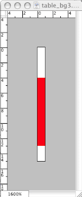
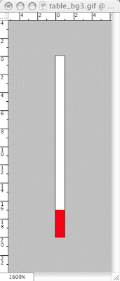
- For our template, we need three background images. Two of them will form custom horizontal stripes, and one will form a custom gradient. To create the horizontal stripes we created two different images, each with the dimensions width: 1px by height: 15px. When viewed in PhotoShop at maximum zoom, this is how those images appear:
 Notice to the right and at the top of each image the rulers. These measure the images in pixels. Use these measurements to create similar images yourself for your template. However, you may use a different color.
- For the next image, I wanted to create a gradient that changes from white on the left side to a light red on the right side. As a result, this meant I would have to create a background image that repeated vertically instead of horizontally like the other two. Therefore, I gave it the following dimensions: width: 700px by height: 1px. I made it a very gradual gradient stretched the full 700 pixels. Because of its peculiar dimensions, both very wide and very narrow, it is impossible to show here.
One note: you may ask yourself what would be the purpose of making such tiny images. Why have an image that is almost unmanageably narrow? The reason is file size. An image that is so narrow will have a much smaller file size and will therefore transfer and load up almost instantaneously in the browser window.
- Images—In addition to background images, we will also need a couple of other images. Together, these will form the title banner of the page.
- The first of these (do not include the border around the image) has the following dimensions, width: 175px by height: 100px:
- The second image will serve as a kind of logo. You will need to create now, and its dimensions are width: 85px by height: 80px:

- CSS Class Selectors—Using a CSS Class is a special way to attach styles to an element in a page of HTML. Let's review, a CSS style definition consists of three (3) basic terms:
1selector {2property: 3value;}
The selector determines to which HTML element the style will be applied, as in the following example:
h1 {font-size:28pt;}
In the above example, the selector is the h1. It selects, or indicates that the following styles are to be applied to all<h1> tags. The following two terms after the selector should be self-explanatory, they are the property of the tag being styled, font-size, and then the particular value or setting for that property, 28pt.
Up to now, this is the only sort of style definition we have considered, those that match a particular HTML tag; however, there are selectors which may be used for any tag. This makes the style definition very flexible, as it can be applied as often or seldom as necessary. They are known as classes. and the selector, since it is not given a particular tag name such as body or h1, must have unique names. These names are preceded by a dot (.).
.red {color:#ff0000; font-weight:bold;}
Once created, the class is applied like all attributes are, and to any tag that is necessary, such as the two examples that follow:
<p class="red">hello!</p>
<td class="red">cell 1</td>
With this understanding, we will create three (3) classes to be applied immediately to our table, one for each row. Later, we may use these classes again if we need to.
<style type="text/css">
body
{background-color:#ffffff;
margin-top:0px;
margin-bottom:0px;
margin-left:0px;
margin-right:0px;}
table
{width:100%;
border-collapse:collapse;}
a:link
{font-family:Arial Black;
font-size:10pt;
color:#ffffff;
line-height:8pt;
text-decoration:none;}
a:visited
{font-family:Arial Black;
font-size:10pt;
color:#cccccc;
line-height:8pt;
text-decoration:none;}
a:active
{font-family:Arial Black;
font-size:10pt;
color:#ff0000;
line-height:8pt;
text-decoration:underline;}
a:hover
{font-family:Arial Black;
font-size:10pt;
color:#ff0000;
line-height:8pt;
text-decoration:underline;}
// class number 1
--sets a background image that repeats horizontally—we did this in class
.red1
{background-color:#fc8585;
background-image:url("images/red1.gif");
background-repeat:repeat-x;}
// class number 2
--sets a background image that repeats horizontally—we did this in class also
.red2
{background-color:#fc8585;
background-image:url("images/red2.gif");
background-repeat:repeat-x;}
// class number 3
--sets a background image that repeats vertically— we did NOT do this in class. It goes with the third background image mentioned above:
.red3
{background-color:#fc8585;
background-image:url("images/red3.gif");
background-repeat:repeat-y;}
//-->
</style>
These styles can then be applied to the table cells along with the title image:
<table
border="1px">
// below here is row 1
<tr>
<td class="red1" colspan="3"><img src="images/title.gif"/></td>
</tr>
// below here is row 2
<tr>
<td class="red2"colspan="3"> </td>
</tr>
// below here is row 3
<tr>
<td><a href="http://www.yahoo.com" target="_blank">home</a></td>
<td rowspan="3"><a href="http://www.amazon.com" target="_blank">galleries</a></td>
<td rowspan="3"></td>
</tr>
// below here is row 4
<tr>
<td><a href="http://www.google.com" target="_blank">about</a></td>
</tr>
// below here is row 5
<tr>
<td><a href="http://www.msn.com" target="_blank">contact</a></td>
</tr>
// below here is row 6
<tr>
<td class="red3" colspan="3"> </td>
</tr>
// below here is row 7
<tr>
<td> </td>
<td colspan="2"> </td>
</tr>
</table>
This code produces the following results (If you mouse over on the left side of the white area in YOUR own example, not here, you will see the links appear):

- More Classes—In order to get the template to appear exactly the way we wish, we need to change the widths of columns in the middle section of the table (which is now the white area between the red stripes that contains the links). The first column needs to remain constant, no matter what the size of the browser window is since it contains most of the navigation for the site. The last column, also, needs to remain constant since it is going to contain the logo. I would like this column to be the same width as the image it is going to contain, 85px. I would also like the first column to be that width as it is narrow and seems a reasonable width for a column that will only contain links, nothing else. Later, we can decide to change these widths if we decide they are not exacty what we want. In addition, we need to set the background-color for these cells and columns, which will be black. It may seem then, we need only one class, two at most, since all the cells in this middle section will be the same color, black. However, we really need three, and they need to do the following:
- new class 1: This class will be for the first column and it needs to make the background black, set the width to 80 pixels, and align the text to the right;
- new class 2: This class will be for the second column and it also needs to make the background black, but it does not need to set a width, and it needs to align the text to the center and vertically in the middle (as this cell has a rowspan of 3 and extends downward across 3 rows);
- new class 3: This class will be for the third column and it, like the other two, needs to make the background black, needs to set the width to 80 pixels, like the first, but does not need to set an alignment as it will not have any text. Unlike the others, however, it will require a background image, the logo that we created. Unlike the other background images that we created, this one will not repeat at all in either the X or Y directions.
The following is how these three new classes will appear in the stylesheet:
// column class number 1
--sets the styles for the first column between the red stripes
.col1
{width:80px;
background-color:#000000;
text-align:right;}
// column class number 2
--sets the styles for the second column between the red stripes
.col2
{background-color:#000000;
text-align:left;
vertical-align:middle;
padding:20px;}
// column class number 1
--sets the styles for the third column between the red stripes
.col3
{width:80px;
background-color:#000000;
background-image:url("images/logo1.png");
background-repeat:no-repeat}
Next, we need to apply those classes to the tags within the HTML:
<table border="1px">
// below here is row 1
<tr>
<td class="red1" colspan="3"><img src="images/title.gif"/></td>
</tr>
// below here is row 2
<tr>
<td class="red2"colspan="3"> </td>
</tr>
// below here is row 3
<tr>
<td class="col1"><a href="http://www.yahoo.com" target="_blank">home</a></td>
<td class="col2" rowspan="3"><a href="http://www.amazon.com" target="_blank">galleries</a></td>
<td class="col3" rowspan="3"></td>
</tr>
// below here is row 4
<tr>
<td class="col1"><a href="http://www.google.com" target="_blank">about</a></td>
</tr>
// below here is row 5
<tr>
<td class="col1"><a href="http://www.msn.com" target="_blank">contact</a></td>
</tr>
// below here is row 6
<tr>
<td class="red3" colspan="3"> </td>
</tr>
// below here is row 7
<tr>
<td> </td>
<td colspan="2"> </td>
</tr>
</table>
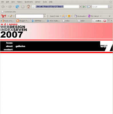
The above changes and additions to the code produces a table that now looks like the image below:
- Inline Styles—The last thing that I would like to add to this template for our website are borders; however, I only want to add borders very selectively. I do NOT wish to have borders throughout the table. I only want borders to appear between the links and no where else within the table. This makes things a little tricky, so I have to be very clear in my own mind where the borders need to be:
- We need a border below the first link on the bottom of the cell;
- We need a border below the second link on the bottom of the cell;
- We do NOT need a border below the third, however;
- We need a border on the right hand side of the first link between the first and second columns;
- We need a border on the right hand side of the second link between the first and second columns;
- We need a border on the right hand side of the third link between the first and second columns;
- We do NOT need borders anywhere else;
Because where we need borders to be is so specific, the only way to do this is by employing what are known as Inline Styles. This type of CSS follows the same rules as the other two types we have discussed in class, linked/attached/external stylsheets and embedded stylesheets; however, they apply their styles in very specific instances. Attached styles may apply to many webpages at once. Embedded styles may apply to every instance of a tag within a page. Inline styles apply to only one tag at a time as they are typed within the specific tag for which they are required. Since we do not wish to apply borders to every <td> tag, but to only a couple of them, we will use Inline styles for this. Below is how the code will be modified:
<table border="1px">
// below here is row 1
<tr>
<td class="red1" colspan="3"><img src="images/title.gif"/></td>
</tr>
// below here is row 2
<tr>
<td class="red2"colspan="3"> </td>
</tr>
// below here is row 3
<tr>
<td class="col1" style="border-color:#ffffff; border-style:solid; border-width:1px; border-top:0px; border-left:0px;"><a href="http://www.yahoo.com" target="_blank">home</a></td>
<td class="col2" rowspan="3"><a href="http://www.amazon.com" target="_blank">galleries</a></td>
<td class="col3" rowspan="3"></td>
</tr>
// below here is row 4
<tr>
<td class="col1" style="border-color:#ffffff; border-style:solid; border-width:1px; border-top:0px; border-left:0px;"><a href="http://www.google.com" target="_blank">about</a></td>
</tr>
// below here is row 5
<tr>
<td class="col1" style="border-color:#ffffff; border-style:solid; border-width:1px; border-bottom:0px; border-top:0px; border-left:0px;"><a href="http://www.msn.com" target="_blank">contact</a></td>
</tr>
// below here is row 6
<tr>
<td class="red3" colspan="3"> </td>
</tr>
// below here is row 7
<tr>
<td> </td>
<td colspan="2"> </td>
</tr>
</table>
And so we get the following completed template:

 And here below is the HTML for the table that produced these results (notice the URLs in red--our first task will be to revise these):
<table border="1px">
<tr>
<td class="red3" colspan="3"><img src="images/title.gif"/></td>
</tr>
<tr>
<td class="red1"colspan="3"> </td>
</tr>
<tr>
<td class="col1" style="border-color:#ffffff; border-style:solid;
border-width:1px; border-top:0px; border-left:0px;">
<a href="http://www.yahoo.com" target="_blank">home</a>
</td>
<td class="col2" rowspan="3">
<a href="http://www.amazon.com"
target="_blank">galleries</a>
</td>
<td class="col3" rowspan="3"> </td>
</tr>
<tr>
<td class="col1" style="border-color:#ffffff; border-style:solid;
border-width:1px; border-top:0px; border-left:0px;">
<a href="http://www.google.com" target="_blank">about</a>
</td>
</tr>
<tr>
<td class="col1" style="border-color:#ffffff; border-style:solid;
border-width:1px; border-top:0px; border-left:0px; border-bottom:0px;">
<a href="http://www.msn.com" target="_blank">contact</a>
</td>
</tr>
<tr>
<td class="red2" colspan="3"> </td>
</tr>
<tr>
<td> </td>
<td rowspan="2"> </td>
</tr>
</table>
In addition, we typed the following rather extensive CSS in an embedded stylesheet:
body
{background-color:#ffffff;
margin-top:0px;
margin-bottom:0px;
margin-left:0px;
margin-right:0px;}
table
{width:100%;
border-collapse:collapse;}
a:link
{font-family:Arial Black;
font-size:10pt;
color:#ffffff;
line-height:8pt;
text-decoration:none;}
a:visited
{font-family:Arial Black;
font-size:10pt;
color:#cccccc;
line-height:8pt;
text-decoration:none;}
a:active
{font-family:Arial Black;
font-size:10pt;
color:#ff0000;
line-height:8pt;
text-decoration:underline;}
a:hover
{font-family:Arial Black;
font-size:10pt;
color:#ff0000;
line-height:8pt;
text-decoration:underline;}
.red3
{background-color:#fc8585;
background-image:url("images/red3.gif");
background-repeat:repeat-y;}
.red1
{background-color:#fc8585;
background-image:url("images/red1.gif");
background-repeat:repeat-x;}
.red2
{background-color:#fc8585;
background-image:url("images/red2.gif");
background-repeat:repeat-x;}
.col1
{width:80px;
background-color:#000000;
text-align:right;}
.col2
{background-color:#000000;
text-align:left;
vertical-align:middle;
padding:20px;}
.col3
{width:80px;
background-color:#000000;
background-image:url("images/logo1.png");
background-repeat:no-repeat}
And here below is the HTML for the table that produced these results (notice the URLs in red--our first task will be to revise these):
<table border="1px">
<tr>
<td class="red3" colspan="3"><img src="images/title.gif"/></td>
</tr>
<tr>
<td class="red1"colspan="3"> </td>
</tr>
<tr>
<td class="col1" style="border-color:#ffffff; border-style:solid;
border-width:1px; border-top:0px; border-left:0px;">
<a href="http://www.yahoo.com" target="_blank">home</a>
</td>
<td class="col2" rowspan="3">
<a href="http://www.amazon.com"
target="_blank">galleries</a>
</td>
<td class="col3" rowspan="3"> </td>
</tr>
<tr>
<td class="col1" style="border-color:#ffffff; border-style:solid;
border-width:1px; border-top:0px; border-left:0px;">
<a href="http://www.google.com" target="_blank">about</a>
</td>
</tr>
<tr>
<td class="col1" style="border-color:#ffffff; border-style:solid;
border-width:1px; border-top:0px; border-left:0px; border-bottom:0px;">
<a href="http://www.msn.com" target="_blank">contact</a>
</td>
</tr>
<tr>
<td class="red2" colspan="3"> </td>
</tr>
<tr>
<td> </td>
<td rowspan="2"> </td>
</tr>
</table>
In addition, we typed the following rather extensive CSS in an embedded stylesheet:
body
{background-color:#ffffff;
margin-top:0px;
margin-bottom:0px;
margin-left:0px;
margin-right:0px;}
table
{width:100%;
border-collapse:collapse;}
a:link
{font-family:Arial Black;
font-size:10pt;
color:#ffffff;
line-height:8pt;
text-decoration:none;}
a:visited
{font-family:Arial Black;
font-size:10pt;
color:#cccccc;
line-height:8pt;
text-decoration:none;}
a:active
{font-family:Arial Black;
font-size:10pt;
color:#ff0000;
line-height:8pt;
text-decoration:underline;}
a:hover
{font-family:Arial Black;
font-size:10pt;
color:#ff0000;
line-height:8pt;
text-decoration:underline;}
.red3
{background-color:#fc8585;
background-image:url("images/red3.gif");
background-repeat:repeat-y;}
.red1
{background-color:#fc8585;
background-image:url("images/red1.gif");
background-repeat:repeat-x;}
.red2
{background-color:#fc8585;
background-image:url("images/red2.gif");
background-repeat:repeat-x;}
.col1
{width:80px;
background-color:#000000;
text-align:right;}
.col2
{background-color:#000000;
text-align:left;
vertical-align:middle;
padding:20px;}
.col3
{width:80px;
background-color:#000000;
background-image:url("images/logo1.png");
background-repeat:no-repeat}
 Notice that the text appears indented on the left-hand side, that there are two columns of exactly the same width and separated by a narrow gutter of space between them, and that the text alignment is justified—aligned on both edges. Also notice the text that appears on the right-hand side of the layout. This is actually an image in which the text leads vertically from top-to-bottom instead of right-to-left.
 You can see that the text is simply bolder than the rest of the paragraph. A simple CSS class may be used to set this up:
.abt_bold
{font-weight:bold;
font-size:9pt;}
The difficult part comes when we try to decide where and how to apply this class. There is no tag before and after that one line of text in which we can insert the class attribute, so we'll have to create a new tag. In HTML, there is another tag, much like the <div> tag, that sets off a small division of text from the rest of the text around it so that it can be different. We cannot use the <div> tag, however, because it is a block tag; and, if you remember, block tags send everything that follow to the next line and adds an additional line of blank space before and after. No, instead we must use an inline tag that does not do this: this tag is known as the <span> tag.
Like the <div> tag, it does not do much on its own other than say to the browser that the text in between the spans is somehow different and set off from the rest of the text; but with CSS added, you can style the text in between any way you wish, such as with the new class that we have created like so:
<div>
For many types of communication, websites have replaced printed media as the main tool. In other instances, Internet applications have gained an important position next to traditional media. Use of the Internet has reached a stage of maturity, and the same can be said of web design: over the past ten years, it has changed from hesitant and experimental to confident and sophisticated. The increasingly common use of fast-speed Internet allows designers to use larger files, and it has become more common for clients to allocate a budget for professional photography.
<br/>
<br/>
The captions in this book provide information about those involved in the design and programming and are coded as follows:
<br/>
<br/>
<table>
<tr>
<td>D</td>
<td> </td>
<td>design</td>
</tr>
<tr>
<td>C</td>
<td> </td>
<td>coding</td>
</tr>
<tr>
<td>P</td>
<td> </td>
<td>production</td>
</tr>
<tr>
<td>A</td>
<td> </td>
<td>agency</td>
</tr>
<tr>
<td>M</td>
<td> </td>
<td>designer's contact address</td>
</tr>
</table>
</div>
<br/>
<div> A CD-ROM containing all the pages, arranged in the same order as the book, can be found inside the back cover. It allows you to view each page on your computer witha minimum of loading time, and to access the Internet in order to browse the selected pages.
<br/>
<br/>
<br/>
<span class="abt_bold">
Submissions & recommendations
</span>
<br/>
Each year, brand new editions of all The Pepin Press' web design books are published. Should you wish to submit or recommend designs for consideration, please access the submissions form at http://www.webdesignindex.org.
<br/>
<br/>
<br/>
<span class="abt_bold">
The Pepin Press/Agile Rabbit Editions
</span>
<br/>
For more information about the Pepin Press' many publications on design, fashion, popular culture, visual references and ready-to-use images, please visit http://www.pepinpress.com.
</div>
We also need to apply that same abt_bold class to the parts of the table that contain the abbreviations, as they are also bold:
<table>
<tr>
<td class="abt_bold">D</td>
<td> </td>
<td>design</td>
</tr>
<tr>
<td class="abt_bold">C</td>
<td> </td>
<td>coding</td>
</tr>
<tr>
<td class="abt_bold">P</td>
<td> </td>
<td>production</td>
</tr>
<tr>
<td class="abt_bold">A</td>
<td> </td>
<td>agency</td>
</tr>
<tr>
<td class="abt_bold">M</td>
<td> </td>
<td>designer's contact address</td>
</tr>
</table>
You can see that the text is simply bolder than the rest of the paragraph. A simple CSS class may be used to set this up:
.abt_bold
{font-weight:bold;
font-size:9pt;}
The difficult part comes when we try to decide where and how to apply this class. There is no tag before and after that one line of text in which we can insert the class attribute, so we'll have to create a new tag. In HTML, there is another tag, much like the <div> tag, that sets off a small division of text from the rest of the text around it so that it can be different. We cannot use the <div> tag, however, because it is a block tag; and, if you remember, block tags send everything that follow to the next line and adds an additional line of blank space before and after. No, instead we must use an inline tag that does not do this: this tag is known as the <span> tag.
Like the <div> tag, it does not do much on its own other than say to the browser that the text in between the spans is somehow different and set off from the rest of the text; but with CSS added, you can style the text in between any way you wish, such as with the new class that we have created like so:
<div>
For many types of communication, websites have replaced printed media as the main tool. In other instances, Internet applications have gained an important position next to traditional media. Use of the Internet has reached a stage of maturity, and the same can be said of web design: over the past ten years, it has changed from hesitant and experimental to confident and sophisticated. The increasingly common use of fast-speed Internet allows designers to use larger files, and it has become more common for clients to allocate a budget for professional photography.
<br/>
<br/>
The captions in this book provide information about those involved in the design and programming and are coded as follows:
<br/>
<br/>
<table>
<tr>
<td>D</td>
<td> </td>
<td>design</td>
</tr>
<tr>
<td>C</td>
<td> </td>
<td>coding</td>
</tr>
<tr>
<td>P</td>
<td> </td>
<td>production</td>
</tr>
<tr>
<td>A</td>
<td> </td>
<td>agency</td>
</tr>
<tr>
<td>M</td>
<td> </td>
<td>designer's contact address</td>
</tr>
</table>
</div>
<br/>
<div> A CD-ROM containing all the pages, arranged in the same order as the book, can be found inside the back cover. It allows you to view each page on your computer witha minimum of loading time, and to access the Internet in order to browse the selected pages.
<br/>
<br/>
<br/>
<span class="abt_bold">
Submissions & recommendations
</span>
<br/>
Each year, brand new editions of all The Pepin Press' web design books are published. Should you wish to submit or recommend designs for consideration, please access the submissions form at http://www.webdesignindex.org.
<br/>
<br/>
<br/>
<span class="abt_bold">
The Pepin Press/Agile Rabbit Editions
</span>
<br/>
For more information about the Pepin Press' many publications on design, fashion, popular culture, visual references and ready-to-use images, please visit http://www.pepinpress.com.
</div>
We also need to apply that same abt_bold class to the parts of the table that contain the abbreviations, as they are also bold:
<table>
<tr>
<td class="abt_bold">D</td>
<td> </td>
<td>design</td>
</tr>
<tr>
<td class="abt_bold">C</td>
<td> </td>
<td>coding</td>
</tr>
<tr>
<td class="abt_bold">P</td>
<td> </td>
<td>production</td>
</tr>
<tr>
<td class="abt_bold">A</td>
<td> </td>
<td>agency</td>
</tr>
<tr>
<td class="abt_bold">M</td>
<td> </td>
<td>designer's contact address</td>
</tr>
</table>


