- TOPICS:
- Final Project;
- Classwork:
- LINK REVIEW: the Template;
- LINK INTRODUCE: the Gallery;
- LINK Creating a table for the secondary navigation for the Gallery pages;
- LINK Inserting the text for the Gallery secondary navigation;
- LINK Adding the anchor tags for the Gallery secondary navigation;
- LINK The URL list for the featured websites;
- LINK Creating the table for the gallery images;
- LINK Inserting the images into the gallery pages;
- LINK Creating the captions for the gallery images;
- LINK Positioning the table of gallery images;
- LINK linking to the featured external sites;
- LINK Final suggestions;
- HOMEWORK—Final Project, Part III: As of two weeks ago, the homework for each class is to be part of the final project. Each part will be due one week from the time that it was assigned. This means that the assignment for this week will be due in the next class. Each week I will assign a new part to the website. If you produce these assignments on time each week, you will have accumulated HALF THE POINTS for the final.
If you do not show me the work each week, your chances of receiving a passing grade for the final project are vastly reduced.
This does not mean that each part has to be perfect each week, but it should be largely complete and without error. It is up to you to find your own errors.
The site that we are going to produce accompanies a book that has already been published that highlights some of the best web-designs of last year. It will have four main parts: the home page, six about pages (six versions of the page, each one for a different language), two gallery pages, and a contact page that will include a form for submitting personal information.
- Due in class next week: you must complete BOTH of the gallery pages which we began in class this week. To do so, you must follow the directions here in this blog. Recall that these documents should have the following names: gal_1.html and gal_2.html.
LINK Click here to read more about the Gallery section of this assignment.
- Due in class in two weeks: you must complete the home page of the site. This will be done in the file that we have named index.html. I will not provide you with any directions for this part of the site, although I will give you all the necessary content. LINK Click here to read more about this site and to download the necessary files. Keep in mind that you have to keep with your color scheme, and that it must work with the white background I have established for the template. Recall also that your color scheme can only consist of two colors, not including black or gray. Your entire site can include only these colors and lighter or darker variations of them. The two colors must be adjacent on the color wheel. Acceptable color pairs are as follows: red and orange, orange and yellow, yellow and green, green and blue, blue and purple, or purple and red. Your colors may also be reflected in the template that we created in class. If you are unhappy with your choice of colors in class, then you may change them as part of your homework.
- Due in class next week: you must complete BOTH of the gallery pages which we began in class this week. To do so, you must follow the directions here in this blog. Recall that these documents should have the following names: gal_1.html and gal_2.html.
LINK Click here to read more about the Gallery section of this assignment.
- FINAL PROJECT
The site that we are going to produce accompanies a book that has already been published that highlights some of the best web-designs of last year. It will have four main parts: the home page, six about pages (six versions of the page, each one for a different language), two gallery pages, and a contact page that will include a form for submitting personal information. Please read the information provided.
- CONTENT REQUIREMENTS:
- Part 1: TEMPLATE—This is what we have already completed as of the class before last which includes the top banner of the site and its primary navigation. If you have yet to complete this, check the previous blog entry here: LINK Week 10 blog entry.
- Part 2: ABOUT PAGES—these pages will all look identical. Each will include some imagery of your choice and the text about this book in six (6) different languages (to be furnished at a later time). The main thing you need to know about him right now to start your site is that this is a book about the state-of-the-art web design. LINK This is a .zip file that contains all the text for this page. For this section, each language will be placed in a separate about page and so each language is saved in a separate file. Remember, you must use all the text.
- Part 3: IMAGE GALLERY PAGES—Below here you will see a series of links to various sites. You must visit each site and take a screen shot of the main page of the site. Using photoshop, you must crop the screen shot and create a large .jpg image and a much smaller .gif image. You must place all the thumbnail images of the main pages of each site into the gallery pages. Each thumbnail will also provide a link to the larger image that you created with the screen shot of the site and that image will be a link to the site that will open up in a separate window when clicked on. Below are the links for the first gallery page:
- http://www.thorns.no/ltd/
- http://www.urbjects.com
- http://www.hellalouie.com
- http://junekim.com
- http://www.kunstdichte.com
- http://c.dric.be
- http://www.estudiosaci.com.br
- http://www.atelierduchene.com
- http://www.e-motionalis.net
- http://www.grivina.ru
- http://juliaabelmann.com
- http://www.claudioviscardi.it
- http://ki2n.com
- http://www.artworksgroup.net
- http://www.talkingmeanstrouble.com
- http://www.heidilangauer.ch
- http://bestiario.org
- http://www.disgenia.net
- http://www.animaisa.ru
- http://couscouskid.co.uk
- http://www.dev4design.com/new.html
- http://www.mandarine24.com/
- http://www.lesdoigtsdelhomme.com/
- http://www.jonathanyuen.com/main.html
- http://www.microbians.com/
- http://www.bernhardwolff.com/
- http://www.417north.com/v7/
- http://www.peyotronica.com/web.html
- http://www.faile.net/
- http://www.sinelab.com/
- http://www.jazzve.com/
- http://www.nineoff.com/
- http://www.mutanthands.com/
- http://www.hungout.com/
- http://www.airbagconcept.com.ar/
- http://shadowtones.net/
- http://ctdia.com.br/hotsite/
- http://www.thewebflight.com/
- http://www.thecabrians.com/
- Part 4: CONTACT PAGE—This page includes an image of the cover of the book, publication information, and book-availability information. It will also have a form for the visitor to submit his/her personal information so as to be a part of the mailing list. We will be completing this page next week and starting it in class, week 13.
- Part 5: HOME PAGE—In this page, you should establish the color scheme that you will use throughout your design for this site. "The Look" will be established in part by what we do in class together, but the rest is up to you, such as the colors, the fonts, and the particular layout that you will choose. You will need one image for this page and some text. The image is a .jpg file and the text is a word .doc file that comes in six different languages. You must include all six in your design.
- Text: LINK This is a .zip file that contains all the text for this page. Each language is saved in a separate file. Remember, you must use all the text.
- Image: LINK This is a .zip file that contains a .psd file of the image that you need for this page. I intentionally left it as a .psd so that you can modify it and then save it in the format(s) of your choice.
- Part 2: ABOUT PAGES—these pages will all look identical. Each will include some imagery of your choice and the text about this book in six (6) different languages (to be furnished at a later time). The main thing you need to know about him right now to start your site is that this is a book about the state-of-the-art web design. LINK This is a .zip file that contains all the text for this page. For this section, each language will be placed in a separate about page and so each language is saved in a separate file. Remember, you must use all the text.
- Part 1: TEMPLATE—This is what we have already completed as of the class before last which includes the top banner of the site and its primary navigation. If you have yet to complete this, check the previous blog entry here: LINK Week 10 blog entry.
- DESIGN REQUIREMENTS:
- Color Scheme—you must choose a color scheme for your web-site that you can show to me or describe to me. My suggestions are to keep it simple, easy, non-complicated. Keep in mind who your audience is and what the subject matter is.
- Page Layout—you must use CSS and you may use tables to lay out all pages in a pleasing way. If you are not certain how to do this, consult our past classes and me for assistance.
- TECHNICAL REQUIREMENTS:
- XHTML—ALL CODE for this site must be typed using STRICT XHTML standards. This means the following:
- that all tags and their attributes must be typed in lower case;
- that all attribute values must be typed in quotes and with units;
- that the DTD for strict XHTML must be typed at the top of the document;
- that all empty tags must be typed with the slash at the end, such as with the <br/> tag;
- that none of the deprecated inline tags are to be used, such as the <font>, <b>, <u>, or <i> tags;
- and, in addition, that the <tbody> and the <thead> tags, as well as the height attribute for the <table> and <td> tags, are not permitted.
- CSS—ALL STYLING must be done using CSS. We have used it extensively in this class, so it is a requirement that this site use CSS for the styling of the page. All three levels of styles may be, and are encouraged to be used. Please consult me if you need additional assistance with this.
- XHTML—ALL CODE for this site must be typed using STRICT XHTML standards. This means the following:
- CONTENT REQUIREMENTS:
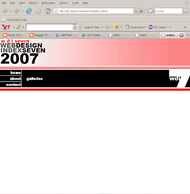
- REVIEW—Two weeks ago, we began with a table as a starting point to create the template for the site. By the end of the posting, you should have had a fully-realized template that included a banner with the name of the site, a site logo, and some navigation. This is what we ended up producing:
- GALLERY—The next step that we covered in class last week and in this blog was to create a secondary navigation. Since there are six different about pages in six different languages, we had to create another set of links that will fit below the other links. To do this we had to create another table in the about pages to house the new links to each of the different languages. We must do the same thing for the two gallery pages.
- Table: Since we have more than one gallery page to choose from, we will put this new secondary navigation into BOTH of them. Let's begin with gal_1.html. The new navigation will fit into the first cell of the sixth row, in exactly the same place that the secondary navigation was in the about pages; and, in order to create it, we must first create a simple table to fit within the first table, a table within a table. We have done this several times before (including last week), so it should need no explanation, but it will consist of only one row of four cells. <table border="1px"> <tr> <td class="red3" colspan="3"><img src="images/title.gif"/></td> </tr> <tr> <td class="red1"colspan="3"> </td> </tr> <tr> <td class="col1" style="border-color:#ffffff; border-style:solid; border-width:1px; border-top:0px; border-left:0px;"> <a href="index.html">home</a> </td> <td class="col2" rowspan="3"> <a href="gal_1.html">galleries</a> </td> <td class="col3" rowspan="3"> </td> </tr> <tr> <td class="col1" style="border-color:#ffffff; border-style:solid; border-width:1px; border-top:0px; border-left:0px;"> <a href="abt_eng.html">about</a> </td> </tr> <tr> <td class="col1" style="border-color:#ffffff; border-style:solid; border-width:1px; border-top:0px; border-left:0px; border-bottom:0px;"> <a href="con.html">contact</a> </td> </tr> <tr> <td class="red2" colspan="3"> <table> <tr> <td> </td> <td> </td> <td> </td> <td> </td> </tr> </table> </td> </tr> <tr> <td> </td> <td rowspan="2"> </td> </tr> </table>
- Text: Within this table, we will type the text for the links that will link to both of the gallery pages. Notice that the first cell is blank and has been given the width of 100 pixels. <table border="1px"> <tr> <td class="red3" colspan="3"><img src="images/title.gif"/></td> </tr> <tr> <td class="red1"colspan="3"> </td> </tr> <tr> <td class="col1" style="border-color:#ffffff; border-style:solid; border-width:1px; border-top:0px; border-left:0px;"> <a href="index.html">home</a> </td> <td class="col2" rowspan="3"> galleries </td> <td class="col3" rowspan="3"> </td> </tr> <tr> <td class="col1" style="border-color:#ffffff; border-style:solid; border-width:1px; border-top:0px; border-left:0px;"> <a href="abt_eng.html">about</a> </td> </tr> <tr> <td class="col1" style="border-color:#ffffff; border-style:solid; border-width:1px; border-top:0px; border-left:0px; border-bottom:0px;"> <a href="con.html">contact</a> </td> </tr> <tr> <td class="red2" colspan="3"> <table> <tr> <td style="width:100px;"> </td> <td>gallery one</td> <td>gallery two</td> <td style="width:100px;"> </td> </tr> </table> </td> </tr> <tr> <td> </td> <td rowspan="2"> </td> </tr> </table>
- Links: Next, we need to convert those words into links to the appropriate pages:
- gallery one: links to gal_1.html.
- gallery two: links to gal_2.html.
- Content: Now that we have all navigation for the site complete, both the primary navigation—the home, about, contact, galleries links—and the secondary navigation—the links to the various languages in the about pages, and the secondary navigation—the links to the thumbnail images in the gallery pages, we can work with the actual content of the gallery.
The content for the gallery section consists almost entirely of images. These images come from a series of 40 websites that will be featured in this site we are making for their good design. Below is a series of steps of how to produce these images:
- Type in one of the links to the sites in the list below.
- Maximize the browser window.
- Press on the Print Screen key in the upper right of your keyboard if you have a PC. With a MAC, the application Grab in your utilities folder is a very useful little application to do the same thing and more.
- Open Photoshop and open a new image.
- Then paste the shot (ctrl-V or apple-V).
- Save as a .jpg file into your images folder.
- Resize your images so that the width is 100px or less—all images must have the same width.
- Choose save for web and save as a .gif image, but this time add the letters SM (for small) to the end of your filename before the extension. Make certain it goes into your images folder.
- Repeat these steps for each of the 40 websites. When complete, you will have 2 images for each site.
- http://www.thorns.no/ltd/
- http://www.urbjects.com
- http://www.hellalouie.com
- http://junekim.com
- http://www.kunstdichte.com
- http://c.dric.be
- http://www.estudiosaci.com.br
- http://www.atelierduchene.com
- http://www.e-motionalis.net
- http://www.grivina.ru
- http://juliaabelmann.com
- http://www.claudioviscardi.it
- http://ki2n.com
- http://www.artworksgroup.net
- http://www.talkingmeanstrouble.com
- http://www.heidilangauer.ch
- http://bestiario.org
- http://www.disgenia.net
- http://www.animaisa.ru
- http://couscouskid.co.uk
- http://www.dev4design.com/new.html
- http://www.mandarine24.com/
- http://www.lesdoigtsdelhomme.com/
- http://www.jonathanyuen.com/main.html
- http://www.microbians.com/
- http://www.bernhardwolff.com/
- http://www.417north.com/v7/
- http://www.peyotronica.com/web.html
- http://www.faile.net/
- http://www.sinelab.com/
- http://www.jazzve.com/
- http://www.nineoff.com/
- http://www.mutanthands.com/
- http://www.hungout.com/
- http://www.airbagconcept.com.ar/
- http://shadowtones.net/
- http://ctdia.com.br/hotsite/
- http://www.thewebflight.com/
- http://www.thecabrians.com/
- Table: We will begin by creating another table for our gallery images below the template table. This table must have two rows and ten cells per row. Below is what you should end up with:
<table border="1px">
<tr>
<td class="red3" colspan="3"><img src="images/title.gif"/></td>
</tr>
<tr>
<td class="red1"colspan="3"> </td>
</tr>
<tr>
<td class="col1" style="border-color:#ffffff; border-style:solid;
border-width:1px; border-top:0px; border-left:0px;">
<a href="index.html">home</a>
</td>
<td class="col2" rowspan="3">
galleries
</td>
<td class="col3" rowspan="3"> </td>
</tr>
<tr>
<td class="col1" style="border-color:#ffffff; border-style:solid;
border-width:1px; border-top:0px; border-left:0px;">
<a href="abt_eng.html">about</a>
</td>
</tr>
<tr>
<td class="col1" style="border-color:#ffffff; border-style:solid;
border-width:1px; border-top:0px; border-left:0px;
border-bottom:0px;">
<a href="con.html">contact</a>
</td>
</tr>
<tr>
<td class="red2" colspan="3">
<table>
<tr>
<td style="width:100px;"> </td>
<td>
gallery one
</td>
<a href="gal_2.html">gallery two</a>
</td>
<td style="width:100px;"> </td>
</tr>
</table>
</td>
</tr>
<tr>
<td> </td>
<td rowspan="2"> </td>
</tr>
</table>
<table border="1px">
<tr>
<td> </td>
<td> </td>
<td> </td>
<td> </td>
<td> </td>
<td> </td>
<td> </td>
<td> </td>
<td> </td>
<td> </td>
</tr>
<tr>
<td> </td>
<td> </td>
<td> </td>
<td> </td>
<td> </td>
<td> </td>
<td> </td>
<td> </td>
<td> </td>
<td> </td>
</tr>
</table>
Once you get this new table, alter every other cell in the first row with colspan so that it looks like this:
This is achieved with the following code: <table border="1px"> <tr> <td colspan="2"> </td><td> </td><td colspan="2"> </td><td> </td><td colspan="2"> </td><td> </td><td colspan="2"> </td><td> </td><td colspan="2"> </td><td> </td></tr> <tr> <td> </td> <td> </td> <td> </td> <td> </td> <td> </td> <td> </td> <td> </td> <td> </td> <td> </td> <td> </td> </tr> </table> Finally, copy and paste these two rows 3 more times: <table border="1px"> <tr> <td colspan="2"> </td> <td colspan="2"> </td> <td colspan="2"> </td> <td colspan="2"> </td> <td colspan="2"> </td> </tr> <tr> <td> </td> <td> </td> <td> </td> <td> </td> <td> </td> <td> </td> <td> </td> <td> </td> <td> </td> <td> </td> </tr> <tr> <td colspan="2"> </td> <td colspan="2"> </td> <td colspan="2"> </td> <td colspan="2"> </td> <td colspan="2"> </td> </tr> <tr> <td> </td> <td> </td> <td> </td> <td> </td> <td> </td> <td> </td> <td> </td> <td> </td> <td> </td> <td> </td> </tr> <tr> <td colspan="2"> </td> <td colspan="2"> </td> <td colspan="2"> </td> <td colspan="2"> </td> <td colspan="2"> </td> </tr> <tr> <td> </td> <td> </td> <td> </td> <td> </td> <td> </td> <td> </td> <td> </td> <td> </td> <td> </td> <td> </td> </tr> <tr> <td colspan="2"> </td> <td colspan="2"> </td> <td colspan="2"> </td> <td colspan="2"> </td> <td colspan="2"> </td> </tr> <tr> <td> </td> <td> </td> <td> </td> <td> </td> <td> </td> <td> </td> <td> </td> <td> </td> <td> </td> <td> </td> </tr> </table> - Images: In the larger cells, the ones in which you applied the colspan attribute, you must place the thumbnail images that you created from the list of websites that I gave you. There will be five thumbnail images on every other row. The image below shows you what you will have when complete:

- Text: Next, we need caption text to go with each of the thumbnail images. This text will simply be the name of the site. These are not the web addresses of the sites that I have given you in the list above, but the actual name of the site. In addition, this text needs to be styled with a class that we will place within the <td> tags for the cells that contain the caption text. We will call the class .caption: body {background-color:#ffffff; margin-top:0px; margin-bottom:0px; margin-left:0px; margin-right:0px;} table {width:100%; border-collapse:collapse;} a:link {font-family:Arial Black; font-size:10pt; color:#ffffff; line-height:8pt; text-decoration:none;} a:visited {font-family:Arial Black; font-size:10pt; color:#cccccc; line-height:8pt; text-decoration:none;} a:active {font-family:Arial Black; font-size:10pt; color:#ff0000; line-height:8pt; text-decoration:underline;} a:hover {font-family:Arial Black; font-size:10pt; color:#ff0000; line-height:8pt; text-decoration:underline;} .red3 {background-color:#fc8585; background-image:url("images/red3.gif"); background-repeat:repeat-y;} .red1 {background-color:#fc8585; background-image:url("images/red1.gif"); background-repeat:repeat-x;} .red2 {background-color:#fc8585; background-image:url("images/red2.gif"); background-repeat:repeat-x;} .col1 {width:80px; background-color:#000000; text-align:right;} .col2 {background-color:#000000; text-align:left; vertical-align:middle; padding:20px;} .col3 {width:80px; background-color:#000000; background-image:url("images/logo1.png"); background-repeat:no-repeat} .caption {font-family:Arial, Helvetica, sans serif; font-size:9pt; line-height:8pt; color:#333333;} #layer_1 {width:275px; height:400px; position:absolute; z-index:1; top:230px; left:85px;} #layer_2 {width:275px; height:400px; position:absolute; z-index:2; top:230px; left:385px} In addition to the text identifying the site, we will also add a couple of <br/> tags afterwards so that there is a little space below the text. <table border="1px"> <tr> <td colspan="2"><img src="images/site1_SM.gif"/></td> <td colspan="2"><img src="images/site1_SM.gif"/></td> <td colspan="2"><img src="images/site1_SM.gif"/></td> <td colspan="2"><img src="images/site1_SM.gif"/></td> <td colspan="2"><img src="images/site1_SM.gif"/></td> </tr> <tr> <td>Name of Site<br/><br/></td> <td> </td> <td>Name of Site<br/><br/></td> <td> </td> <td>Name of Site<br/><br/></td> <td> </td> <td>Name of Site<br/><br/></td> <td> </td> <td>Name of Site<br/><br/></td> <td> </td> </tr> <tr> <td colspan="2"><img src="images/site1_SM.gif"/></td> <td colspan="2"><img src="images/site1_SM.gif"/></td> <td colspan="2"><img src="images/site1_SM.gif"/></td> <td colspan="2"><img src="images/site1_SM.gif"/></td> <td colspan="2"><img src="images/site1_SM.gif"/></td> </tr> <tr> <td>Name of Site<br/><br/></td> <td> </td> <td>Name of Site<br/><br/></td> <td> </td> <td>Name of Site<br/><br/></td> <td> </td> <td>Name of Site<br/><br/></td> <td> </td> <td>Name of Site<br/><br/></td> <td> </td> </tr> <tr> <td colspan="2"><img src="images/site1_SM.gif"/></td> <td colspan="2"><img src="images/site1_SM.gif"/></td> <td colspan="2"><img src="images/site1_SM.gif"/></td> <td colspan="2"><img src="images/site1_SM.gif"/></td> <td colspan="2"><img src="images/site1_SM.gif"/></td> </tr> <tr> <td>Name of Site<br/><br/></td> <td> </td> <td>Name of Site<br/><br/></td> <td> </td> <td>Name of Site<br/><br/></td> <td> </td> <td>Name of Site<br/><br/></td> <td> </td> <td>Name of Site<br/><br/></td> <td> </td> </tr> <tr> <td colspan="2"><img src="images/site1_SM.gif"/></td> <td colspan="2"><img src="images/site1_SM.gif"/></td> <td colspan="2"><img src="images/site1_SM.gif"/></td> <td colspan="2"><img src="images/site1_SM.gif"/></td> <td colspan="2"><img src="images/site1_SM.gif"/></td> </tr> <tr> <td>Name of Site<br/><br/></td> <td> </td> <td>Name of Site<br/><br/></td> <td> </td> <td>Name of Site<br/><br/></td> <td> </td> <td>Name of Site<br/><br/></td> <td> </td> <td>Name of Site<br/><br/></td> <td> </td> </tr> </table>
- Positioning: The next step is to position this table within the browser window. We'll do this in the same way that we did last week: first by adding <div> tags and then by creating a new ID in the css stylesheet. First let's look at the ID that we need:
#layer_gal
{width:505px;I chose this width because I multiplied five images times the width of each image, which I chose as 100px. I then added five additional pixels to that. If the width of your images is 80, then you'd multiply that by five and add 5 more pixels. That would give you 405 instead.
position:absolute;
z-index:4;
top:20px;
left:85px}
Notice below where the <div> tags are as well as the ID attribute:
<div id="layer_gal">
<table border="1px">
<tr>
<td colspan="2"><img src="images/site1_SM.gif"/></td>
<td colspan="2"><img src="images/site1_SM.gif"/></td>
<td colspan="2"><img src="images/site1_SM.gif"/></td>
<td colspan="2"><img src="images/site1_SM.gif"/></td>
<td colspan="2"><img src="images/site1_SM.gif"/></td>
</tr>
<tr>
<td>Name of Site<br/><br/></td>
<td> </td>
<td>Name of Site<br/><br/></td>
<td> </td>
<td>Name of Site<br/><br/></td>
<td> </td>
<td>Name of Site<br/><br/></td>
<td> </td>
<td>Name of Site<br/><br/></td>
<td> </td>
</tr>
<tr>
<td colspan="2"><img src="images/site1_SM.gif"/></td>
<td colspan="2"><img src="images/site1_SM.gif"/></td>
<td colspan="2"><img src="images/site1_SM.gif"/></td>
<td colspan="2"><img src="images/site1_SM.gif"/></td>
<td colspan="2"><img src="images/site1_SM.gif"/></td>
</tr>
<tr>
<td>Name of Site<br/><br/></td>
<td> </td>
<td>Name of Site<br/><br/></td>
<td> </td>
<td>Name of Site<br/><br/></td>
<td> </td>
<td>Name of Site<br/><br/></td>
<td> </td>
<td>Name of Site<br/><br/></td>
<td> </td>
</tr>
<tr>
<td colspan="2"><img src="images/site1_SM.gif"/></td>
<td colspan="2"><img src="images/site1_SM.gif"/></td>
<td colspan="2"><img src="images/site1_SM.gif"/></td>
<td colspan="2"><img src="images/site1_SM.gif"/></td>
<td colspan="2"><img src="images/site1_SM.gif"/></td>
</tr>
<tr>
<td>Name of Site<br/><br/></td>
<td> </td>
<td>Name of Site<br/><br/></td>
<td> </td>
<td>Name of Site<br/><br/></td>
<td> </td>
<td>Name of Site<br/><br/></td>
<td> </td>
<td>Name of Site<br/><br/></td>
<td> </td>
</tr>
<tr>
<td colspan="2"><img src="images/site1_SM.gif"/></td>
<td colspan="2"><img src="images/site1_SM.gif"/></td>
<td colspan="2"><img src="images/site1_SM.gif"/></td>
<td colspan="2"><img src="images/site1_SM.gif"/></td>
<td colspan="2"><img src="images/site1_SM.gif"/></td>
</tr>
<tr>
<td>Name of Site<br/><br/></td>
<td> </td>
<td>Name of Site<br/><br/></td>
<td> </td>
<td>Name of Site<br/><br/></td>
<td> </td>
<td>Name of Site<br/><br/></td>
<td> </td>
<td>Name of Site<br/><br/></td>
<td> </td>
</tr>
</table>
</div>
The image below is what results:

- Web-sites: The last aspect of this section that we must add are the links to the actual websites that the thumbnails belong to. Each image below in the table, therefore, must be turned into a link using the anchor tag, and these links must open up into a separate browser window using the target attribute: <div id="layer_gal"> <table border="1px"> <tr> <td colspan="2"> <a href="http://www.tcicollege.edu" target="_blank"> <img src="images/site1_SM.gif"/> </a> </td> <td colspan="2"> <a href="http://www.tcicollege.edu" target="_blank"> <img src="images/site1_SM.gif"/> </a> </td> <td colspan="2"> <a href="http://www.tcicollege.edu" target="_blank"> <img src="images/site1_SM.gif"/> </a> </td> <td colspan="2"> <a href="http://www.tcicollege.edu" target="_blank"> <img src="images/site1_SM.gif"/> </a> </td> <td colspan="2"> <a href="http://www.tcicollege.edu" target="_blank"> <img src="images/site1_SM.gif"/> </a> </td> </tr> <tr> <td>Name of Site<br/><br/></td> <td> </td> <td>Name of Site<br/><br/></td> <td> </td> <td>Name of Site<br/><br/></td> <td> </td> <td>Name of Site<br/><br/></td> <td> </td> <td>Name of Site<br/><br/></td> <td> </td> </tr> <tr> <td colspan="2"> <a href="http://www.tcicollege.edu" target="_blank"> <img src="images/site1_SM.gif"/> </a> </td> <td colspan="2"> <a href="http://www.tcicollege.edu" target="_blank"> <img src="images/site1_SM.gif"/> </a> </td> <td colspan="2"> <a href="http://www.tcicollege.edu" target="_blank"> <img src="images/site1_SM.gif"/> </a> </td> <td colspan="2"> <a href="http://www.tcicollege.edu" target="_blank"> <img src="images/site1_SM.gif"/> </a> </td> <td colspan="2"> <a href="http://www.tcicollege.edu" target="_blank"> <img src="images/site1_SM.gif"/> </a> </td> </tr> <tr> <td>Name of Site<br/><br/></td> <td> </td> <td>Name of Site<br/><br/></td> <td> </td> <td>Name of Site<br/><br/></td> <td> </td> <td>Name of Site<br/><br/></td> <td> </td> <td>Name of Site<br/><br/></td> <td> </td> </tr> <tr> <td colspan="2"> <a href="http://www.tcicollege.edu" target="_blank"> <img src="images/site1_SM.gif"/> </a> </td> <td colspan="2"> <a href="http://www.tcicollege.edu" target="_blank"> <img src="images/site1_SM.gif"/> </a> </td> <td colspan="2"> <a href="http://www.tcicollege.edu" target="_blank"> <img src="images/site1_SM.gif"/> </a> </td> <td colspan="2"> <a href="http://www.tcicollege.edu" target="_blank"> <img src="images/site1_SM.gif"/> </a> </td> <td colspan="2"> <a href="http://www.tcicollege.edu" target="_blank"> <img src="images/site1_SM.gif"/> </a> </td> </tr> <tr> <td>Name of Site<br/><br/></td> <td> </td> <td>Name of Site<br/><br/></td> <td> </td> <td>Name of Site<br/><br/></td> <td> </td> <td>Name of Site<br/><br/></td> <td> </td> <td>Name of Site<br/><br/></td> <td> </td> </tr> <tr> <td colspan="2"> <a href="http://www.tcicollege.edu" target="_blank"> <img src="images/site1_SM.gif"/> </a> </td> <td colspan="2"> <a href="http://www.tcicollege.edu" target="_blank"> <img src="images/site1_SM.gif"/> </a> </td> <td colspan="2"> <a href="http://www.tcicollege.edu" target="_blank"> <img src="images/site1_SM.gif"/> </a> </td> <td colspan="2"> <a href="http://www.tcicollege.edu" target="_blank"> <img src="images/site1_SM.gif"/> </a> </td> <td colspan="2"> <a href="http://www.tcicollege.edu" target="_blank"> <img src="images/site1_SM.gif"/> </a> </td> </tr> <tr> <td>Name of Site<br/><br/></td> <td> </td> <td>Name of Site<br/><br/></td> <td> </td> <td>Name of Site<br/><br/></td> <td> </td> <td>Name of Site<br/><br/></td> <td> </td> <td>Name of Site<br/><br/></td> <td> </td> </tr> </table> </div>
- Finish: To end this posting, I will make a couple of suggestions to complete this posting without completely going through them:
- CSS—I would suggest making a style with IMG as the selector that draws a narrow outline around all the images in the page, in particular the images of the gallery.
- Image—I would also suggest that you create an image like the vertical images in the about pages with all the names of the different languages here on this page that lines up on the right-hand margin. Instead of typing the language name, perhaps gallery one and gallery two should be there.
- GALLERY—The next step that we covered in class last week and in this blog was to create a secondary navigation. Since there are six different about pages in six different languages, we had to create another set of links that will fit below the other links. To do this we had to create another table in the about pages to house the new links to each of the different languages. We must do the same thing for the two gallery pages.
Wednesday, July 30, 2008
Summer 2008
week 12: 07/30
Hello everyone,
By the end of class tonight, you should have last week's work done and at least one of the galleries nearly complete. If you have not, I suggest doing it as soon as possible. If you are further behind than one week, you are following a VERY poor strategy. If you wait until next week to finish what I started in class last night, you will find yourself in a very big hole.
Why is this so, you might ask? Well, because as of last week you might have noticed that I assigned you the final part of the project, the home/index page, which you will have to design all on your own. That means that if you wait until next week, you'll have two times as much work with only one week remaining to do it. Also, if you wait until next week to begin, you won't be able to show me the home/index page before you turn it in. Therefore, I suggest that you at least start on the home/index page and show me what you have done on it next week so I can give you suggestions as to how to improve it. That page is worth the most points of any page in this site.
In addition, next week, I will give you the the study sheet for the FINAL EXAM. All of this is due in two weeks; so, if you wait until next class to finish tonight's assignment, you'll be very far behind. Please don't wait, or you'll be very sorry.
Carter-


Wednesday, July 23, 2008
Summer 2008
week 11: 07/23
- TOPICS:
- Final Project;
- Classwork:
- LINK Starting with our Template;
- LINK Adjusting the links;
- LINK Modifying the CSS;
- LINK Adding a table for the secondary navigation for the About pages;
- LINK Adding the text for the secondary navigation links;
- LINK Adding the anchor tags for the secondary navigation links;
- LINK Adjusting the background image for the secondary navigation;
- LINK Downloading and inserting the content for the About pages;
- LINK Creating columns of text;
- LINK Adding the <DIV> tags;
- LINK Adding the CSS IDs
- LINK Adding the Image to the layout
- Due in class next week: you must complete ALL SIX of the about pages which we begin in class this week. To do so, you must follow the directions here in this blog. Recall that these documents should have the following names: abt_eng.html, abt_esp.html, abt_deu.html, abt_fra.html, abt_por.html, and abt_ita.html.
LINK Click here to read more about the About section of this assignment.
- Due in class in three weeks: you must complete the home page of the site. This will be done in the file that we have named index.html. I will not provide you with any directions for this part of the site, although I will give you all the necessary content. LINK Click here to read more about this site and to download the necessary files. Keep in mind that you have to keep with your color scheme, and that it must work with the white background I have established for the template. Recall also that your color scheme can only consist of two colors, not including black or gray. Your entire site can include only these colors and lighter or darker variations of them. The two colors must be adjacent on the color wheel. Acceptable color pairs are as follows: red and orange, orange and yellow, yellow and green, green and blue, blue and purple, or purple and red. Your colors will also be reflected in the template that we created in class. If you are unhappy with your choice of colors in class, then you may change them as part of your homework.
- The site that we are going to produce accompanies a book that has already been published that highlights some of the best web-designs of last year. It will have four main parts: the home page, six about pages (six versions of the page, each one for a different language), two gallery pages, and a contact page that will include a form for submitting personal information. Please read the information provided.
- CONTENT REQUIREMENTS:
- Part 1: TEMPLATE—This is what we have already completed as of the class before last which includes the top banner of the site and its primary navigation. If you have yet to complete this, check the previous blog entry here: LINK Week 10 blog entry.
- Part 2: ABOUT PAGES—these pages will all look identical. Each will include some imagery of your choice and the text about this book in six (6) different languages (to be furnished at a later time). The main thing you need to know about him right now to start your site is that this is a book about the state-of-the-art web design.
- ABOUT Text:LINK This is a .zip file that contains all the text for this page. For this section, each language will be placed in a separate about page and so each language is saved in a separate file. Remember, you must use all the text.
- Part 3: IMAGE GALLERY PAGES—I will provide a series of links to the various sites that you must include in this web-page. You must create thumbnail images of the main page of each site by doing a screen capture. Each thumbnail will also provide a link to the relevant site that will open up in a separate windown when clicked on.
- Part 4: CONTACT PAGE—This page includes an image of the cover of the book, publication information, and book-availability information. It will also have a form for the visitor to submit his/her personal information so as to be a part of the mailing list.
- Part 5: HOME PAGE—In this page, you should establish the color scheme that you will use throughout your design for this site. "The Look" will be established in part by what we do in class together, but the rest is up to you, such as the colors, the fonts, and the particular layout that you will choose. You will need one image for this page and some text. The image is a .jpg file and the text is a word .doc file that comes in six different languages. You must include all six in your design.
- INDEX Text: LINK This is a .zip file that contains all the text for this page. Each language is saved in a separate file. Remember, you must use all the text.
- Image: LINK This is a .zip file that contains a .psd file of the image that you need for this page. I intentionally left it as a .psd so that you can modify it and then save it in the format(s) of your choice.
- Part 2: ABOUT PAGES—these pages will all look identical. Each will include some imagery of your choice and the text about this book in six (6) different languages (to be furnished at a later time). The main thing you need to know about him right now to start your site is that this is a book about the state-of-the-art web design.
- Part 1: TEMPLATE—This is what we have already completed as of the class before last which includes the top banner of the site and its primary navigation. If you have yet to complete this, check the previous blog entry here: LINK Week 10 blog entry.
- DESIGN REQUIREMENTS:
- Color Scheme—you must choose a color scheme for your web-site that you can show to me or describe to me. My suggestions are to keep it simple, easy, non-complicated. Keep in mind who your audience is and what the subject matter is.
- Page Layout—you must use CSS and you may use tables to lay out all pages in a pleasing way. If you are not certain how to do this, consult our past classes and me for assistance.
- TECHNICAL REQUIREMENTS:
- XHTML—ALL CODE for this site must be typed using STRICT XHTML standards. This means the following:
- that all tags and their attributes must be typed in lower case;
- that all attribute values must be typed in quotes and with units;
- that the DTD for strict XHTML must be typed at the top of the document;
- that all empty tags must be typed with the slash at the end, such as with the <br/> tag;
- that none of the deprecated inline tags are to be used, such as the <font>, <b>, <u>, or <i> tags;
- and, in addition, that the <tbody> and the <thead> tags, as well as the height attribute for the <table> and <td> tags, are not permitted.
- CSS—ALL STYLING must be done using CSS. We have used it extensively in this class, so it is a requirement that this site use CSS for the styling of the page. All three levels of styles may be, and are encouraged to be used. Please consult me if you need additional assistance with this.
- XHTML—ALL CODE for this site must be typed using STRICT XHTML standards. This means the following:
- CONTENT REQUIREMENTS:
 And here below is the HTML for the table that produced these results (notice the URLs in red--our first task will be to revise these):
<table border="1px">
<tr>
<td class="red3" colspan="3"><img src="images/title.gif"/></td>
</tr>
<tr>
<td class="red1"colspan="3"> </td>
</tr>
<tr>
<td class="col1" style="border-color:#ffffff; border-style:solid;
border-width:1px; border-top:0px; border-left:0px;">
<a href="http://www.yahoo.com" target="_blank">home</a>
</td>
<td class="col2" rowspan="3">
<a href="http://www.amazon.com"
target="_blank">galleries</a>
</td>
<td class="col3" rowspan="3"> </td>
</tr>
<tr>
<td class="col1" style="border-color:#ffffff; border-style:solid;
border-width:1px; border-top:0px; border-left:0px;">
<a href="http://www.google.com" target="_blank">about</a>
</td>
</tr>
<tr>
<td class="col1" style="border-color:#ffffff; border-style:solid;
border-width:1px; border-top:0px; border-left:0px; border-bottom:0px;">
<a href="http://www.msn.com" target="_blank">contact</a>
</td>
</tr>
<tr>
<td class="red2" colspan="3"> </td>
</tr>
<tr>
<td> </td>
<td rowspan="2"> </td>
</tr>
</table>
In addition, we typed the following rather extensive CSS in an embedded stylesheet:
body
{background-color:#ffffff;
margin-top:0px;
margin-bottom:0px;
margin-left:0px;
margin-right:0px;}
table
{width:100%;
border-collapse:collapse;}
a:link
{font-family:Arial Black;
font-size:10pt;
color:#ffffff;
line-height:8pt;
text-decoration:none;}
a:visited
{font-family:Arial Black;
font-size:10pt;
color:#cccccc;
line-height:8pt;
text-decoration:none;}
a:active
{font-family:Arial Black;
font-size:10pt;
color:#ff0000;
line-height:8pt;
text-decoration:underline;}
a:hover
{font-family:Arial Black;
font-size:10pt;
color:#ff0000;
line-height:8pt;
text-decoration:underline;}
.red3
{background-color:#fc8585;
background-image:url("images/red3.gif");
background-repeat:repeat-y;}
.red1
{background-color:#fc8585;
background-image:url("images/red1.gif");
background-repeat:repeat-x;}
.red2
{background-color:#fc8585;
background-image:url("images/red2.gif");
background-repeat:repeat-x;}
.col1
{width:80px;
background-color:#000000;
text-align:right;}
.col2
{background-color:#000000;
text-align:left;
vertical-align:middle;
padding:20px;}
.col3
{width:80px;
background-color:#000000;
background-image:url("images/logo1.png");
background-repeat:no-repeat}
And here below is the HTML for the table that produced these results (notice the URLs in red--our first task will be to revise these):
<table border="1px">
<tr>
<td class="red3" colspan="3"><img src="images/title.gif"/></td>
</tr>
<tr>
<td class="red1"colspan="3"> </td>
</tr>
<tr>
<td class="col1" style="border-color:#ffffff; border-style:solid;
border-width:1px; border-top:0px; border-left:0px;">
<a href="http://www.yahoo.com" target="_blank">home</a>
</td>
<td class="col2" rowspan="3">
<a href="http://www.amazon.com"
target="_blank">galleries</a>
</td>
<td class="col3" rowspan="3"> </td>
</tr>
<tr>
<td class="col1" style="border-color:#ffffff; border-style:solid;
border-width:1px; border-top:0px; border-left:0px;">
<a href="http://www.google.com" target="_blank">about</a>
</td>
</tr>
<tr>
<td class="col1" style="border-color:#ffffff; border-style:solid;
border-width:1px; border-top:0px; border-left:0px; border-bottom:0px;">
<a href="http://www.msn.com" target="_blank">contact</a>
</td>
</tr>
<tr>
<td class="red2" colspan="3"> </td>
</tr>
<tr>
<td> </td>
<td rowspan="2"> </td>
</tr>
</table>
In addition, we typed the following rather extensive CSS in an embedded stylesheet:
body
{background-color:#ffffff;
margin-top:0px;
margin-bottom:0px;
margin-left:0px;
margin-right:0px;}
table
{width:100%;
border-collapse:collapse;}
a:link
{font-family:Arial Black;
font-size:10pt;
color:#ffffff;
line-height:8pt;
text-decoration:none;}
a:visited
{font-family:Arial Black;
font-size:10pt;
color:#cccccc;
line-height:8pt;
text-decoration:none;}
a:active
{font-family:Arial Black;
font-size:10pt;
color:#ff0000;
line-height:8pt;
text-decoration:underline;}
a:hover
{font-family:Arial Black;
font-size:10pt;
color:#ff0000;
line-height:8pt;
text-decoration:underline;}
.red3
{background-color:#fc8585;
background-image:url("images/red3.gif");
background-repeat:repeat-y;}
.red1
{background-color:#fc8585;
background-image:url("images/red1.gif");
background-repeat:repeat-x;}
.red2
{background-color:#fc8585;
background-image:url("images/red2.gif");
background-repeat:repeat-x;}
.col1
{width:80px;
background-color:#000000;
text-align:right;}
.col2
{background-color:#000000;
text-align:left;
vertical-align:middle;
padding:20px;}
.col3
{width:80px;
background-color:#000000;
background-image:url("images/logo1.png");
background-repeat:no-repeat}
- Links—To start out, we need to adjust the links. As you notice in the HTML code above, I colored the URLs as red. We are going to change those so that the reflect the pages within our site instead of external links: however, there are a few guidelines you must consider first:
- Pages: We must select which pages match up to those links:
- home—links up to the index.html file.
- about—links up to the abt_eng.html file. As there are many files for this section, we will start with the one that foregrounds English and then create a secondary navigation menu so that users may read the text in other languages of their choice.
- contact—links up to the con.html file.
- galleries—links up to the gal_1.html file. Since there are two files that contain gallery images, we will have the main link send the user to the first page of the gallery, and then create a secondary navigation menu to allow the users to select among additional gallery pages.
- Target—Next, we wish to remove the target attribute from each of the links so that the user will not automatically open up additional browser windows simply by clicking on the links.
- Files—Remember that the links must be modified in ALL of the files.
- Non-links—And finally, deactivate those links for the current page. For example, in index.html, deactivate the home link. When the user is looking at the home page (index.html), there is no reason to link to this page as the user is already there. The same goes for all of the other pages.
target="_blank">home</a> </td> <td class="col2" rowspan="3"> <a href="gal_1.html"target="_blank">galleries</a> </td> <td class="col3" rowspan="3"> </td> </tr> <tr> <td class="col1" style="border-color:#ffffff; border-style:solid; border-width:1px; border-top:0px; border-left:0px;"> <a href="abt_eng.html"target="_blank">about</a> </td> </tr> <tr> <td class="col1" style="border-color:#ffffff; border-style:solid; border-width:1px; border-top:0px; border-left:0px; border-bottom:0px;"> <a href="con.html"target="_blank">contact</a> </td> </tr> <tr> <td class="red2" colspan="3"> </td> </tr> <tr> <td> </td> <td rowspan="2"> </td> </tr> </table> - Pages: We must select which pages match up to those links:
- CSS—For reasons that will soon be clear, we must also make a minor modification to the CSS in the embedded stylesheet within the head section of the document. This change will be to alter the color of the links in their initial states from white to gray. a:link {font-family:Arial Black; font-size:10pt; color:#aaaaaa; line-height:8pt; text-decoration:none;} a:visited {font-family:Arial Black; font-size:10pt; color:#999999; line-height:8pt; text-decoration:none;} a:active {font-family:Arial Black; font-size:10pt; color:#ff0000; line-height:8pt; text-decoration:underline;} a:hover {font-family:Arial Black; font-size:10pt; color:#ff0000; line-height:8pt; text-decoration:underline;}
- ABOUT—The next step that we started to cover in class was to create a secondary navigation. Since there are six different about pages in six different languages, we will create another set of links that will fit below the other links.
- Table: Since we have several about pages to choose from, we will put this new secondary navigation into ALL of them. Let's begin with abt_eng.html. The new navigation will fit into the first cell of the sixth row; and, in order to create it, we must first create a simple table to fit within the first table, a table within a table. We have done this several times before, so it should need no explanation, but it will consist of only one row of seven cells. <table border="1px"> <tr> <td class="red3" colspan="3"><img src="images/title.gif"/></td> </tr> <tr> <td class="red1"colspan="3"> </td> </tr> <tr> <td class="col1" style="border-color:#ffffff; border-style:solid; border-width:1px; border-top:0px; border-left:0px;"> <a href="index.html">home</a> </td> <td class="col2" rowspan="3"> <a href="gal_1.html">galleries</a> </td> <td class="col3" rowspan="3"> </td> </tr> <tr> <td class="col1" style="border-color:#ffffff; border-style:solid; border-width:1px; border-top:0px; border-left:0px;"> <a href="abt_eng.html">about</a> </td> </tr> <tr> <td class="col1" style="border-color:#ffffff; border-style:solid; border-width:1px; border-top:0px; border-left:0px; border-bottom:0px;"> <a href="con.html">contact</a> </td> </tr> <tr> <td class="red2" colspan="3"> <table> <tr> <td> </td> <td> </td> <td> </td> <td> </td> <td> </td> <td> </td> <td> </td> </tr> </table> </td> </tr> <tr> <td> </td> <td rowspan="2"> </td> </tr> </table>
- Text: Within this table, we will type the text for the links that will link to each of the about pages with the different languages. Notice that the first cell is blank and has been given the width of 100 pixels. <table border="1px"> <tr> <td class="red3" colspan="3"><img src="images/title.gif"/></td> </tr> <tr> <td class="red1"colspan="3"> </td> </tr> <tr> <td class="col1" style="border-color:#ffffff; border-style:solid; border-width:1px; border-top:0px; border-left:0px;"> <a href="index.html">home</a> </td> <td class="col2" rowspan="3"> <a href="gal_1.html">galleries</a> </td> <td class="col3" rowspan="3"> </td> </tr> <tr> <td class="col1" style="border-color:#ffffff; border-style:solid; border-width:1px; border-top:0px; border-left:0px;"> <a href="abt_eng.html">about</a> </td> </tr> <tr> <td class="col1" style="border-color:#ffffff; border-style:solid; border-width:1px; border-top:0px; border-left:0px; border-bottom:0px;"> <a href="con.html">contact</a> </td> </tr> <tr> <td class="red2" colspan="3"> <table> <tr> <td style="width:100px;"> </td> <td>deutsch</td> <td>english</td> <td>francais</td> <td>italiano</td> <td>portugues</td> <td>espanol</td> </tr> </table> </td> </tr> <tr> <td> </td> <td rowspan="2"> </td> </tr> </table>
- Links: Next, we need to convert those words into links to the appropriate pages:
- deutsch: links to abt_deu.html.
- english: links to abt_eng.html.
- francais: links to abt_fra.html.
- italiano: links to abt_ita.html.
- portugues: links to abt_por.html.
- espanol: links to abt_esp.html.
- Background Image:
Finally, we are going to make a last minor modification of the background image that you should see behind these links. In my view it interrupts the links graphically, so I'd like to change it. Feel free, however, to change it in ways other than what I suggest.
The image that we will be modifying is red2.gif, so go ahead and open it up in PhotoShop. Currently, the image looks like so: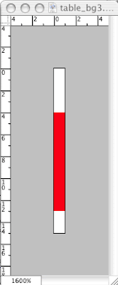
But you are going to modify it, first by changing the image size so that the height is 20 pixels instead of 15. Then you will select the bottom 3 or 4 pixels so that they are red. The rest of it will be white. When complete, it will look like the image to the right:
Make sure and save it with the same name so that when you refresh your pages, the new background image appears. What you will see is a narrow line that extends across the page. Make sure you get the same results in all the pages of the site.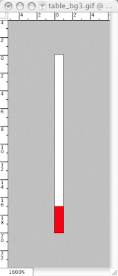
- Content: Now that we have all navigation for the site complete, both the primary navigation—the home, about, contact, galleries links—and the secondary navigation—the links to the various languages in the about pages, we can begin to work with the actual content of the site. Since we have been working on the about part of the site, we'll start with the content for this section. The content for the about section consists almost entirely of text. This text comes in the six different languages as suggested by the secondary navigation: deutsch, english, francais, italiano, portugues, espanol.
LINK This is a .zip file that contains all the text for these pages. For this section, each language will be placed in a separate about page and so each language is saved in a separate file. Remember, you must use all the text.
I will begin with the language file for English. It consists of the following text:
For many types of communication, websites have replaced printed media as the main tool. In other instances, Internet applications have gained an important position next to traditional media. Use of the Internet has reached a stage of maturity, and the same can be said of web design: over the past ten years, it has changed from hesitant and experimental to confident and sophisticated. The increasingly common use of fast-speed Internet allows designers to use larger files, and it has become more common for clients to allocate a budget for professional photography.
The captions in this book provide information about those involved in the design and programming and are coded as follows:
D - design
C - coding
P - production
A - agency
M - designer's contact address
A CD-ROM containing all the pages, arranged in the same order as the book, can be found inside the back cover. It allows you to view each page on your computer witha minimum of loading time, and to access the Internet in order to browse the selected pages.
Submissions & recommendations
Each year, brand new editions of all The Pepin Press' web design books ar published. Should you wish to submit or recommend designs for consideration, please access the submissions form at http://www.webdesignindex.org.
The Pepin Press/Agile Rabbit Editions
For more information about the Pepin Press' many publications on design, fashion, popular culture, visual references and ready-to-use images, please visit http://www.pepinpress.com.
All of this text must be placed within the abt_eng.html file, and I would like to do it so that the text appears in two columns, such as you find in newspapers and magazines. Below you will see an image of how I would like this to finally appear:
 Notice that the text appears indented on the left-hand side, that there are two columns of exactly the same width and separated by a narrow gutter of space between them, and that the text alignment is justified—aligned on both edges. Also notice the text that appears on the right-hand side of the layout. This is actually an image in which the text leads vertically from top-to-bottom instead of right-to-left.
- Text Columns: We will begin by putting the content into the document below the template table. I will go ahead and take the liberty of inserting a few break tags where necessary. In addition, I will also include a small table for the key to the abbreviations. Below is what we end up with:
<table border="1px">
<tr>
<td class="table_bg1" colspan="3">
<img src="images/title.gif"/></td>
</tr>
<tr>
<td class="red1"colspan="3"> </td>
</tr>
<tr>
<td class="col1" style="border-color:#ffffff;
border-style:solid; border-width:1px; border-top:0px;
border-left:0px;">
<a href="index.html">home</a>
</td>
<td class="col2" rowspan="3">
<a href="gal_1.html">galleries</a>
</td>
<td class="col3" rowspan="3"> </td>
</tr>
<tr>
<td class="col1" style="border-color:#ffffff;
border-style:solid; border-width:1px; border-top:0px;
border-left:0px;">
<a href="abt_eng.html">about</a>
</td>
</tr>
<tr>
<td class="col1" style="border-color:#ffffff;
border-style:solid; border-width:1px; border-top:0px;
border-left:0px; border-bottom:0px;">
<a href="con.html">contact</a>
</td>
</tr>
<tr>
<td class="red2" colspan="3">
<table>
<tr>
<td style="width:100px;"> </td>
<td>
<a href="abt_deu.html">deutsch</a>
</td>
<td>english</td>
<td>
<a href="abt_fra.html">francais</a>
</td>
<td>
<a href="abt_ita.html">italiano</a>
</td>
<td>
<a href="abt_por.html">portugues</a>
</td>
<td>
<a href="abt_esp.html">espanol</a>
</td>
</tr>
</table>
</td>
</tr>
<tr>
<td> </td>
<td rowspan="2"> </td>
</tr>
</table>
For many types of communication, websites have replaced printed media as the main tool. In other instances, Internet applications have gained an important position next to traditional media. Use of the Internet has reached a stage of maturity, and the same can be said of web design: over the past ten years, it has changed from hesitant and experimental to confident and sophisticated. The increasingly common use of fast-speed Internet allows designers to use larger files, and it has become more common for clients to allocate a budget for professional photography.
<br/>
<br/>
The captions in this book provide information about those involved in the design and programming and are coded as follows:
<br/>
<br/>
<table>
<tr>
<td>D</td>
<td> </td>
<td>design</td>
</tr>
<tr>
<td>C</td>
<td> </td>
<td>coding</td>
</tr>
<tr>
<td>P</td>
<td> </td>
<td>production</td>
</tr>
<tr>
<td>A</td>
<td> </td>
<td>agency</td>
</tr>
<tr>
<td>M</td>
<td> </td>
<td>designer's contact address</td>
</tr>
</table>
<br/>
A CD-ROM containing all the pages, arranged in the same order as the book, can be found inside the back cover. It allows you to view each page on your computer witha minimum of loading time, and to access the Internet in order to browse the selected pages.
<br/>
<br/>
<br/>
Submissions & recommendations<br/>
Each year, brand new editions of all The Pepin Press' web design books are published. Should you wish to submit or recommend designs for consideration, please access the submissions form at http://www.webdesignindex.org.
<br/>
<br/>
<br/>
The Pepin Press/Agile Rabbit Editions<br/>
For more information about the Pepin Press' many publications on design, fashion, popular culture, visual references and ready-to-use images, please visit http://www.pepinpress.com.
- Divisions: Once we get the text into the document, we need to think about how to divide it up into columns. Our first task is to determine where one column ends and then where the next one begins. If you look at the image above of the finished product, you'll see that I've already decided that the end of the first column would be after the table with the abbreviations. Eventually we are going to style and place these columns of text with CSS, and to help us with this placement we need to employ a new HTML TAG. This tag does very little on its own except to divide the page into sections. It works much like the <p> tag in that it is a block tag and separates each block of text into a discreet unit; however, it is not restricted to only paragraph text. This new tag will work with all content, and it is known as the <div> tag. In order to divide our text into the two separate blocks, or columns, we will use this tag as such: <div> For many types of communication, websites have replaced printed media as the main tool. In other instances, Internet applications have gained an important position next to traditional media. Use of the Internet has reached a stage of maturity, and the same can be said of web design: over the past ten years, it has changed from hesitant and experimental to confident and sophisticated. The increasingly common use of fast-speed Internet allows designers to use larger files, and it has become more common for clients to allocate a budget for professional photography. <br/> <br/> The captions in this book provide information about those involved in the design and programming and are coded as follows: <br/> <br/> <table> <tr> <td>D</td> <td> </td> <td>design</td> </tr> <tr> <td>C</td> <td> </td> <td>coding</td> </tr> <tr> <td>P</td> <td> </td> <td>production</td> </tr> <tr> <td>A</td> <td> </td> <td>agency</td> </tr> <tr> <td>M</td> <td> </td> <td>designer's contact address</td> </tr> </table> </div> <br/> <div> A CD-ROM containing all the pages, arranged in the same order as the book, can be found inside the back cover. It allows you to view each page on your computer witha minimum of loading time, and to access the Internet in order to browse the selected pages. <br/> <br/> <br/> Submissions & recommendations<br/> Each year, brand new editions of all The Pepin Press' web design books are published. Should you wish to submit or recommend designs for consideration, please access the submissions form at http://www.webdesignindex.org. <br/> <br/> <br/> The Pepin Press/Agile Rabbit Editions<br/> For more information about the Pepin Press' many publications on design, fashion, popular culture, visual references and ready-to-use images, please visit http://www.pepinpress.com. </div>
- Placement: The <div> tags alone will not do much to position the blocks of text on the page where we want them. To do that, we must employ CSS, and that is by converting those blocks of text into independent layers and then moving them where we want them. We have not yet done this yet, so what follows is new CSS.
- ID's: To create a layer that we are free to move around the browser window where we wish, we have to employ the series of new type of CSS selector known as an ID. An ID is similar to a class in that it may be applied to almost any block tag. The difference is that it may be used only one time within a document. It is a unique identity given to a single element within a page. An analogy would be a classroom in a school: if everyone had the same name, it would be very difficult for me to run the class. If I had to call on a student named Joshua in a class of students all named Joshua, who would respond to me? Creating IDs for layers is a way to give each layer a special and unique name, which is why we give each ID a unique name and why each may only be applied one time. I am going to make this simple: our first layer will be given the id name layer_1 and our second layer will be given the id name of layer_2. We provide these names within the embedded stylesheet in the head section like so: body {background-color:#ffffff; margin-top:0px; margin-bottom:0px; margin-left:0px; margin-right:0px;} table {width:100%; border-collapse:collapse;} a:link {font-family:Arial Black; font-size:10pt; color:#ffffff; line-height:8pt; text-decoration:none;} a:visited {font-family:Arial Black; font-size:10pt; color:#cccccc; line-height:8pt; text-decoration:none;} a:active {font-family:Arial Black; font-size:10pt; color:#ff0000; line-height:8pt; text-decoration:underline;} a:hover {font-family:Arial Black; font-size:10pt; color:#ff0000; line-height:8pt; text-decoration:underline;} .table_bg1 {background-color:#fc8585; background-image:url("images/table_bg1.gif"); background-repeat:repeat-y;} .red1 {background-color:#fc8585; background-image:url("images/red1.gif"); background-repeat:repeat-x;} .red2 {background-color:#fc8585; background-image:url("images/red2.gif"); background-repeat:repeat-x;} .col1 {width:80px; background-color:#000000; text-align:right;} .col2 {background-color:#000000; text-align:left; vertical-align:middle; padding:20px;} .col3 {width:80px; background-color:#000000; background-image:url("images/logo1.png"); background-repeat:no-repeat} #layer_1 #layer_2 Notice that there are # signs before each ID. Now, the way these IDs are applied, is identical to the way classes are applied within the HTML. Since we want to apply the ID to our layers, we will do so in the <div> tags like so: <div id="layer_1"> The other ID will be applied to the other <div> tag in exactly the same way.
- properties: Following each ID there are also an entire series of properties required to create and position the layer within the browser window. They are as follows:
- width—sets the width of the layer;
- height—sets the height of the layer;
- position—sets the way that the layer will be placed on the stage. In our layout we will position the layers relative to the upper left hand corner of the browser window. The position of everything will therefore be measured by some distance from the left and some distance from the top. This is known as absolute positioning.
- top—sets the position of the layer in a distance from the top edge of the browser window;
- left—sets the position of the layer in a distance from the left hand edge of the browser window;
- z-index—sets the stacking order of the layers, determining which layers are on top or below the other layers;
- style: We will have to add a few more properties so as to style the text as we wish. Some of these are familiar, such as font and color, others will be new to you: #layer_1 {width:275px; height:400px; position:absolute; z-index:1; top:230px; left:85px; font-family:Gill Sans, Gill Sans MT, sans serif; font-size:10pt; color:#000000; text-align:justify; line-height:9pt;} #layer_2 {width:275px; height:400px; position:absolute; z-index:2; top:230px; left:385px; font-family:Gill Sans, Gill Sans MT, sans serif; font-size:10pt; color:#000000; text-align:justify; line-height:9pt;}
- Further Styling: There is one other item of styling I would like to add. If you look at the image below again, notice that there are a couple of lines of text in bold above a couple of the paragraphs (click on image to make it larger):
 You can see that the text is simply bolder than the rest of the paragraph. A simple CSS class may be used to set this up:
.abt_bold
{font-weight:bold;
font-size:9pt;}
The difficult part comes when we try to decide where and how to apply this class. There is no tag before and after that one line of text in which we can insert the class attribute, so we'll have to create a new tag. In HTML, there is another tag, much like the <div> tag, that sets off a small division of text from the rest of the text around it so that it can be different. We cannot use the <div> tag, however, because it is a block tag; and, if you remember, block tags send everything that follow to the next line and adds an additional line of blank space before and after. No, instead we must use an inline tag that does not do this: this tag is known as the <span> tag.
Like the <div> tag, it does not do much on its own other than say to the browser that the text in between the spans is somehow different and set off from the rest of the text; but with CSS added, you can style the text in between any way you wish, such as with the new class that we have created like so:
<div>
For many types of communication, websites have replaced printed media as the main tool. In other instances, Internet applications have gained an important position next to traditional media. Use of the Internet has reached a stage of maturity, and the same can be said of web design: over the past ten years, it has changed from hesitant and experimental to confident and sophisticated. The increasingly common use of fast-speed Internet allows designers to use larger files, and it has become more common for clients to allocate a budget for professional photography.
<br/>
<br/>
The captions in this book provide information about those involved in the design and programming and are coded as follows:
<br/>
<br/>
<table>
<tr>
<td>D</td>
<td> </td>
<td>design</td>
</tr>
<tr>
<td>C</td>
<td> </td>
<td>coding</td>
</tr>
<tr>
<td>P</td>
<td> </td>
<td>production</td>
</tr>
<tr>
<td>A</td>
<td> </td>
<td>agency</td>
</tr>
<tr>
<td>M</td>
<td> </td>
<td>designer's contact address</td>
</tr>
</table>
</div>
<br/>
<div> A CD-ROM containing all the pages, arranged in the same order as the book, can be found inside the back cover. It allows you to view each page on your computer witha minimum of loading time, and to access the Internet in order to browse the selected pages.
<br/>
<br/>
<br/>
<span class="abt_bold">
Submissions & recommendations
</span>
<br/>
Each year, brand new editions of all The Pepin Press' web design books are published. Should you wish to submit or recommend designs for consideration, please access the submissions form at http://www.webdesignindex.org.
<br/>
<br/>
<br/>
<span class="abt_bold">
The Pepin Press/Agile Rabbit Editions
</span>
<br/>
For more information about the Pepin Press' many publications on design, fashion, popular culture, visual references and ready-to-use images, please visit http://www.pepinpress.com.
</div>
We also need to apply that same abt_bold class to the parts of the table that contain the abbreviations, as they are also bold:
<table>
<tr>
<td class="abt_bold">D</td>
<td> </td>
<td>design</td>
</tr>
<tr>
<td class="abt_bold">C</td>
<td> </td>
<td>coding</td>
</tr>
<tr>
<td class="abt_bold">P</td>
<td> </td>
<td>production</td>
</tr>
<tr>
<td class="abt_bold">A</td>
<td> </td>
<td>agency</td>
</tr>
<tr>
<td class="abt_bold">M</td>
<td> </td>
<td>designer's contact address</td>
</tr>
</table>
You can see that the text is simply bolder than the rest of the paragraph. A simple CSS class may be used to set this up:
.abt_bold
{font-weight:bold;
font-size:9pt;}
The difficult part comes when we try to decide where and how to apply this class. There is no tag before and after that one line of text in which we can insert the class attribute, so we'll have to create a new tag. In HTML, there is another tag, much like the <div> tag, that sets off a small division of text from the rest of the text around it so that it can be different. We cannot use the <div> tag, however, because it is a block tag; and, if you remember, block tags send everything that follow to the next line and adds an additional line of blank space before and after. No, instead we must use an inline tag that does not do this: this tag is known as the <span> tag.
Like the <div> tag, it does not do much on its own other than say to the browser that the text in between the spans is somehow different and set off from the rest of the text; but with CSS added, you can style the text in between any way you wish, such as with the new class that we have created like so:
<div>
For many types of communication, websites have replaced printed media as the main tool. In other instances, Internet applications have gained an important position next to traditional media. Use of the Internet has reached a stage of maturity, and the same can be said of web design: over the past ten years, it has changed from hesitant and experimental to confident and sophisticated. The increasingly common use of fast-speed Internet allows designers to use larger files, and it has become more common for clients to allocate a budget for professional photography.
<br/>
<br/>
The captions in this book provide information about those involved in the design and programming and are coded as follows:
<br/>
<br/>
<table>
<tr>
<td>D</td>
<td> </td>
<td>design</td>
</tr>
<tr>
<td>C</td>
<td> </td>
<td>coding</td>
</tr>
<tr>
<td>P</td>
<td> </td>
<td>production</td>
</tr>
<tr>
<td>A</td>
<td> </td>
<td>agency</td>
</tr>
<tr>
<td>M</td>
<td> </td>
<td>designer's contact address</td>
</tr>
</table>
</div>
<br/>
<div> A CD-ROM containing all the pages, arranged in the same order as the book, can be found inside the back cover. It allows you to view each page on your computer witha minimum of loading time, and to access the Internet in order to browse the selected pages.
<br/>
<br/>
<br/>
<span class="abt_bold">
Submissions & recommendations
</span>
<br/>
Each year, brand new editions of all The Pepin Press' web design books are published. Should you wish to submit or recommend designs for consideration, please access the submissions form at http://www.webdesignindex.org.
<br/>
<br/>
<br/>
<span class="abt_bold">
The Pepin Press/Agile Rabbit Editions
</span>
<br/>
For more information about the Pepin Press' many publications on design, fashion, popular culture, visual references and ready-to-use images, please visit http://www.pepinpress.com.
</div>
We also need to apply that same abt_bold class to the parts of the table that contain the abbreviations, as they are also bold:
<table>
<tr>
<td class="abt_bold">D</td>
<td> </td>
<td>design</td>
</tr>
<tr>
<td class="abt_bold">C</td>
<td> </td>
<td>coding</td>
</tr>
<tr>
<td class="abt_bold">P</td>
<td> </td>
<td>production</td>
</tr>
<tr>
<td class="abt_bold">A</td>
<td> </td>
<td>agency</td>
</tr>
<tr>
<td class="abt_bold">M</td>
<td> </td>
<td>designer's contact address</td>
</tr>
</table>
- Image: The very last element of this layout to add is the image that runs vertically against the right-hand margin. It is actually a series of six images each with a different language and which read as such: web design index deutsch, web design index english, web design index francais, web design index italiano, web design index portugues, and web design index espanol. Here are the properties for the image and the example of the one for the abt_eng.html page:
To place this image in the correct location we have to create a third layer in our stylesheet: #layer_3 {width:50px; height:400px; position:absolute; z-index:3; top:230px; right:25px;} Finally, just one last note about the last property, right:25px: we did not place it from the left like the other two layers. Here we placed 25 pixels from the right margin because we want it to always appear against that edge.- width: 25px;
- height: 260px (keep in mind, that the height will be variable depending on the language as some of the languages have more letters and are therefore longer words);
- resolution: 72ppi;
- background color: white
- font: Impact;
- text color: based on your color scheme;

- Text Columns: We will begin by putting the content into the document below the template table. I will go ahead and take the liberty of inserting a few break tags where necessary. In addition, I will also include a small table for the key to the abbreviations. Below is what we end up with:
<table border="1px">
<tr>
<td class="table_bg1" colspan="3">
<img src="images/title.gif"/></td>
</tr>
<tr>
<td class="red1"colspan="3"> </td>
</tr>
<tr>
<td class="col1" style="border-color:#ffffff;
border-style:solid; border-width:1px; border-top:0px;
border-left:0px;">
<a href="index.html">home</a>
</td>
<td class="col2" rowspan="3">
<a href="gal_1.html">galleries</a>
</td>
<td class="col3" rowspan="3"> </td>
</tr>
<tr>
<td class="col1" style="border-color:#ffffff;
border-style:solid; border-width:1px; border-top:0px;
border-left:0px;">
<a href="abt_eng.html">about</a>
</td>
</tr>
<tr>
<td class="col1" style="border-color:#ffffff;
border-style:solid; border-width:1px; border-top:0px;
border-left:0px; border-bottom:0px;">
<a href="con.html">contact</a>
</td>
</tr>
<tr>
<td class="red2" colspan="3">
<table>
<tr>
<td style="width:100px;"> </td>
<td>
<a href="abt_deu.html">deutsch</a>
</td>
<td>english</td>
<td>
<a href="abt_fra.html">francais</a>
</td>
<td>
<a href="abt_ita.html">italiano</a>
</td>
<td>
<a href="abt_por.html">portugues</a>
</td>
<td>
<a href="abt_esp.html">espanol</a>
</td>
</tr>
</table>
</td>
</tr>
<tr>
<td> </td>
<td rowspan="2"> </td>
</tr>
</table>
For many types of communication, websites have replaced printed media as the main tool. In other instances, Internet applications have gained an important position next to traditional media. Use of the Internet has reached a stage of maturity, and the same can be said of web design: over the past ten years, it has changed from hesitant and experimental to confident and sophisticated. The increasingly common use of fast-speed Internet allows designers to use larger files, and it has become more common for clients to allocate a budget for professional photography.
<br/>
<br/>
The captions in this book provide information about those involved in the design and programming and are coded as follows:
<br/>
<br/>
<table>
<tr>
<td>D</td>
<td> </td>
<td>design</td>
</tr>
<tr>
<td>C</td>
<td> </td>
<td>coding</td>
</tr>
<tr>
<td>P</td>
<td> </td>
<td>production</td>
</tr>
<tr>
<td>A</td>
<td> </td>
<td>agency</td>
</tr>
<tr>
<td>M</td>
<td> </td>
<td>designer's contact address</td>
</tr>
</table>
<br/>
A CD-ROM containing all the pages, arranged in the same order as the book, can be found inside the back cover. It allows you to view each page on your computer witha minimum of loading time, and to access the Internet in order to browse the selected pages.
<br/>
<br/>
<br/>
Submissions & recommendations<br/>
Each year, brand new editions of all The Pepin Press' web design books are published. Should you wish to submit or recommend designs for consideration, please access the submissions form at http://www.webdesignindex.org.
<br/>
<br/>
<br/>
The Pepin Press/Agile Rabbit Editions<br/>
For more information about the Pepin Press' many publications on design, fashion, popular culture, visual references and ready-to-use images, please visit http://www.pepinpress.com.


Subscribe to:
Posts (Atom)