- TOPICS:
- Final Project;
- Classwork:
- Review:
- LINK Creating a simple table;
- LINK Modifying the table with Colspan;
- LINK NOTE:change table from class by Adding anonther Rowspan&8212extending another cell downward using the rowspan attribute;
- LINK Adding CSS styles—using an embedded stylesheet for the background color, margins, and links.
- LINK NOTE:change table from class by Adding Links—typing text and hyperlinks temporarily to various external sites.
- Introduce:
- Review:
- HOMEWORK—Final Project, Part I: Starting this week, the homework for each class is part of the final project. Each part will be do one week from the time that it was assigned. This means that the assignment for this week will be due in the next class. Each week I will assign a new part to the website. If you produce these assignments on time each week, you will have accumulated HALF THE POINTS for the final.
The site that we are going to produce accompanies a book that has already been published that highlights some of the best web-designs of last year. It will have four main parts: the home page, six about pages (six versions of the page, each one for a different language), two gallery pages, and a contact page that will include a form for submitting personal information.
- Due in class next week: you must complete the template that we begin in class this week. To do so, you must follow the directions here in this blog.
- Due in class next week:when complete, you must make nine (9) additional copies of this file (copy & paste them) and give them the following names: abt_eng.html, abt_esp.html, abt_deu.html, abt_fra.html, abt_por.html, and abt_ita.html, gal_1.html, gal_2.html, and con.html. For the homework due this week, you need not make any changes to these documents until further instruction in the next class. As a result, all the pages will be exactly alike for the time being.
- Due in class next week: you have to come up with a color scheme that works with a white background. Your color scheme can only consist of two colors, not including black or gray. Your entire site can include only these colors and lighter or darker variations of them. The two colors must be adjacent on the color wheel. Acceptable color pairs are as follows: red and orange, orange and yellow, yellow and green, green and blue, blue and purple, or purple and red. Your colors will also be reflected in the template that we created in class. If you are unhappy with your choice of colors in class, then you may change them as part of your homework.
- QUIZ next week covering CSS. Review the questions from last week's post as well as those from the posts of the following weeks that concern CSS: from week 6 and week 2.
- FINAL PROJECT
- The site that we are going to produce accompanies a book that has already been published that highlights some of the best web-designs of last year. It will have four main parts: the home page, six about pages (six versions of the page, each one for a different language), two gallery pages, and a contact page that will include a form for submitting personal information. Please read the information provided.
- CONTENT REQUIREMENTS:
- Part 1: TEMPLATE & HOME PAGE—this page includes some kind of appropriate imagery of your choice. In this page, you should establish the color scheme that you will use throughout your design for this site. ÔThe LookÕ will be established in part by what we do in class together. The rest is up to you, such as the colors, the fonts, and the particular imagery that you will choose. ***More on the HOME PAGE at the end of this postin.***
- Part 2: ABOUT PAGES—these pages will all look identical. Each will include some imagery of your choice and the text about this book in six (6) different languages (to be furnished at a later time). The main thing you need to know about him right now to start your site is that this is a book about the state-of-the-art web design.
- Part 3: CONTACT PAGE—This page includes an image of the cover of the book, publication information, and book-availability information. It will also have a form for the visitor to submit his/her personal information so as to be a part of the mailing list.
- Part 4: IMAGE GALLERY PAGES—I will provide a series of links to the various sites that you must include in this web-page. You must create thumbnail images of the main page of each site by doing a screen capture. Each thumbnail will also provide a link to the relevant site that will open up in a separate windown when clicked on.
- DESIGN REQUIREMENTS:
- Color Scheme—you must choose a color scheme for your web-site that you can show to me or describe to me. My suggestions are to keep it simple, easy, non-complicated. Keep in mind who your audience is and what the subject matter is.
- Page Layout—you must use CSS and/or tables to lay out all pages in a pleasing way. If you are not certain how to do this, consult our past classes and me for assistance.
- TECHNICAL REQUIREMENTS:
- XHTML—ALL CODE for this site must be typed using STRICT XHTML standards. This means the following:
- that all tags and their attributes must be typed in lower case;
- that all attribute values must be typed in quotes and with units;
- that the DTD for strict XHTML must be typed at the top of the document;
- that all empty tags must be typed with the slash at the end, such as with the <br/> tag;
- that none of the deprecated inline tags are to be used, such as the <font>, <b>, <u>, or <i> tags;
- and, in addition, that the <tbody> and the <thead> tags, as well as the height attribute for the <table> and <td> tags, are not permitted.
- CSS—ALL STYLING must be done using CSS. We have used it extensively in this class, so it is a requirement that this site use CSS for the styling of the page. All three levels of styles may be, and are encouraged to be used. Please consult me if you need additional assistance with this.
- XHTML—ALL CODE for this site must be typed using STRICT XHTML standards. This means the following:
- CONTENT REQUIREMENTS:
- The site that we are going to produce accompanies a book that has already been published that highlights some of the best web-designs of last year. It will have four main parts: the home page, six about pages (six versions of the page, each one for a different language), two gallery pages, and a contact page that will include a form for submitting personal information. Please read the information provided.
- INTRODUCE—As has been the case during 5 of the last 6 weeks, we started last Wednesday's class with a review of a now familiar topic, HTML tables. This was the sixth class that we have worked on tables, and I hope that fact alone indicates their importance to creating effective, and well-designed web-pages. I will not discuss the topic at much length this time, however, and instead will demonstrate examples of code and the resulting tables.
LINK Click here
LINK and here for a more thorough introduction, discussion and demonstration on the topic of tables.
- A Simple Table—We shall begin the class be creating a simple table of seven (7) rows with three (3) cells in each row:
And here is the code for this table (if you wish to view this table, temporarily use the border attribute, which we will eventually delete): <table border="1px"> // below here is row 1 <tr> <td> </td> <td> </td> <td> </td> </tr> // below here is row 2 <tr> <td> </td> <td> </td> <td> </td> </tr> // below here is row 3 <tr> <td> </td> <td> </td> <td> </td> </tr> // below here is row 4 <tr> <td> </td> <td> </td> <td> </td> </tr> // below here is row 5 <tr> <td> </td> <td> </td> <td> </td> </tr> // below here is row 6 <tr> <td> </td> <td> </td> <td> </td> </tr> // below here is row 7 <tr> <td> </td> <td> </td> <td> </td> </tr> </table> - Modifying the Table—Next, I add colspan and rowspan to alter the table. Rows 1, 2, and 6 get a rowspan of three to stretch the cell all the way across the table. Cell 2 of row 7 gets a rowspan of two, and cells 2 and 3 of row 3 get a rowspan of 3 to push the cells downward through three rows:
<table border="1px">
// below here is row 1
<tr>
<td colspan="3"> </td>
<td> </td><td> </td></tr> // below here is row 2 <tr> <td colspan="3"> </td><td> </td><td> </td></tr> // below here is row 3 <tr> <td> </td> <td> </td> <td rowspan="3"> </td> </tr> // below here is row 4 <tr> <td> </td> <td> </td><td> </td></tr> // below here is row 5 <tr> <td> </td> <td> </td><td> </td></tr> // below here is row 6 <tr> <td colspan="3"> </td><td> </td><td> </td></tr> // below here is row 7 <tr> <td> </td> <td rowspan="2"> </td><td> </td></tr> </table> - Changing Table—To complete the table modifications, I want all of you to add another rowspan attribute to cell 2 of row 3. After this, you will also have to delete one cell from rows 4 and 5:
<table border="1px"> // below here is row 1 <tr> <td colspan="3"> </td> </tr> // below here is row 2 <tr> <td colspan="3"> </td> </tr> // below here is row 3 <tr> <td> </td> <td rowspan="3"> </td> <td rowspan="3"> </td> </tr> // below here is row 4 <tr> <td> </td><td> </td></tr> // below here is row 5 <tr> <td> </td><td> </td></tr> // below here is row 6 <tr> <td colspan="3"> </td> </tr> // below here is row 7 <tr> <td> </td> <td rowspan="2"> </td> </tr> </table> - Adding CSS Styles—To begin to design the page, I will add some styling to the page using an embedded stylesheet. Recall, that an embedded stylesheet are CSS styles that are defined within the HEAD SECTION of the document, between a pair of <style> tags. To see further discussion on the topic of CSS, please see last week's posting. Please note, that I am adding styles right now to design the various link states even though we have not put any links into the table yet: <style type="text/css"> <!-- // sets styles for entire document window body {background-color:#ffffff; margin-top:0px; margin-bottom:0px; margin-left:0px; margin-right:0px;} // sets styles for entire table table {width:100%; border-collapse:collapse;} // un-clicked links a:link {font-family:Arial Black; font-size:10pt; color:#ffffff; line-height:8pt; text-decoration:none;} // already clicked links a:visited {font-family:Arial Black; font-size:10pt; color:#cccccc; line-height:8pt; text-decoration:none;} // as links are being clicked a:active {font-family:Arial Black; font-size:10pt; color:#ff0000; line-height:8pt; text-decoration:underline;} // as the mouse passes over links a:hover {font-family:Arial Black; font-size:10pt; color:#ff0000; line-height:8pt; text-decoration:underline;} //--> </style> Since we have styles for links, we are going to turn the text in the table, the words home, about, contact, galleries into links. You can make them link to anything you want for now: <table border="1px"> // below here is row 1 <tr> <td colspan="3"> </td> </tr> // below here is row 2 <tr> <td colspan="3"> </td> </tr> // below here is row 3 <tr> <td><a href="http://www.yahoo.com" target="_blank">home</a></td> <td rowspan="3"><a href="http://www.amazon.com" target="_blank">galleries</a></td> </tr> // below here is row 4 <tr> <td><a href="http://www.google.com" target="_blank">about</a></td> </tr> // below here is row 5 <tr> <td><a href="http://www.msn.com" target="_blank">contact</a></td> </tr> // below here is row 6 <tr> <td colspan="3"> </td> </tr> // below here is row 7 <tr> <td> </td> <td rowspan="2"> </td> </tr> </table>
- Background Images—Using background images has long been a staple of webpages with conventional HTML, despite the fact that the repeating images when done well became little more than wallpaper. However, with the advent of XHTML and CSS, the possibilities of background imagery vastly expanded.
With expanded control over how and where the images were to repeat, if they were to repeat at all, a whole new variety of effects became possible, from custom gradients to a whole variety of vertical and horizontal stripes. Moreover, the CSS programmer could not only now halt the repetition of the images altogether to a single instance, but position the image as well. Furthermore, given the property of background images to repeat, we can create images of minimal dimensions, say only one pixel in width that may then repeat itself horizontally to form a stripe that seems much wider; or, only one pixel in height that then repeats itself vertically in the same fashion.
For our template, we need three background images. Two of them will form custom horizontal stripes, and one will form a custom gradient. To create the horizontal stripes we created two different images, each with the dimensions width: 1px by height: 15px. When viewed in PhotoShop at maximum zoom, this is how those images appear:
 Notice to the right and at the top of each image the rulers. These measure the images in pixels. Use these measurements to create similar images yourself for your template. However, you may use a different color.
For the next image, I wanted to create a gradient that changes from white on the left side to a light red on the right side. As a result, this meant I would have to create a background image that repeated vertically instead of horizontally like the other two. I gave it the following dimensions: width: 700px by height: 1px. I made it a very gradual gradient stretched the full 700 pixels. Because of its peculiar dimensions, both very wide and very narrow, it is impossible to show here.
One note: you may ask yourself what would be the purpose of making such tiny images. Why have an image that is almost unmanageably narrow? The reason is file size. An image that is so narrow will have a much smaller file size and will therefore transfer and load up almost instantaneously in the browser window.
Notice to the right and at the top of each image the rulers. These measure the images in pixels. Use these measurements to create similar images yourself for your template. However, you may use a different color.
For the next image, I wanted to create a gradient that changes from white on the left side to a light red on the right side. As a result, this meant I would have to create a background image that repeated vertically instead of horizontally like the other two. I gave it the following dimensions: width: 700px by height: 1px. I made it a very gradual gradient stretched the full 700 pixels. Because of its peculiar dimensions, both very wide and very narrow, it is impossible to show here.
One note: you may ask yourself what would be the purpose of making such tiny images. Why have an image that is almost unmanageably narrow? The reason is file size. An image that is so narrow will have a much smaller file size and will therefore transfer and load up almost instantaneously in the browser window.
- Images—In addition to background images, we will also need a couple of other images. Together, these will form the title banner of the page, and the first of these has the following dimensions, width: 175px by height: 100px:
The second image we did not create in class, but it will serve as a kind of logo. You will need to create now, and its dimensions are width: 85px by height: 80px:

- CSS Class Selectors—Using a CSS Class is a special way to attach styles to an element in a page of HTML. Let's review, a CSS style definition consists of three (3) basic terms: 1selector {2property: 3value;} The selector determines to which HTML element the style will be applied, as in the following example: h1 {font-size:28pt;} In the above example, the selector is the h1. It selects, or indicates that the following styles are to be applied to all<h1> tags. The following two terms after the selector should be self-explanatory, they are the property of the tag being styled, font-size, and then the particular value or setting for that property, 28pt. Up to now, this is the only sort of style definition we have considered, those that match a particular HTML tag; however, there are selectors which may be used for any tag. This makes the style definition very flexible, as it can be applied as often or seldom as necessary. They are known as classes. and the selector, since it is not given a particular tag name such as body or h1, must have unique names. These names are preceded by a dot (.). .red {color:#ff0000; font-weight:bold;} Once created, the class is applied like all attributes are, and to any tag that is necessary, such as the two examples that follow: <p class="red">hello!</p> <td class="red">cell 1</td> With this understanding, we will create three (3) classes to be applied immediately to our table, one for each row. Later, we may use these classes again if we need to. <style type="text/css"> <!-- body {background-color:#ffffff; margin-top:0px; margin-bottom:0px; margin-left:0px; margin-right:0px;} table {width:100%; border-collapse:collapse;} a:link {font-family:Arial Black; font-size:10pt; color:#ffffff; line-height:8pt; text-decoration:none;} a:visited {font-family:Arial Black; font-size:10pt; color:#cccccc; line-height:8pt; text-decoration:none;} a:active {font-family:Arial Black; font-size:10pt; color:#ff0000; line-height:8pt; text-decoration:underline;} a:hover {font-family:Arial Black; font-size:10pt; color:#ff0000; line-height:8pt; text-decoration:underline;} // class number 1 --sets a background image that repeats vertically .table_bg1 {background-color:#fc8585; background-image:url("images/table_bg1.gif"); background-repeat:repeat-y;} // class number 2 --sets a background image that repeats horizontally .table_bg2 {background-color:#fc8585; background-image:url("images/table_bg2.gif"); background-repeat:repeat-x;} // class number 3 --sets a background image that repeats horizontally .table_bg3 {background-color:#fc8585; background-image:url("images/table_bg3.gif"); background-repeat:repeat-x;} //--> </style> These styles can then be applied to the table cells along with the title image: <table
border="1px"> // below here is row 1 <tr> <td class="table_bg1" colspan="3"><img src="images/title.gif"/></td> </tr> // below here is row 2 <tr> <td class="table_bg2"colspan="3"> </td> </tr> // below here is row 3 <tr> <td><a href="http://www.yahoo.com" target="_blank">home</a></td> <td rowspan="3"><a href="http://www.amazon.com" target="_blank">galleries</a></td> <td rowspan="3"></td> </tr> // below here is row 4 <tr> <td><a href="http://www.google.com" target="_blank">about</a></td> </tr> // below here is row 5 <tr> <td><a href="http://www.msn.com" target="_blank">contact</a></td> </tr> // below here is row 6 <tr> <td class="table_bg3" colspan="3"> </td> </tr> // below here is row 7 <tr> <td> </td> <td rowspan="2"> </td> </tr> </table> This code produces the following results (If you mouse over on the left side of the white area in YOUR own example, not here, you will see the links appear):
- More Classes—In order to get the template to appear exactly the way we wish, we need to change the widths of columns in the middle section of the table (which is now the white area between the red stripes that contains the links). The first column needs to remain constant, no matter what the size of the browser window is since it contains most of the navigation for the site. The last column, also, needs to remain constant since it is going to contain the logo. I would like this column to be the same width as the image it is going to contain, 85px. I would also like the first column to be that width as it is narrow and seems a reasonable width for a column that will only contain links, nothing else. Later, we can decide to change these widths if we decide they are not exacty what we want. In addition, we need to set the background-color for these cells and columns, which will be black. It may seem then, we need only one class, two at most, since all the cells in this middle section will be the same color, black. However, we really need three, and they need to do the following:
- new class 1: This class will be for the first column and it needs to make the background black, set the width to 80 pixels, and align the text to the right;
- new class 2: This class will be for the second column and it also needs to make the background black, but it does not need to set a width, and it needs to align the text to the center and vertically in the middle (as this cell has a rowspan of 3 and extends downward across 3 rows);
- new class 3: This class will be for the third column and it, like the other two, needs to make the background black, needs to set the width to 80 pixels, like the first, but does not need to set an alignment as it will not have any text. Unlike the others, however, it will require a background image, the logo that we created. Unlike the other background images that we created, this one will not repeat at all in either the X or Y directions.
- Inline Styles—The last thing that I would like to add to this template for our website are borders; however, I only want to add borders very selectively. I do NOT wish to have borders throughout the table. I only want borders to appear between the links and no where else within the table. This makes things a little tricky, so I have to be very clear in my own mind where the borders need to be:
- We need a border below the first link on the bottom of the cell;
- We need a border below the second link on the bottom of the cell;
- We do NOT need a border below the third, however;
- We need a border on the right hand side of the first link between the first and second columns;
- We need a border on the right hand side of the second link between the first and second columns;
- We need a border on the right hand side of the third link between the first and second columns;
- We do NOT need borders anywhere else;

- Images—In addition to background images, we will also need a couple of other images. Together, these will form the title banner of the page, and the first of these has the following dimensions, width: 175px by height: 100px:
- A Simple Table—We shall begin the class be creating a simple table of seven (7) rows with three (3) cells in each row:
Friday, March 28, 2008
Spring 2008
week 10: 03/26
Hi everybody,
What we did in class this week was the beginning of the final project. Each week we will produce a part of the project, which you will complete as homework. Then, and at the end of the next four weeks, you should have most of the project completed.
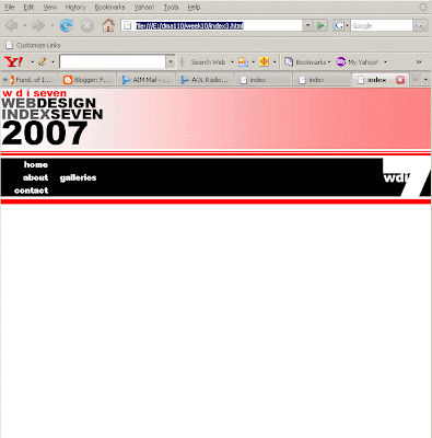
For this week's class we created the template that we will use for all the pages of the project. Like the mid-term, each page will begin with this template so that all pages will look identical. This will make certain that the most important information, as well as the links, remain in the same place on every page.
Carter-


Friday, March 21, 2008
Spring 2008
week 9: 03/19
Hi everybody,
I was very happy with how things went in class this past Wednesday. I know that that particular class is always a lot to swallow all in one night, but there really is no other way of doing it. Nonetheless, you all seemed to pick it up rather well. We will be creating something like this for the final project.
In fact, everything we do in class from here on out, all the classwork and all the homework, will be geared to producing your final project.
From this week until the end of the term, everything I assign as homework, you will be able to use directly in the project you turn into me the last day of class. This week's homework is PART I of your final project. Therefore, if you do not do your homework, you will actually lose points out of your final project.
This final project consists of a small web-site of six (6) pages of content. This does not mean six html files, no, but six pages OF CONTENT. There may be other files that you will produce that do not contain any content (or very little), such as the frameset files I introduced in this week's class, or the navigation file with the links—the .html file that contains the menu navigation does not officially count as a page of your site even if the links are technically content. Another example of a document that will not count as content that we produced this week is the external stylesheet.
Carter-
Search Engines: Search engines are unable to contend with frames and framesets well. Most are not able to locate them at all, but even the most advanced of them will have difficulties. In fact, the algorithms of many search engines were not written to locate and index frames and framestes simply because they are so problematic.
To understand the reason for this, you must remember that search engines find individual pages with the content relative to the terms of a search; but how would a search engine locate a page without any content whatsoever? The answer is that hey can't, so they don't try. To understand why this is a problem, you have to keep in mind that frameset documents do not contain content! The only possibility is to show the individual pages of content as isolated and independent of their organizing frameset. Therefore, most search listings to framed pages result in broken framesets.
These issues for framesets with regard to search engines will not change for a couple reasons:
Bookmarks & Favorites: When users bookmark a framed page they may discover that when they return that the bookmark takes them to a different page.
Miscellaneous:
Frames may reduce the amount of space on the page for content.
The URL in the address bar remains the same throughout a visit to any particular site regardless of which page the user views. For most, this is undesirable as it may make web browsing disorienting.
Printing intact framesets is impossible.
Many designers and technicians are vehemently against frames. Many reviewers and commentators consider them amateurish and they will tell you.
/ol>
Alternative—IFrames: There is one alternative to ordinary frames and framesets, and so is worth mentioning here—IFrames. I won't go into the details here this week, but IFrames are fairly well supported, can achieve most of the same effects as frames, and have fewer problems. Worth a try if you really need frames-type functionality. I will cover IFrames briefly in another class.
As a way of conclusion I will state that the disadvantages of using framesets outweigh the advantages. In my opinion, you should be very wary about using frames, and only consider them if there really is no other option.
- TOPICS:
- HOMEWORK—Final Project, Part I: Starting this week, the homework for each class is part of the final project. Each part will be do one week from the time that it was assigned. This means that the assignment for this week will be due in the next class. Each week I will assign a new part to the website. If you produce these assignments on time each week, you will have accumulated HALF THE POINTS for the final.
The site that we are going to produce accompanies a book that has already been published that highlights some of the best web-designs of last year. It will have four main parts: the home page, an about page, two gallery pages, and a mailing list page with a form for submitting personal information.
- Due in class next week: you have to come up with a color scheme that works with a white background. Your color scheme can only consist of two colors, not including black or gray. Your entire site can include only these colors and lighter or darker variations of them.
- Due in class next week: you will have to produce in PhotoShop and/or Illustrator what is known as a mockup of the layout idea for the site. If you need to look at other websites for ideas, please do so. Other sites are good sources of inspiration. DO NOT begin coding the website as I have to give you more information in class next week. All you need to do for next week regarding this site is what is stated above.
- QUIZ next week covering CSS. Review the questions from last week's post as well as those from the posts of the following weeks that concern CSS: from week 6 and week 2.
- FINAL PROJECT
- DESIGN REQUIREMENTS:
- Color Scheme—you must choose a color scheme for your web-site that you can show to me or describe to me. My suggestions are to keep it simple, easy, non-complicated. Keep in mind who your audience is and what the subject matter is. There is a 2-color limit.
- Page Layout—centering all your content in the page does not make for page layout. If you this, you will get a poor grade for your final project. All pages must use CSS and/or tables to lay them out in a pleasing way. If you are not certain how to do this, consult our past classes and me for assistance.
- TECHNICAL REQUIREMENTS:
- XHTML—ALL CODE for this site must be typed using STRICT XHTML standards. This means the following:
- that all tags and their attributes must be typed in lower case;
- that all attribute values must be typed in quotes and with units;
- that the DTD for strict XHTML must be typed at the top of the document;
- that all empty tags must be typed with the slash at the end, such as with the <br/> tag;
- that none of the deprecated inline tags are to be used, such as the <font>, <b>, <u>, or <i> tags;
- and, in addition, that the <tbody> and the <thead> tags, as well as the height attribute for the <table> and <td> tags, are not permitted.
- CSS—ALL STYLING must be done using CSS. We have used it extensively in this class, so it is a requirement that this site use CSS for the styling of the page. All three levels of styles may be, and are encouraged to be used. Please consult me if you need additional assistance with this.
- XHTML—ALL CODE for this site must be typed using STRICT XHTML standards. This means the following:
- QUESTIONS—Here are some questions to help guide you through this weeks' material:
- What is the one type of XHTML document that does not have a body section? In place of the body section, what is used? What is the purpose of this sort of document?
- What are four attributes that may be used with a <frameset> tag?
- What are four attributes that may be used with the <frame/> tag?
- Of the three kinds of tags—inline, block, empty—which sort is the <frame/> tag?
- What kind of content is contained within a frameset document? Why?
- If you wish to create a webpage with a two-frame frameset, how many documents do you need to create at a minimum? Why?
- Which attribute for the <frameset> tag causes the frames to divide up the browser window horizontally?
- What is the purpose of naming frames?
- INTRODUCE: Framesets—In this week's class we saw the introduction of the issue of one of the more advanced issues and final of HTML that we will cover in this term, frames and framesets. Essentially, a frameset is a series of documents, held together by a frame, that work together to divide the browser window into multiple browser windows, much like a window frame divides the space of the window into several panes. Similarly, each pane, or frame of a frameset may contain and hold a different web-document or web-site.
There is virtually no limit to the number of frames that may be contained within a frameset, as it depends on how many are programmed into the frameset document; however, design and function are first and foremost the constraints that should guide you when attempting to determine how many frames are necessary and practical.
- The Frameset Documents—As mentioned, the guiding document is the frameset document; which, as mentioned, works much as a window frame. I do not mean the panes of glass, but rather the frame that binds the panes together. As it is merely a frame, this document, the frameset document, has no <body> tag. Furthermore, as it has no body section, it therefore has no content. Instead, replacing the body section, frameset documents have a frameset section that sets up the parameters of the frameset, exactly how many frames and what their orientation will be. Therefore, a frameset document starts out pretty much the same as an ordinary HTML document, but diverges with the second section:
<html>
<head>
<title>frameset document</title>
</head>
<frameset>
</frameset>
</html>
Above, you can see that the frameset section, instead of the body section, follows the head section instead in the document. This is where the browser window is carved up into frames. For horizontal frames, the attribute rows is used; and for vertical frames, the attribute cols is used.
<frameset cols="150px, *">
In the above frameset tag, a two-frame frameset is created, where the first frame (the first column) is 150 pixels wide, and the second one, indicated by the asterisk, is whatever remains of the open browser window.
- The <frame/> tag—To complete the frameset, however, there must be a <frame/> tag for each frame. Since there are two measurements (150, *) in the above setup there must also be two frame tags. <html> <head> <title>frameset document</title> </head> <frameset cols="150px, *"> <frame/> <frame/> </frameset> </html> The <frame/> tags are empty tags, but there are nonetheless still two tags, one for each frame in the frameset. Furthermore, each must be accompanied with the src attribute in order to place another document within the frameset: <frame src="nav.html"/> <frame src="p1.html"/> In this example, Notice that the second src attribute is followed by what we will consider our first primary content file p1.html (see below). Also, above that following the first src attribute, another document named nav.html will appear in the first frame of the frameset. This will be a file that we compose solely of links. To remove the borders between frames, the <frameset> tag require two additional attributes and values: frameborder="no" border="0px". You should notice above, that in addition to the attributes regulating the border, and indicating the source files for the frames, that there is a name attribute for each frame. There is an important reason for giving names to frames, particularly the frame where the primary content of the website will go. Primary content here refers to those documents that contain most of the content of the site, the images and text, as opposed to the document that contains the navigation, or the frameset document itself. This is so that the frame can be targeted. This can be done with links, for example, so that linked documents can be targeted to open up into a particular frame.
- Primary Content—We will return to the issue of linking and targeting windows in a moment. Let us instead create all the other necessary files to complete the frameset. First, comes the primary content documents. Once again, these are files that contain the "pages" of the site, those files that contain the actual stuff that makes up the site, the information that the site is there to dispense, all the text, the images, and anything else that the site must tell the casual user. In class, we created three of these and named them p1.html, p2.html, and p3.html. Since we weren't creating a real website, these pages were just dummy pages filled with dummy content, but we included text formatted by the <h1> tag, the <h2> tag, and the <p> tag. Below is an example of what one of those pages that we created in class might have looked like. It is a very minimal page: <!DOCTYPE html PUBLIC "-//W3C//DTD XHTML 1.0 Strict//EN" "http://www.w3.org/TR/xhtml1/DTD/xhtml1-strict.dtd"> <html> <head> <title>p1.html: primary content document 1</title> </head> <body> <h1>A Primary Heading</h1> <h2>A Sub-heading</h2> <p>Finally, in this last line, you get a very brief and simple paragraph. If we are going to follow the rules of proper grammar, then this paragraph must have at least three sentences. Therefore, if you count them after reading this, you will discover that this paragraph is indeed grammatically correct.</p> </body> </html> Once saved, this is how the file should appear in a browser:

- Secondary Content—This sort of content includes all those files that have content that fill a purely functional role. Examples of this would be links and navigation. While still technically content in that they are usually words or images or some other visual element, they do not dispense any particular information. Instead they are purely mechanical devices that connect disparate areas of content within a single file or among various files. In any well-made site composed of a frameset, there must be at least one frame that serves the purely functional role of navigation. This frame will contain all the primary navigation of the site and allows the visitor to move easily from page to page. The advantage to centralizing most of the navigation into one frame in this way is that this frame need not ever change. It remains visible in a steady location no matter which page of the site the user is viewing. The most common location of this frame is horizontally across the top of the browser window, or vertically along the left side. In the example we worked with in class on Wednesday, we created a navigation file in which the links appeared vertically along the left-hand side of the screen. Below is the code for that file which we named nav.html. Notice that we have linked to the three primary content documents: <!DOCTYPE html PUBLIC "-//W3C//DTD XHTML 1.0 Strict//EN" "http://www.w3.org/TR/xhtml1/DTD/xhtml1-strict.dtd"> <html> <head> <title>nav.html: secondary content document 1</title> </head> <body> <br/> <br/> <br/> <a href="p1.html">one</a> <br/> <br/> <a href="p2.html">two</a> <br/> <br/> <a href="p3.html">three</a> </body> </html> This is a very simple file consisting entirely of those links, so the window will be nearly blank. Below is how it will appear in a browser:
 When we put all the files together inside the frameset document, the following image of it is what we get:

- Targeting Windows—In past classes, we have created links that opened up completely new browser windows or new tabs when clicked. The way we did this was by adding another attribute to the tag that creates links, the <a> tag. This attribute is target, and it points the new document to be opened up into a browser window other than the current one, either another window that is already open, or a blank window that has not yet been opened. To open up into a new browser window, the value for the attribute is "_blank" . Below is an example of how this attribute might be used: <a href="something.html" target="_blank">click here</a> This same attribute is used when you use frameset documents in order to have a link open up a document in a new frame. For example, if you click on a link in one frame, you may want it to open up into a different frame. To do this, you simply target the name of a particular frame. Recall, therefore, when we named our frames in the frameset document: <html> <head> <title>frameset document</title> </head> <frameset cols="150px, *"> <frame src="nav.html" name="nav" noresize="noresize"/> <frame src="p1.html" name="content" noresize="noresize"/> </frameset> </html> Given that we know that the narrow first frame is named nav and the larger second frame is named content, it would be easy to point to a particular frame using the target attribute. Therefore, in the navigation document, the links would look like so: <!DOCTYPE html PUBLIC "-//W3C//DTD XHTML 1.0 Strict//EN" "http://www.w3.org/TR/xhtml1/DTD/xhtml1-strict.dtd"> <html> <head> <title>nav.html: secondary content document 1</title> </head> <body> <br/> <br/> <br/> <a href="p1.html" target="content";>one</a> <br/> <br/> <a href="p2.html" target="content">two</a> <br/> <br/> <a href="p3.html" target="content">three</a> </body> </html>
- Framesets: Advantages & Disadvantages—Frames and framesets are but one tool used to achieve certain results and resolve some difficult problems when designing a website. They certainly have some unmatched advantages, but they also result in some serious disadvantages. There are many pros and cons on the issue of frames and framesets, but it is my opinion that in most cases, they present more problems than they are worth. Other people may have differing opinions; however, I would say that the consensus on this subject is that the use framesets are to be avoided.
- Advantages: The most advantageous feature, and where their superiority is unmatched by other techniques, is their capability to hold one part of the page in place and static while allowing for the possibility of changing another part. For this reason frames are often used for navigation menus which for practical purposes should be kept in the same place throughout the site. Frames can also help reduce file size and therefore alleviate the burden on bandwidth and server load as identical content need not be loaded each time a user vists a different page within the site.
- Disadvantages:
- Disfunctional Framesets: A frameset breaks when its frames do not load or display properly; when, for example, a navigation frame, for whatever reason, is missing or one of the frames takes up more space than it should. A broken frameset makes a website inaccessible and worthless.
Framesets become non-functional fairly frequently because of several because of several commonly known reasons:
- Visitors link to a page intended as only a part of a frameset by way of a search engine like Google instead of a frameset.
- The user's web browser malfunctions and temporarily has problems parsing frameset information, which occurs frequently with Internet Explorer in particular.
- Disfunctional Framesets: A frameset breaks when its frames do not load or display properly; when, for example, a navigation frame, for whatever reason, is missing or one of the frames takes up more space than it should. A broken frameset makes a website inaccessible and worthless.
Framesets become non-functional fairly frequently because of several because of several commonly known reasons:
- Some browsers do not support frames.
- A difficult to locate typing error in your code may break the frameset.
- The <frame/> tag—To complete the frameset, however, there must be a <frame/> tag for each frame. Since there are two measurements (150, *) in the above setup there must also be two frame tags. <html> <head> <title>frameset document</title> </head> <frameset cols="150px, *"> <frame/> <frame/> </frameset> </html> The <frame/> tags are empty tags, but there are nonetheless still two tags, one for each frame in the frameset. Furthermore, each must be accompanied with the src attribute in order to place another document within the frameset: <frame src="nav.html"/> <frame src="p1.html"/> In this example, Notice that the second src attribute is followed by what we will consider our first primary content file p1.html (see below). Also, above that following the first src attribute, another document named nav.html will appear in the first frame of the frameset. This will be a file that we compose solely of links. To remove the borders between frames, the <frameset> tag require two additional attributes and values: frameborder="no" border="0px". You should notice above, that in addition to the attributes regulating the border, and indicating the source files for the frames, that there is a name attribute for each frame. There is an important reason for giving names to frames, particularly the frame where the primary content of the website will go. Primary content here refers to those documents that contain most of the content of the site, the images and text, as opposed to the document that contains the navigation, or the frameset document itself. This is so that the frame can be targeted. This can be done with links, for example, so that linked documents can be targeted to open up into a particular frame.
- For some of these errors, you may think that including in your code a link intended to reload the frameset will resolve these problems, such as "click here to restore the broken frameset"; however, most users will not notice or ignore such suggestions or warnings, and the large majority of them will have no idea to what it refers.
- The Frameset Documents—As mentioned, the guiding document is the frameset document; which, as mentioned, works much as a window frame. I do not mean the panes of glass, but rather the frame that binds the panes together. As it is merely a frame, this document, the frameset document, has no <body> tag. Furthermore, as it has no body section, it therefore has no content. Instead, replacing the body section, frameset documents have a frameset section that sets up the parameters of the frameset, exactly how many frames and what their orientation will be. Therefore, a frameset document starts out pretty much the same as an ordinary HTML document, but diverges with the second section:
<html>
<head>
<title>frameset document</title>
</head>
<frameset>
</frameset>
</html>
Above, you can see that the frameset section, instead of the body section, follows the head section instead in the document. This is where the browser window is carved up into frames. For horizontal frames, the attribute rows is used; and for vertical frames, the attribute cols is used.
<frameset cols="150px, *">
In the above frameset tag, a two-frame frameset is created, where the first frame (the first column) is 150 pixels wide, and the second one, indicated by the asterisk, is whatever remains of the open browser window.


- The root of the problem is with frames themselves, not the search engines, so there is little hope that search engines will "get better" at dealing with them.
- Frames are out of fashion, especially amongst the types of site the search engines are trying to target, so the problems associated with frames are not a priority for search engines.
- Back buttons on web browers often do not work properly with framesets.
Friday, March 14, 2008
Spring 2008
week 8: 03/12
Hi everybody,
I want to make a point about the second half of the term: if you think you have been doing poorly, and if you discover next week when I give you all your grades back on your midterm that you did do poorly, or not as well as you'd wanted, then you can remember that at least you have another 5 weeks of class. Remember also that all of the remaining assignments, the homework I assign each week, the final exam and the final project can help bring up your grades. Homework is as important as the midterm, and it can help you on the exams and the projects. Starting with the next week, each homework will be building a different part of your final project.
This is the beginning of the 2nd part of the term and during this part of the term we will be focusing on CSS and using it in each of the remaining classes. Therefore, I emphasized its importance by devoting half of this week's class and this to it and and yet another class and posting to tables. We will continue to work with tables as they are an indispensable part of laying out webpages together with CSS to help us layout, design, and style our pages.
Believe it or not, our next class will be our ninth. That means there will only be five more weeks until the last class. So, catch a brief rest here and there when you can. There will be plenty of work to do over the next several weeks in this class, and I've no doubt in your other classes as well. Don't put things off.
Next week, I will be assigning the first part of the final project, so you should start working as soon as I assign it if you want to do well and complete it in time.
Carter-
- TOPICS:
- More with Tables:
- Introducing Cascading Style Sheets:
- HOMEWORK—
—QUESTIONS: answer the questions below as your homework.
Type the questions and answers in an HTML document for the next class.
—QUIZ over CSS a week from next Wednesday (a week from the next class—3/29/08); - QUESTIONS—Here are some questions to help guide you through this weeks' material:
- What does the abbreviation CSS stand for?
- What does CSS do?
- What is a style definition?
- What are the three parts of a style definition?
- Which two parts of the style definition fall between the curly brackets?
- What does a selector do?
- May there be more than one property defined in a style definition? If so, what is the limit on how many properties may be defined in any given style definition?
- What attributes must be used with the <style> tags in order to place a CSS Stylesheet into a web page?
- In which section must the <style> be typed into a web page?
- What is one advantage to an embedded stylesheet and therefore typing all the styles at the top of the page together in the head section?
- What are the three types of CSS styles?
- Where are the various types of CSS styles typed?
- What are the four link states as they are defined by CSS, what do they refer to, and what order must they be typed?
- REVIEW:We have worked with HTML Tables now for a couple weeks (almost five weeks now if you count since our last class), and we have dealt primarily how to create and manipulate our tables: what are the tags that go into making them, how to begin to set them up by row and then by cell, how to change the way they look with the border and background, and how to create larger cells both horizontally and vertically. In our last class, we continued with this exploration of tables by pushing further the complexity of the tables: we increased our investigation of two attributes for the <td> tag, rowspan and colspan. These attributes extend the ability of the <td> tag to become larger both horizontally and vertically, to take up the space of more than one cell, and perhaps to occupy the space of an entire row.
This week, therefore, we learn no new HTML tags, but instead simply deepen our knowledge and understanding of what has already been covered on tables. Next week we will look even further into the capabilities of HTML Tables. This way, hopefully, by spending five or six (6) entire classes on the subject of tables, you will begin to understand their importance in creating sophisticated designs for your web-pages.
But first, let us review what we went over in previous classes on tables:
- Basic tags used in the creation of HTML tables: <html>, <table>, <title>, <tr> >, and <td>.
- Tables are created by the <table> tag, another example of a block level tag; however, as mentioned above, they are a special case, not only for what they can create in a web-page, but primarily for the many other varied tasks they may perform.
First and foremost, tables refer exactly to what the term suggests: they create tables for data, such as in accounting ledgers. By appearance, the table tag creates a grid of rectangular ‘cells’ where some kind of data or information is placed. These tables are organized by column (vertical divisions up and down the height of the page) and by row (horizontal divisions across the width of the page). They are built in HTML, however, one row at a time.
Here are a series of attributes that may be used with the <table> tag:
- width—changes the width of the table with units in pixels or as a percentage of the browser window.
- border—adds a border around the table and between the various rows and cells with a thickness of the designer’s choice with units in pixels. To be used sparingly as it tends to be over-used and used badly.
- bgcolor—the same attribute used in the <body> tag. In this case, it adds a background color only the area of the table itself. The particular color must be indicated in the hexadecimal color code.
- bordercolor—much like the bgcolor attribute in that it uses the hexadecimal color code, but in this case it only colors the borders.
- cellspacing—regulates the spacing between the various cells in the table.
- cellpadding—regulates the spacing around the edge against the border within each cell of the table.
- Table rows are created row-by-row using the <tr> tag, the table row tag. Each of these tags marks the beginning and ending of a single row in a table. For each row, one pair of these tags is necessary, one marking the start of the row, and one the end of it. Each row is composed of one or more cells.
- Table cells are the individual rectangles that make up the grid of the table. Each horizontal row consists of at least one rectangular cell where text or some kind of image may be placed. Typed between a pair of <tr> tags, each pair of <td> (for table data) tags creates one cell. For each additional cell, there must be another pair of <td> tags, and for each of these cells there must be some kind of content between the tags, or the cell will not register and therefore not appear in the browser window. This content may be in the form of an image, a link, some text, or even a blank space created by the series of characters, . Here are a series of attributes, which may be used with the <td> tag:
- width—changes the width of the cell and all of the cells below it in the same column with units in pixels or as a percentage of the table width.
- bgcolor—the same attribute used in the <body> tag. In this case, it adds a background color only the area of the table itself. The particular color must be indicated in the hexadecimal color code.
- align—sets the horizontal alignment for the content within the particular cell. There are three (3) possible values for this attribute: right, left, and center.
- valign—sets the vertical alignment for the content within the particular cell. Here, also, there are three (3) possible values: top, bottom, and middle.
- colspan—allows the particular cell to extend, or span, horizontally across more than one column of cells.
- rowspan—allows the particular cell to extend, or span, vertically downward across more than one row of cells.
- Table cells are the individual rectangles that make up the grid of the table. Each horizontal row consists of at least one rectangular cell where text or some kind of image may be placed. Typed between a pair of <tr> tags, each pair of <td> (for table data) tags creates one cell. For each additional cell, there must be another pair of <td> tags, and for each of these cells there must be some kind of content between the tags, or the cell will not register and therefore not appear in the browser window. This content may be in the form of an image, a link, some text, or even a blank space created by the series of characters, . Here are a series of attributes, which may be used with the <td> tag:
- INTRODUCE: In our last class we continued working with Tables in HTML, but focused on two attributes (rowspan and colspan) which go with the <td>tag to extend a cell downward or upward. Here is how it works:
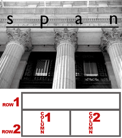
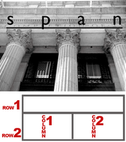 horizontal (side to side) arrays of table cells are considered rows, and vertical (up and down) arrays of cells are considered columns. And just as columns in buildings are also vertical, they support a horizontal beam which spans across several columns. Just look at the front of the NYC Post Office across the street. It has columns also.
- Colspan: In the picture above and to the right you can see that there are 3 columns which support the beam above them, where the word span is written. The table below this image is similar: there are two rows, one above the other, but the one on the top spans across the two columns in the row below. In HTML we would say that the big cell of the top row has a colspan of 2 because it spans the 2 columns below it.
In the table below, there are three (4) rows (horizontal divisions) and four (4) columns (vertical divisions):
Notice that the center row extends all the way across all four of the columns. This is because it has a greater colspan than the other cells of the table, <td colspan="4"> </td>. That one row, the one in the middle, only has one cell in the entire row. The other two rows, the one above and the one below, each have four (4) cells, and the code for this table looks like so: <table width="100%" border="1px" cellspacing="0px;" cellpadding="0px"> <tr> <td> </td> <td> </td> <td> </td> <td> </td> </tr> <tr> <td colspan="4"> </td> </tr> <tr> <td> </td> <td> </td> <td> </td> <td> </td> </tr> </table> If for whatever reason, you forgot that the second row gets only one cell, and instead put four (4) cells like all the other rows, your code would be like what follows--notice that row 2 has four cells like all the others, even though the first cell in that row has a rowspan of 4: <table width="100%" border="1px" cellspacing="0px;" cellpadding="0px"> <tr> <td> </td> <td> </td> <td> </td> <td> </td> </tr> <tr> <td colspan="4"> </td> <td> </td> <td> </td> <td> </td> </tr> <tr> <td> </td> <td> </td> <td> </td> <td> </td> </tr> </table> The previous code produces a table like the one below. Look how the second row has some extra cells hanging off the end:
All you need to do to solve that problem is simply delete those extra cells. In this case we have three extra cells hanging off the end, so we just need to delete those three in the second row and then it will look as it should. In the next example, we have a similar problem, but in the opposite direction: instead of extending a cell horizontally as we have in the previous example, we can also extend a cell vertically as we will see next. - Rowspan: In the following example, you will see another table; however, instead of a cell getting larger across the table, it gets larger down the table. This cell also has an increased span, but we call it rowspan instead of colspan. That is because the cell grows larger downward from one row to another. Remember, rows are like horizontal layers. In the following example, the first cell extends downward to the bottom of the table, so it spans more than one row. It therefore has an increased rowspan, a rowspan of 4:
The code for this table is as follows, you should take note that in this case, only the first row has four (4) cells. All of the other rows have only three cells. <table width="100%" border="1px" cellspacing="0px;" cellpadding="0px"> <tr> <td rowspan="4"> </td> <td> </td> <td> </td> <td> </td> </tr> <tr> <td> </td> <td> </td> <td> </td> </tr> <tr> <td> </td> <td> </td> <td> </td> </tr> <tr> <td> </td> <td> </td> <td> </td> </tr> </table> And that makes sense if we examine the table. The first cell of the table, the big one, starts in the upper-righthand corner. This is the first cell of the first row. All we did to make it bigger, to make it go from top to bottom of the table, was use the rowspan attribute. If we took that out, then we see that we're missing a cell in each of the other rows. What happens, then, when we increase the rowspan is that the cell pushes downward, moving all the cells below it to the right. If we had forgotten to remove one of the cells in rows 2, 3, and 4, then we would have the table as follows:
The code for this mistake is below: <table width="100%" border="1px" cellspacing="0px;" cellpadding="0px"> <tr> <td rowspan="4"> </td> <td> </td> <td> </td> <td> </td> </tr> <tr> <td> </td> <td> </td> <td> </td> <td> </td> </tr> <tr> <td> </td> <td> </td> <td> </td> <td> </td> </tr> <tr> <td> </td> <td> </td> <td> </td> <td> </td> </tr> </table> Like the colspan example, this can be remedied simply by removing one cell from rows 2, 3, and 4. - Colspan & Rowspan:These two attributes may also be used together instead of just one or the other. This way, a table cell can be expanded both horizontally and vertically, both across the table and down the table. The table below is an example of this:
and below is the code for such a table: <table width="100%" border="1px" cellspacing="0px;" cellpadding="0px"> <tr> <td> </td> <td> </td> <td> </td> <td> </td> </tr> <tr> <td> </td> <td colspan="2" rowspan="2"> </td> <td> </td> </tr> <tr> <td> </td> <td> </td> </tr> <tr> <td> </td> <td> </td> <td> </td> <td> </td> </tr> </table> Notice above, that there are only three (3) cells in row 2, and only two (2) cells in row 3. Row 2 is the row that contains the cell with the rowspan and colspan attributes. If it, and the row below it, row 3, had the same number of cells as the other two rows, rows 1 and 4, here is what the table would look like:
Notice here that this time there are three extra cells, one in the second row, and two in the third row. As for the other examples, the solution to this mistake is simply to delete the extra cells. Here is the code for the previous table with the unnecessary cells shown in red: <table width="100%" border="1px" cellspacing="0px;" cellpadding="0px"> <tr> <td> </td> <td> </td> <td> </td> <td> </td> </tr> <tr> <td> </td> <td colspan="2" rowspan="2"> </td> <td> </td> <td> </td> </tr> <tr> <td> </td> <td> </td> <td> </td> <td> </td> </tr> <tr> <td> </td> <td> </td> <td> </td> <td> </td> </tr> </table> - Complex usage of Colspan & Rowspan:As mentioned previously, tables in web-pages and web-sites are ubiquitous, they are everywhere. In most cases these tables are used invisibly, with the borders set to zero, as layout devices. Many times, therefore, it can be quite difficult to discern exactly what is the structure of the tables at work in a particular design or layout. This skill, however, deciphering the code of already existing sites, understanding the tables of sites already publish, is a valuable one especially given the reality that much work in web-design is work with templates and work on maintenance. It is important to learn how to figure out a table so that it may be revised, or edited, or so that it may be improved or adapted to new uses. Below here, then, is an example from class of a complex use of colspan and rowspan in a table:
<table width="100%" border="1px" cellspacing="0px;" cellpadding="0px"> <tr> <td> </td> <td> </td> <td> </td> <td> </td> <td> </td> <td> </td> <td> </td> </tr> <tr> <td> </td> <td> </td> <td colspan="2"> </td> </tr> <tr> <td> </td> <td rowspan="5"> </td> <td> </td> <td colspan="4"> </td> </tr> <tr> <td> </td> <td rowspan="4"> </td> <td> </td> <td colspan="3"> </td> </tr> <tr> <td> </td> <td rowspan="3"> </td> <td> </td> <td colspan="2"> </td> </tr> <tr> <td> </td> <td rowspan="2"> </td> <td rowspan="2" colspan="2"> </td> </tr> <tr> <td> </td> </tr> </table> A pattern in the code for such a table is less evident perhaps than the other previous examples given; however, note that there the first row has seven cells, and that the last row only has one cell. Because of this, I will break down the table and just do a little at a time. We will begin with rowspan, investigating how it has been achieved, and then move on to colspan afterwards. Prior to that and just as a point of comparison, below I show the original table of 7 rows with 7 cells per row to show how the increased rowspan and colspan affects it, the unnecessary cells in red:- The next table shows the first step, the original table with just the rowspan added:
<table width="100%" border="1px" cellspacing="0px;" cellpadding="0px"> <tr> <td> </td> <td> </td> <td> </td> <td> </td> <td> </td> <td> </td> <td> </td> </tr> <tr> <td> </td> <td> </td> <td> </td> <td> </td> <td> </td> <td> </td> <td> </td> </tr> <tr> <td> </td> <td rowspan="5"> </td> <td> </td> <td colspan="4"> </td> </tr> <tr> <td> </td> <td> </td> <td rowspan="4"> </td> <td> </td> <td> </td> <td> </td> <td> </td> </tr> <tr> <td> </td> <td> </td> <td> </td> <td rowspan="3"> </td> <td> </td> <td> </td> <td> </td> </tr> <tr> <td> </td> <td> </td> <td> </td> <td> </td> <td rowspan="2"> </td> <td rowspan="2"> </td> <td> </td> </tr> <tr> <td> </td> <td> </td> <td> </td> <td> </td> <td> </td> <td> </td> <td> </td> </tr> </table> - Above here, it is interesting that the unnecessary cells are not hanging off the end of the rows, but are nestled in between the enlarged cells, which makes the selection of which cells to eliminate particularly difficult. In fact, unlike previous examples, the last cells of each row are to be retained and not eliminated. See below the table with the unecessary cells removed:
- The next step is to add in the colspan to the cells we wish to expand across the cells. We will do this first, however, before we remove any unnecessary cells:
<table width="100%" border="1px" cellspacing="0px;" cellpadding="0px"> <tr> <td> </td> <td> </td> <td> </td> <td> </td> <td> </td> <td> </td> <td> </td> </tr> <tr> <td> </td> <td> </td> <td colspan="5"> </td> <td> </td> <td> </td> <td> </td> <td> </td> </tr> <tr> <td> </td> <td rowspan="5"> </td> <td> </td> <td colspan="4"> </td> <td> </td> <td> </td> <td> </td> </tr> <tr> <td> </td> <td rowspan="4"> </td> <td> </td> <td> </td> <td colspan="3"> </td> <td> </td> </tr> <tr> <td> </td> <td rowspan="3"> </td> <td> </td> <td> </td> <td colspan="2"> </td> </tr> <tr> <td> </td> <td rowspan="2"> </td> <td rowspan="2" colspan="2"> </td> <td> </td> </tr> <tr> <td> </td> <td> </td> </tr> </table>- As you can see, things are coming along quite well. We simply have to remove the unnecessary cells in red. Once done, we get the table and code below, the same as what we saw in the beginning of this exercise: <table width="100%" border="1px" cellspacing="0px;" cellpadding="0px"> <tr> <td> </td> <td> </td> <td> </td> <td> </td> <td> </td> <td> </td> <td> </td> </tr> <tr> <td> </td> <td> </td> <td colspan="5"> </td> </tr> <tr> <td> </td> <td rowspan="5"> </td> <td> </td> <td colspan="4"> </td> </tr> <tr> <td> </td> <td rowspan="4"> </td> <td> </td> <td colspan="3"> </td> </tr> <tr> <td> </td> <td rowspan="3"> </td> <td> </td> <td colspan="2"> </td> </tr> <tr> <td> </td> <td rowspan="2"> </td> <td rowspan="2" colspan="2"> </td> </tr> <tr> <td> </td> </tr> </table>
- The next step is to add in the colspan to the cells we wish to expand across the cells. We will do this first, however, before we remove any unnecessary cells:
- Extra CreditOkay, here you go. Look at this image and try to reproduce it in HTML. Bring it to class next week and show to me for extra credit.

- The next table shows the first step, the original table with just the rowspan added:
- INTRODUCE:
in this week’s class we saw the introduction of the issue Cascading Style Sheets used together with HTML in order to style the text and colors of a page. CSS works often in much the same way that the in-line HTML tags (<b>, <i>, <u>, <font>, etc.) do to bring some styling onto an otherwise dull page of text. For this reason and from this point on, CSS will completely supplant those in-line tags for our uses in this class. In-line tags are not considered proper when following strict XHTML guidelines (and as a result will not pass the test when the code is validated); therefore, our job is to determine how to best configure our pages without them. In other words, from this point on, we will no longer be using many of those inline tags, and heretofore use only CSS; thereby, at last adherely completely to XHTML Strict standards. - Colspan: In the picture above and to the right you can see that there are 3 columns which support the beam above them, where the word span is written. The table below this image is similar: there are two rows, one above the other, but the one on the top spans across the two columns in the row below. In HTML we would say that the big cell of the top row has a colspan of 2 because it spans the 2 columns below it.
In the table below, there are three (4) rows (horizontal divisions) and four (4) columns (vertical divisions):
- What is CSS? To begin with, CSS is another type of code used only to style a page of content (mostly text and images). It is used for two reasons.
- First, it is vastly more extensive and, thereby, flexible. There are many more aspects of style that you can control with CSS than without it, as you will find out in the weeks to come. You can therefore control the look of your pages much more thoroughly. As a result, you will have many more options of how to style a page, using your own design sense of how to emphasize various elements in the site.
- Second, as it considers a web-site as a living, changing object rather than 100% complete and fully-formed when it is uploaded onto a server, it is much more efficient to use and, therefore, allows you to update your pages much more quickly and completely.
- Where is CSS placed? depending on what kind of CSS you are typing (yes, there is more than one kind), you will type it in different places. Up to this point, we have been typing our code in the <head> section of our document. When typed here, it is known as an embedded stylesheet.
- How is CSS used? As we have been using it up to know, as mentioned above, we have been typing what is known as embedded stylesheets, but all types of CSS follow the same basic format.
In the past, we have styled our pages by using the in-line tags throughout our document to change the way the text looks. With an embedded stylesheet, we put all the styles into a central location embedded in the <head> section. That way, if ever we need to change something or update the page, all we must do is go to the <head> section at the very top of the document rather than go searching around all the code of the page to make the change. This is especially useful, if, like the mid-term project, we must type a long and complicated web-page filled with much text and a complex set of tables that we do not want to accidentally mess up.
As mentioned, the styles are embedded directly into the code in the <head> section of a document, and they are placed between a pair of <style> tags. This is the type of stylesheet that we looked at in last week’s class.
- In the first part of the class demonstration, we constructed a basic web-page with text only using only block tags, <h1>, <h2>, <p>. In some cases, we used these tags more than once each. We used the <h2> tag twice.
- In the second part of the demonstration, we created and applied the styles in an embedded stylesheet and applied them to the various block tags we used in the page. Where we used a tag more than once, such as the styles we attached to the <h2> tag, the styles were applied to each instance automatically by only typing them once.
- To create an embedded stylesheet we use the <style> tag pair.
- The <style> tag requires the <type> attribute with the value "text/css" applied.
- Inside the <style> tag pair, it is necessary to place a series of characters to convince the browsers to hide the code. While not strictly required anymore, in some old browsers, CSS code is not recognized and neither is the <style> tag. For this reason, when the code is read by these old browsers, it is mistaken for plain text and therefore displayed in the page, displacing all the actual content. Therefore, in order to prevent the browsers from doing this, it is necessary to disguise the code as HTML notes, notes that the writer of the code composes to himself or others who read the code when he wishes to identify it without having it appear in the page itself. To do this, you must type the following to open the notes: <!— — ; and the following to close the notes: //— —>.
- When typing CSS code, there are three (3) parts that makes up what is known as a style definition.
- the selector refers to the term that determines to which block of text or element the style will be applied, such as a heading or a paragraph;
- the property refers to the term that identifies which aspect will be styled, such as the size or color or typeface;
- the value refers to the term that supplies a particular quantity for a property, as the background-color property might have the value of red, or the width property might have a value of 500px;
- example: selector property value body { background-color : #aa0000 ;}
- And, finally, why is CSS called Cascading Style Sheets? Where does the Cascading fit in? It is because CSS is implemented on three (3) levels. This is why it is called cascading, as it begins by adding style to the widest, most general location, and ends by adding it in the narrowest, most specific location. All three may be used together to style your pages in the most efficient and effective way possible.
- linked/attached/external styles—First, for those styles that will be applied throughout your site—not only on a single page—such as a common background color, or a common set of margins, or link colors for all of the pages on your site, it is best to apply them to all pages at the same time, rather than on one page at a time. This is better because, for one thing, it is more efficient as all the styles are applied at once and centralized in one location; but by catching things in a single instance, it also prevents you from making more mistakes. The more you have to type the more opportunities you will have for making errors. Therefore, since you will only have to type these styles in one place for the entire site rather than on every single page, your chances for making errors are greatly reduced. For such styles as these, the most general to be applied to all, or most, pages of your web-site, you will type on a single separate document. This document will only have CSS code in it, and it will be attached, or linked, to each of the pages that will receive the stylings that it dictates. This is called a linked or attached or external stylesheet, and the document gets the extension .css.
- embedded styles—Second, for those styles that will be applied to only a single page—you will use what’s called an embedded stylesheet. If you have a single page in a multi-page web-site that is something of an anomaly in that it must be somehow and for some reason different from the other pages (must have a different background color, or have different stylings than other pages in your web-site, for example) then you will use this type of stylesheet for those styles that must be different. These are called embedded styles because rather than being typed in a separate .css document, they are typed, embedded, directly into the HTML & centralized in the head section. This type of stylesheet is meant to style a single page, which is what makes it ideal for a page that has a number of styles that are markedly different from the general styles placed on all the pages. It is also very efficient, as it places all the styles together in the head section.
- in-line styles—Third, for those styles that occur only one time in one particular location in one page, we tend to use what are called in-line styles. These styles are applied directly into a particular HTML tag via the style attribute. They work very much the same as in-line tags do, but are much more versatile and thorough in what types of styling you may apply in that you can do much more with them. These styles are normally used for one-time styling. If you plan on using the same styles in more than one location, then in-line styles are probably not the right CSS to use.

Subscribe to:
Comments (Atom)