- TOPICS:
- Introduce: Liquid Layout I:
- MIDTERM EXAM:—LINK Download the midterm study sheet
11/04/10 <-- the exam will take place a week from Wednesday, so NOT this Wednesday, but the following Wednesday. - MIDTERM PROJECT—(Final Project, Part I):
Starting this week, the homework for each class is part of the final project. Each part will be do one week from the time that it was assigned. Normally, this would mean that the assignment for this week would be due in the next class. However, this week, you will have until SATURDAY to do the assignment. After that, each week I will assign a new part to the website design. If you produce these assignments on time each week, you will have accumulated a small website and you will receive a decent homework grade.
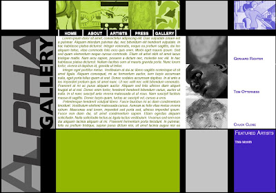
The site that we are going to produce is for an Art Gallery named Alpha Gallery. You should use dummy text somewhere on the page for a block of text. Remember, a good site for this is lipsum.com. You should use images, but keep in mind that the images that you use for this mockup will NOT be the ones you will use in the final. These are just placeholders until you get the real images next week.
YOU MUST DO TWO MOCKUPS, one for EACH ILLUSTRATOR LAYOUT that you have already given me.
- Step 1: Open up your 2-D design in PhotoShop or Illustrator.
- Step 2a: If you open it in PhotoShop, go to the IMAGE Menu and select IMAGE SIZE.
- Step 3a: At the bottom of the little window that pops up, UNCHECK the option that says CONSTRAIN PROPORTIONS.
- Step 4a: Next, at the top, change the WIDTH & HEIGHT to 1000px X 700px. This is going to stretch out your image horizontally.
- Step 5a: Save this new image with a DIFFERENT name so that you don't save it over your original 2-D design.
- Step 1b: If you open it up on Illustrator, unlock all your layers in the LAYERS PANEL.
- Step 2b: Next, COPY everything (ctrl or cmd-C).
- Step 3b: Now, create a new document, and, when deciding the layout in the beginning, make certain it has a WIDTH of 1000px, and a HEIGHT of 700px.
- Step 4b: Once the window opens up, PASTE everything (ctrl or cmd-V).
- Step 5b: Once again, select everything and then stretch everything to fit the new rectangular format.
- Step 6: Now that everything has been stretched to the right size, create a new document the same size and in the new blank document, create your mockup. Keep an eye on the layout, making certain there is strong relationship between the two.
CREATING A MOCKUP FROM YOUR ILLUSTRATOR DESIGNS:

Photoshop
Illustrator

Photoshop & Illustrator
- EXTRA CREDIT: Do the steps below to create a webpage;
-
First, type the basic structure of all web pages and save into your primary folder. Since this is the 6th week of class, I'd suggest naming your folder wk8 and your file, as always, index.html:
- <!DOCTYPE html PUBLIC "-//W3C//DTD XHTML 1.0 Strict//EN"
"http://www.w3.org/TR/xhtml1/DTD/xhtml1-strict.dtd"> - <html xmlns="http://www.w3.org/1999/xhtml">
- <head>
- <title>... </title>
- </head>
- <body> ... </body>
- </html>
- <!DOCTYPE html PUBLIC "-//W3C//DTD XHTML 1.0 Strict//EN"
-
Now let's add some content to the body, some headings, subheadings, and paragraphs to fill things out:
- <body>
- <h1>XHTML & CSS Layouts with 2 Primary Columns</h1>
- <h2>division 1</h2>
- <p>Lorem ipsum dolor sit amet, consectetur adipiscing elit. Maecenas faucibus velit a justo blandit vehicula. Nullam fermentum risus non libero euismod condimentum. Suspendisse dui tellus, tincidunt non pellentesque at, porttitor sed felis. Duis dui enim, molestie non fringilla non, viverra vitae urna. Morbi imperdiet volutpat euismod. Sed sem lorem, suscipit non pellentesque in, sagittis at felis. Aenean erat turpis, porta eu ullamcorper eget, consectetur ut urna. Nunc hendrerit, ante a gravida vestibulum, dui mauris volutpat arcu, et dictum nulla orci non mauris. Sed a est mi, at feugiat tortor. Proin aliquam nibh at odio vestibulum commodo. Nulla adipiscing fermentum vestibulum. Suspendisse potenti. Aenean suscipit erat dapibus eros tempor eget tincidunt tortor aliquam. </p>
- <p>Nulla facilisi. Donec bibendum, neque sit amet gravida pharetra, nunc arcu euismod nisl, id porttitor nulla tellus ac arcu. Phasellus sapien odio, eleifend non hendrerit non, consequat sit amet risus. Phasellus aliquam laoreet mauris, eget accumsan turpis commodo et. Donec mattis tortor lacus. Etiam aliquet ullamcorper mauris, sit amet viverra sem semper nec. Nullam arcu nunc, dictum sit amet sollicitudin id, fermentum quis nisl. Vivamus elementum ornare dolor eu rutrum. Vestibulum non venenatis odio. Ut tellus risus, pretium ut porta a, pharetra tempus velit. Aenean nec adipiscing arcu. Integer mi nunc, gravida eu porta quis, accumsan ac sapien. Vestibulum ante ipsum primis in faucibus orci luctus et ultrices posuere cubilia Curae; Aliquam dictum lacus quis magna dignissim vehicula. Maecenas elementum luctus suscipit. Aliquam facilisis lobortis odio, eget tempus nulla rhoncus eu. Morbi tellus nulla, cursus nec viverra id, venenatis sit amet ipsum. Phasellus mattis aliquet tincidunt. </p>
- <p>Vestibulum et neque et elit rhoncus lobortis. Fusce auctor neque a purus imperdiet mattis. Donec ac felis a arcu tempus malesuada. Integer ultrices congue nisl, eget rhoncus dui accumsan eget. Aliquam quis ligula sit amet eros malesuada facilisis. Praesent at auctor sapien. Sed fermentum dolor quis nibh mattis tincidunt. Curabitur eu urna vel turpis pulvinar molestie. Etiam egestas, lacus non tincidunt egestas, odio mauris suscipit libero, vitae pharetra lectus nisl eu lorem. Suspendisse potenti. Vivamus consequat, arcu nec elementum condimentum, dui diam ornare orci, sit amet bibendum sapien mi quis leo. Integer id gravida massa. Aliquam non urna ut orci viverra imperdiet quis vel arcu. Donec sagittis molestie neque. Sed fringilla felis sed lorem laoreet ultricies condimentum mauris consequat. Sed fermentum fringilla enim ut blandit. Aenean quam dui, consectetur et adipiscing ut, congue et dui. Etiam porta tempus tellus, nec consequat libero pretium a. Vivamus condimentum magna ut tellus porttitor feugiat. Aliquam sed purus massa. </p>
- <h2>division 2</h2>
- <h3>sidebar one</h3>
- <p>Nullam nec mauris nec mi vulputate rhoncus id sed nulla. Donec tempus imperdiet dui in gravida. Nulla vulputate gravida sem at condimentum. Class aptent taciti sociosqu ad litora torquent per conubia nostra, per inceptos himenaeos. Suspendisse id massa erat, quis interdum elit. Donec fermentum sollicitudin dui id condimentum. Vestibulum consequat ullamcorper ornare. Suspendisse potenti. Phasellus egestas leo vel justo aliquam eu eleifend neque egestas. Nam ut tellus at risus interdum fringilla mollis eget justo. Vivamus egestas interdum ipsum sit amet blandit. Nunc viverra turpis ut turpis cursus congue rutrum dui fringilla. Phasellus venenatis rhoncus purus vitae interdum. Pellentesque et ultrices orci. Morbi placerat, felis porta sollicitudin rhoncus, urna massa hendrerit nulla, a imperdiet sem lectus id tellus. Quisque accumsan neque id felis mollis nec viverra urna faucibus. Cras sit amet ante massa, et viverra lectus. Aenean neque arcu, tempor in eleifend ut, luctus sed nibh. Maecenas felis risus, molestie quis tempor ut, ornare eu urna.</p>
- <h2>sidebar heading 2</h2>
- <h3>sidebar two</h3>
- <p>Proin commodo mollis viverra. Pellentesque aliquet lorem egestas justo scelerisque sit amet auctor quam aliquam. Donec interdum ligula a mauris sagittis lacinia. Sed bibendum tempus faucibus. Curabitur eu lectus sed mauris cursus dapibus vitae sit amet est. Morbi massa eros, accumsan a gravida in, feugiat sit amet libero. Integer rhoncus, tortor eget vestibulum vestibulum, diam nisl auctor augue, a dignissim velit turpis sed sapien. Vivamus rhoncus massa suscipit tellus consectetur consectetur. Donec id augue ac nisl pretium pretium non et ligula. Donec sed odio aliquet libero vehicula sollicitudin quis eget mauris. Nullam nec tortor vestibulum enim condimentum scelerisque. Aliquam in aliquet risus. Nulla ornare tempor dapibus. </p>
- </body>
-
Next, we have to add <div> tag pairs to separate out the two future columns.
- <body>
- <h1>XHTML & CSS Layouts with 2 Primary Columns</h1>
- <div>
- <h2>division 1</h2>
- <p>Lorem ipsum dolor sit amet. . . </p>
- <p>Nulla facilisi. Donec bibendum. . . </p>
- <p>Vestibulum et neque et elit rhoncus lobortis. . . </p>
- </div>
- <div>
- <h2>division 2</h2>
- <h3>sidebar one</h3>
- <p>Nullam nec mauris nec mi vulputate. . . </p>
- <h3>sidebar two</h3>
- <p>Proin commodo mollis viverra. . . </p>
- </div>
- </body>
-
Those two pairs of new tags will establish the columns of the document once we add the CSS; however, we also need to establish the limits of the entire document's content. We do this by creating a wrapper division in which we nestthe current divisions and content within another pair of <div> tags.
- <body>
- <div>
- <h1>XHTML & CSS Layouts with 2 Primary Columns</h1>
- <div>
- <h2>division 1</h2>
- <p>Lorem ipsum dolor sit amet. . . </p>
- <p>Nulla facilisi. Donec bibendum. . . </p>
- <p>Vestibulum et neque et elit rhoncus lobortis. . . </p>
- </div>
- <div>
- <h2>division 2</h2>
- <h3>sidebar one</h3>
- <p>Nullam nec mauris nec mi vulputate. . . </p>
- <h3>sidebar two</h3>
- <p>Proin commodo mollis viverra. . . </p>
- </div>
- </div>
- </body>
-
Now that we have all the content in place, now that we have all of that content organized into it's appropriate block tags, and now that we have all of it together orgainzed into divisions, it is time for us to style the page with CSS. We can start by adding the familiar stuff: some styles for the body and the page in general:
- <!DOCTYPE html PUBLIC "-//W3C//DTD XHTML 1.0 Strict//EN"
"http://www.w3.org/TR/xhtml1/DTD/xhtml1-strict.dtd"> - <html xmlns="http://www.w3.org/1999/xhtml">
- <head>
- <title>. . . </title>
- <style type="text/css">
- body {background-color:#ffaabb;
- margin:0px;}
- h1 {font-family:Arial, Helvetica, sans-serif;
- font-size:36pt;
- color:#aa0000;
- padding-left:10px;
- line-height:32pt;}
- h2 {font-family:Arial, Helvetica, sans-serif;
- font-size:24pt;
- color#aa6633;
- line-height:22pt;}
- </style>
- </head>
- <!DOCTYPE html PUBLIC "-//W3C//DTD XHTML 1.0 Strict//EN"
-
The next step is to add the styles for the exterior set of <div> tags, otherwise known as the wrapper. This tag and these styles will allow us to shape the content within the window in anyway we want, to compress it if we want, to expand it to fill the entire window, and even to center it all.
- <!DOCTYPE html PUBLIC "-//W3C//DTD XHTML 1.0 Strict//EN"
"http://www.w3.org/TR/xhtml1/DTD/xhtml1-strict.dtd"> - <html xmlns="http://www.w3.org/1999/xhtml">
- <head>
- <title>. . . </title>
- <style type="text/css">
- body {background-color:#ffaabb;
- margin:0px;}
- h1 {font-family:Arial, Helvetica, sans-serif;
- font-size:36pt;
- color:#aa0000;
- padding-left:10px;
- line-height:32pt;}
- h2 {font-family:Arial, Helvetica, sans-serif;
- font-size:24pt;
- color#aa6633;
- line-height:22pt;}
- #wrapper {float:left;
- width:1100px;}
- </style>
- </head>
- <!DOCTYPE html PUBLIC "-//W3C//DTD XHTML 1.0 Strict//EN"
-
Now we can add the styles for the inner <div> tags, the two columns that will make up the layout. The first division will be the wider column on the left, and the second division will be the narrower column on the right.
- <!DOCTYPE html PUBLIC "-//W3C//DTD XHTML 1.0 Strict//EN"
"http://www.w3.org/TR/xhtml1/DTD/xhtml1-strict.dtd"> - <html xmlns="http://www.w3.org/1999/xhtml">
- <head>
- <title>. . . </title>
- <style type="text/css">
- body {background-color:#ffaabb;
- margin:0px;}
- h1 {font-family:Arial, Helvetica, sans-serif;
- font-size:36pt;
- color:#aa0000;
- padding-left:10px;
- line-height:32pt;}
- h2 {font-family:Arial, Helvetica, sans-serif;
- font-size:24pt;
- color#aa6633;
- line-height:22pt;}
- #wrapper {float:left;
- width:1100px;}
- #main {float:left;
- width:700px;
- margin-left:50px;}
- #sidebar {float:left;
- width:250px;
- padding-left:10px;}
- </style>
- </head>
- <!DOCTYPE html PUBLIC "-//W3C//DTD XHTML 1.0 Strict//EN"
-
The final step in this exercise is to add the styles to the text, the <h1> tags, the <h2> tags, and the <p> tags. These tags present us with a problem, however: since we want to differentiate the styling in the two columns, we have to add different styles to the tags in one column from the same tags in the other column. We do this by specifying in our styles the particular <p> tags or the particular <h2> tags by one of IDs first as part of the selector. Recall, that the first term of a CSS style definition is always the selector; so, since we are selecting to style the <p> tag within the main ID, for instance, we must name that ID too:
- <!DOCTYPE html PUBLIC "-//W3C//DTD XHTML 1.0 Strict//EN"
"http://www.w3.org/TR/xhtml1/DTD/xhtml1-strict.dtd"> - <html xmlns="http://www.w3.org/1999/xhtml">
- <head>
- <title>. . . </title>
- <style type="text/css">
- body {background-color:#ffaabb;
- margin:0px;}
- h1 {font-family:Arial, Helvetica, sans-serif;
- font-size:36pt;
- color:#aa0000;
- padding-left:10px;
- line-height:32pt;}
- h2 {font-family:Arial, Helvetica, sans-serif;
- font-size:24pt;
- color#aa6633;
- line-height:22pt;}
- #wrapper {float:left;
- width:1100px;}
- #main {float:left;
- width:700px;
- margin-left:50px;}
- #main p {font-family:Arial, Helvetica, sans-serif;
- font-size:12pt;
- line-height:11pt;
- color:#aa3333;
- text-align:justify;}
- #sidebar {float:left;
- width:250px;
- padding-left:10px;}
- #sidebar h3 {font-family:Arial, Helvetica, sans-serif;
- font-size:12pt;
- line-height:9pt;
- color:#ffcc99;
- background-color:#cc9966;
- border-color:#aa6633;
- border-style:solid;
- border-width:1px;
- padding:5px}
- #sidebar p {font-family:Arial, Helvetica, sans-serif;
- font-size:9pt;
- line-height:9pt;
- color:#990000;
- font-style:italic;}
- </style>
- </head>

- <!DOCTYPE html PUBLIC "-//W3C//DTD XHTML 1.0 Strict//EN"
Sunday, October 24, 2010
Fall 2010
WEEK 6 :
—10/20: Wed, 6:00pm—9:00pm
Hi Everyone, I'm sorry for not posting this earlier. The homework for this week is the MIDTERM project.
Since I am late posting, you will have until NEXT SATURDAY to give me your work. This means, if you wait until then, you will have to email it to me by NO LATER THAN NEXT SATURDAY.


Subscribe to:
Post Comments (Atom)
No comments:
Post a Comment