- TOPICS:
- Review:
- Introduce I:
- Introduce II: Cascading Style Sheets:
- HOMEWORK: Make sure that you study. As mentioned above, this is the 2nd most important grade of the term.
- LINK Midterm Exam Study Sheet *****Remember, this exam is the SECOND MOST IMPORTANT GRADE OF THE TERM.*****
- REVIEW:
- Tables: The most obvious, but least common use for HTML tables is for organizing columns and rows of data, much like an accountant’s ledger in which she enters credits and debits. When tables are used, these data are presented in the web-page as a grid of rectangular cells. In such a case, the visibility of the table is required, in that the borders of the columns and rows play a necessary role in the organization of the data. Everything must line up with the grid and be very clear and organized.
You already know how to create a table, so here below here you will find a simple table like the one we created in class:
And here is the code to create such a table: <table border="1px" width=@quot;100%"> <tr> <td> </td> <td> </td> <td> </td> <td> </td> <td> </td> </tr> <tr> <td> </td> <td> </td> <td> </td> <td> </td> <td> </td> </tr> <tr> <td> </td> <td> </td> <td> </td> <td> </td> <td> </td> </tr> <tr> <td> </td> <td> </td> <td> </td> <td> </td> <td> </td> </tr> <tr> <td> </td> <td> </td> <td> </td> <td> </td> <td> </td> </tr> </table> - Page Layout: In the past, before widespread usage of CSS, the second, and perhaps less obvious but most common usage for HTML tables was for page layout and design purposes. However, web-designers and coders use tables for this purpose less and less since CSS positioning capabilities have become more and more widely known and used. In the past, designers and the computer applications that they employed created often very, very complex sets of tables, multiple tables and many levels of tables nested within tables. This made for rather messy code. Proper use of CSS has done away for much of this complexity.
As a result, I will spend only half the time here explaining the construction of tables. The rest of the time I will focus on CSS, and how it is applied to tables. In future classes we will concentrate on how to use CSS for page layout without the use of tables altogether, something that tables alone could accomplish in the past.
- Without tables (or CSS), you have only three (3) options for placing content on the page, alignment to the left, right, or center.
- With tables, you may not only align to the left, right, and center, but also to the top, middle, and bottom. Moreover, this is for each and every individual cell of the table: tables allow you to divide up the larger space of the browser window into the smaller rectangles of the table cell, and you may further position your content with the align and valign attributes. Let us begin, therefore, to think about molding a table we have created to fit our purposes:
- Modifying a table entails making simple modifications to the size and colors of a table, as well as its alignment strategies. In the following code, I add text, and then I change the alignment and width of the cells.
<table border="1px">
<tr>
<td> </td>
<td width="10px"> </td>
<td width="500px"> </td>
<td width="10px"> </td>
<td> </td>
</tr>
<tr>
<td> </td>
<td> </td>
<td> </td>
<td> </td>
<td> </td>
</tr>
<tr>
<td align="right">right</td>
<td> </td>
<td align="center">center</td>
<td> </td>
<td align="left">left</td>
</tr>
<tr>
<td> </td>
<td> </td>
<td> </td>
<td> </td>
<td> </td>
</tr>
<tr>
<td> </td>
<td> </td>
<td> </td>
<td> </td>
<td> </td>
</tr>
</table>
Although I do not have the space required in my blog (I would need at least 700px in width) to demonstrate the actual table that I have outlined with my new code above, below you will find a close approximation:
You should notice from the code that in order to achieve the table that I created above, I had to modify the width of individual cells within the <td> </td> tag using the width attribute. I did this in the first row of cells. So, you should also notice that all the cells below in the same column followed the same width. I did NOT have to change the width of each cell in the column.
Next, let's turn to those words that I typed, right/center/left: Please notice that they have different alignments. This is achieved with the align attribute. Recall that there are three possible values for that attribute: left, right, and center.
Before we proceed with the next step, let us add some color to the rows of the table. We do this by using the bgcolor attribute as the example below:
<table border="1px">
<tr>
<td> </td>
<td width="10px"> </td>
<td width="500px">TABLES</td>
<td width="10px"> </td>
<td> </td>
</tr>
<tr bgcolor="#6666cc">
<td> </td>
<td> </td>
<td> </td>
<td> </td>
<td> </td>
</tr>
<tr bgcolor="#220066">
<td align="right">right</td>
<td> </td>
<td align="center">home</td>
<td> </td>
<td align="left">left</td>
</tr>
<tr bgcolor="#330099">
<td> </td>
<td> </td>
<td> </td>
<td> </td>
<td> </td>
</tr>
<tr bgcolor="#4433aa">
<td> </td>
<td> </td>
<td> </td>
<td> </td>
<td> </td>
</tr>
</table>
DMA110 right center left - Defining Tables: In our last class, we continued with the exploration of tables by pushing further the complexity of the tables that we created: we increased our investigation of two attributes for the <td> tag, rowspan and colspan. These attributes extend the ability of the <td> tag to become larger both horizontally and vertically, to take up the space of more than one cell, and perhaps to occupy the space of an entire row. This week, therefore, we learned no new HTML tags, but instead simply deepened our knowledge and understanding of what has already been covered on tables. First of all, then, let us review what we went over in previous classes on tables:
- Basic tags used in the creation of HTML tables: <html>, <table>, <title>, <tr> >, and <td>.
- Tables are created by the <table> tag, another example of a block level tag; however, as mentioned above, they are a special case, not only for what they can create in a web-page, but primarily for the many other varied tasks they may perform.
First and foremost, tables refer exactly to what the term suggests: they create tables for data, such as in accounting ledgers. By appearance, the table tag creates a grid of rectangular ‘cells’ where some kind of data or information is placed. These tables are organized by column (vertical divisions up and down the height of the page) and by row (horizontal divisions across the width of the page). They are built in HTML, however, one row at a time.
Here are a series of attributes that may be used with the <table> tag:
- width—changes the width of the table with units in pixels or as a percentage of the browser window.
- border—adds a border around the table and between the various rows and cells with a thickness of the designer’s choice with units in pixels. To be used sparingly as it tends to be over-used and used badly.
- bgcolor—the same attribute used in the <body> tag. In this case, it adds a background color only the area of the table itself. The particular color must be indicated in the hexadecimal color code.
- bordercolor—much like the bgcolor attribute in that it uses the hexadecimal color code, but in this case it only colors the borders.
- cellspacing—regulates the spacing between the various cells in the table.
- cellpadding—regulates the spacing around the edge against the border within each cell of the table.
- Table rows are created row-by-row using the <tr> tag, the table row tag. Each of these tags marks the beginning and ending of a single row in a table. For each row, one pair of these tags is necessary, one marking the start of the row, and one the end of it. Each row is composed of one or more cells.
- Table cells are the individual rectangles that make up the grid of the table. Each horizontal row consists of at least one rectangular cell where text or some kind of image may be placed. Typed between a pair of <tr> tags, each pair of <td> (for table data) tags creates one cell. For each additional cell, there must be another pair of <td> tags, and for each of these cells there must be some kind of content between the tags, or the cell will not register and therefore not appear in the browser window. This content may be in the form of an image, a link, some text, or even a blank space created by the series of characters, . Here are a series of attributes, which may be used with the <td> tag:
- width—changes the width of the cell and all of the cells below it in the same column with units in pixels or as a percentage of the table width.
- bgcolor—the same attribute used in the <body> tag. In this case, it adds a background color only the area of the table itself. The particular color must be indicated in the hexadecimal color code.
- align—sets the horizontal alignment for the content within the particular cell. There are three (3) possible values for this attribute: right, left, and center.
- valign—sets the vertical alignment for the content within the particular cell. Here, also, there are three (3) possible values: top, bottom, and middle.
- colspan—allows the particular cell to extend, or span, horizontally across more than one column of cells.
- rowspan—allows the particular cell to extend, or span, vertically downward across more than one row of cells.
- Table cells are the individual rectangles that make up the grid of the table. Each horizontal row consists of at least one rectangular cell where text or some kind of image may be placed. Typed between a pair of <tr> tags, each pair of <td> (for table data) tags creates one cell. For each additional cell, there must be another pair of <td> tags, and for each of these cells there must be some kind of content between the tags, or the cell will not register and therefore not appear in the browser window. This content may be in the form of an image, a link, some text, or even a blank space created by the series of characters, . Here are a series of attributes, which may be used with the <td> tag:
- Defining Tables: In our last class, we continued with the exploration of tables by pushing further the complexity of the tables that we created: we increased our investigation of two attributes for the <td> tag, rowspan and colspan. These attributes extend the ability of the <td> tag to become larger both horizontally and vertically, to take up the space of more than one cell, and perhaps to occupy the space of an entire row. This week, therefore, we learned no new HTML tags, but instead simply deepened our knowledge and understanding of what has already been covered on tables. First of all, then, let us review what we went over in previous classes on tables:
- Without tables (or CSS), you have only three (3) options for placing content on the page, alignment to the left, right, or center.
- Tables: The most obvious, but least common use for HTML tables is for organizing columns and rows of data, much like an accountant’s ledger in which she enters credits and debits. When tables are used, these data are presented in the web-page as a grid of rectangular cells. In such a case, the visibility of the table is required, in that the borders of the columns and rows play a necessary role in the organization of the data. Everything must line up with the grid and be very clear and organized.
You already know how to create a table, so here below here you will find a simple table like the one we created in class:
- INTRODUCE I:To return to the present week, in our last class we continued working with Tables in HTML, but focused on two attributes (rowspan and colspan) which go with the <td>tag to extend a cell downward or upward. Here is how it works:
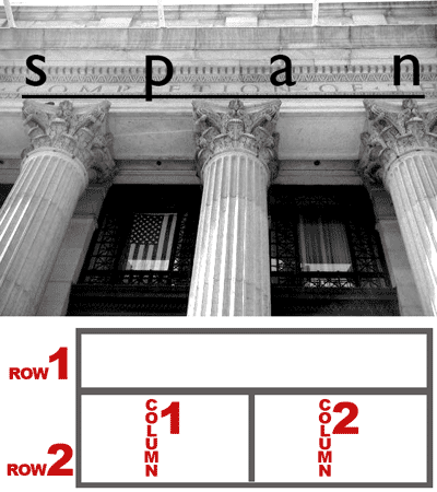
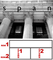 horizontal (side to side) arrays of table cells are considered rows, and vertical (up and down) arrays of cells are considered columns. And just as columns in buildings are also vertical, they support a horizontal beam which spans across several columns. Just look at the front of the NYC Post Office across the street. It has columns also.
- Colspan: In the picture above and to the right you can see that there are 3 columns which support the beam above them, where the word span is written. The table below this image is similar: there are two rows, one above the other, but the one on the top spans across the two columns in the row below. In HTML we would say that the big cell of the top row has a colspan of 2 because it spans the 2 columns below it.
In the table below, there are three (4) rows (horizontal divisions) and four (4) columns (vertical divisions):
Notice that the center row extends all the way across all four of the columns. This is because it has a greater colspan than the other cells of the table, <td colspan="4"> </td>. That one row, the one in the middle, only has one cell in the entire row. The other two rows, the one above and the one below, each have four (4) cells, and the code for this table looks like so: <table width="100%" border="1px"> <tr> <td> </td> <td> </td> <td> </td> <td> </td> </tr> <tr> <td colspan="4"> </td> </tr> <tr> <td> </td> <td> </td> <td> </td> <td> </td> </tr> </table> If for whatever reason, you forgot that the second row gets only one cell, and instead put four (4) cells like all the other rows, your code would be like what follows--notice that row 2 has four cells like all the others, even though the first cell in that row has a rowspan of 4: <table width="100%" border="1px"> <tr> <td> </td> <td> </td> <td> </td> <td> </td> </tr> <tr> <td colspan="4"> </td> <td> </td> <td> </td> <td> </td> </tr> <tr> <td> </td> <td> </td> <td> </td> <td> </td> </tr> </table> The previous code produces a table like the one below. Look how the second row has some extra cells hanging off the end:
All you need to do to solve that problem is simply delete those extra cells. In this case we have three extra cells hanging off the end, so we just need to delete those three in the second row and then it will look as it should. In the next example, we have a similar problem, but in the opposite direction: instead of extending a cell horizontally as we have in the previous example, we can also extend a cell vertically as we will see next. - Rowspan: In the following example, you will see another table; however, instead of a cell getting larger across the table, it gets larger down the table. This cell also has an increased span, but we call it rowspan instead of colspan. That is because the cell grows larger downward from one row to another. Remember, rows are like horizontal layers. In the following example, the first cell extends downward to the bottom of the table, so it spans more than one row. It therefore has an increased rowspan, a rowspan of 4:
The code for this table is as follows, you should take note that in this case, only the first row has four (4) cells. All of the other rows have only three cells. <table width="100%" border="1px"> <tr> <td rowspan="4"> </td> <td> </td> <td> </td> <td> </td> </tr> <tr> <td> </td> <td> </td> <td> </td> </tr> <tr> <td> </td> <td> </td> <td> </td> </tr> <tr> <td> </td> <td> </td> <td> </td> </tr> </table> And that makes sense if we examine the table. The first cell of the table, the big one, starts in the upper-righthand corner. This is the first cell of the first row. All we did to make it bigger, to make it go from top to bottom of the table, was use the rowspan attribute. If we took that out, then we see that we're missing a cell in each of the other rows. What happens, then, when we increase the rowspan is that the cell pushes downward, moving all the cells below it to the right. If we had forgotten to remove one of the cells in rows 2, 3, and 4, then we would have the table as follows:
The code for this mistake is below: <table width="100%" border="1px"> <tr> <td rowspan="4"> </td> <td> </td> <td> </td> <td> </td> </tr> <tr> <td> </td> <td> </td> <td> </td> <td> </td> </tr> <tr> <td> </td> <td> </td> <td> </td> <td> </td> </tr> <tr> <td> </td> <td> </td> <td> </td> <td> </td> </tr> </table> Like the colspan example, this can be remedied simply by removing one cell from rows 2, 3, and 4. - Colspan & Rowspan:These two attributes may also be used together instead of just one or the other. This way, a table cell can be expanded both horizontally and vertically, both across the table and down the table. The table below is an example of this:
and below is the code for such a table: <table width="100%" border="1px"> <tr> <td> </td> <td> </td> <td> </td> <td> </td> </tr> <tr> <td> </td> <td colspan="2" rowspan="2"> </td> <td> </td> </tr> <tr> <td> </td> <td> </td> </tr> <tr> <td> </td> <td> </td> <td> </td> <td> </td> </tr> </table> Notice above, that there are only three (3) cells in row 2, and only two (2) cells in row 3. Row 2 is the row that contains the cell with the rowspan and colspan attributes. If it, and the row below it, row 3, had the same number of cells as the other two rows, rows 1 and 4, here is what the table would look like:
Notice here that this time there are three extra cells, one in the second row, and two in the third row. As for the other examples, the solution to this mistake is simply to delete the extra cells. Here is the code for the previous table with the unnecessary cells shown in red: <table width="100%" border="1px"> <tr> <td> </td> <td> </td> <td> </td> <td> </td> </tr> <tr> <td> </td> <td colspan="2" rowspan="2"> </td> <td> </td> <td> </td> </tr> <tr> <td> </td> <td> </td> <td> </td> <td> </td> </tr> <tr> <td> </td> <td> </td> <td> </td> <td> </td> </tr> </table> - Complex usage of Colspan & Rowspan:As mentioned previously, tables in web-pages and web-sites are ubiquitous, they are everywhere. In most cases these tables are used invisibly, with the borders set to zero, as layout devices. Many times, therefore, it can be quite difficult to discern exactly what is the structure of the tables at work in a particular design or layout. This skill, however, deciphering the code of already existing sites, understanding the tables of sites already publish, is a valuable one especially given the reality that much work in web-design is work with templates and work on maintenance. It is important to learn how to figure out a table so that it may be revised, or edited, or so that it may be improved or adapted to new uses. Below here, then, is an example from class of a complex use of colspan and rowspan in a table:
<table width="100%" border="1px";> <tr> <td> </td> <td> </td> <td> </td> <td> </td> <td> </td> <td> </td> <td> </td> </tr> <tr> <td> </td> <td> </td> <td colspan="2"> </td> </tr> <tr> <td> </td> <td rowspan="5"> </td> <td> </td> <td colspan="4"> </td> </tr> <tr> <td> </td> <td rowspan="4"> </td> <td> </td> <td colspan="3"> </td> </tr> <tr> <td> </td> <td rowspan="3"> </td> <td> </td> <td colspan="2"> </td> </tr> <tr> <td> </td> <td rowspan="2"> </td> <td rowspan="2" colspan="2"> </td> </tr> <tr> <td> </td> </tr> </table> A pattern in the code for such a table is less evident perhaps than the other previous examples given; however, note that there the first row has seven cells, and that the last row only has one cell. Because of this, I will break down the table and just do a little at a time. We will begin with rowspan, investigating how it has been achieved, and then move on to colspan afterwards. Prior to that and just as a point of comparison, below I show the original table of 7 rows with 7 cells per row to show how the increased rowspan and colspan affects it, the unnecessary cells in red:- The next table shows the first step, the original table with just the rowspan added:
<table width="100%" border="1px"> <tr> <td> </td> <td> </td> <td> </td> <td> </td> <td> </td> <td> </td> <td> </td> </tr> <tr> <td> </td> <td> </td> <td> </td> <td> </td> <td> </td> <td> </td> <td> </td> </tr> <tr> <td> </td> <td rowspan="5"> </td> <td> </td> <td colspan="4"> </td> </tr> <tr> <td> </td> <td> </td> <td rowspan="4"> </td> <td> </td> <td> </td> <td> </td> <td> </td> </tr> <tr> <td> </td> <td> </td> <td> </td> <td rowspan="3"> </td> <td> </td> <td> </td> <td> </td> </tr> <tr> <td> </td> <td> </td> <td> </td> <td> </td> <td rowspan="2"> </td> <td rowspan="2"> </td> <td> </td> </tr> <tr> <td> </td> <td> </td> <td> </td> <td> </td> <td> </td> <td> </td> <td> </td> </tr> </table> - Above here, it is interesting that the unnecessary cells are not hanging off the end of the rows, but are nestled in between the enlarged cells, which makes the selection of which cells to eliminate particularly difficult. In fact, unlike previous examples, the last cells of each row are to be retained and not eliminated. See below the table with the unecessary cells removed:
- The next step is to add in the colspan to the cells we wish to expand across the cells. We will do this first, however, before we remove any unnecessary cells:
<table width="100%" border="1px"> <tr> <td> </td> <td> </td> <td> </td> <td> </td> <td> </td> <td> </td> <td> </td> </tr> <tr> <td> </td> <td> </td> <td colspan="5"> </td> <td> </td> <td> </td> <td> </td> <td> </td> </tr> <tr> <td> </td> <td rowspan="5"> </td> <td> </td> <td colspan="4"> </td> <td> </td> <td> </td> <td> </td> </tr> <tr> <td> </td> <td rowspan="4"> </td> <td> </td> <td> </td> <td colspan="3"> </td> <td> </td> </tr> <tr> <td> </td> <td rowspan="3"> </td> <td> </td> <td> </td> <td colspan="2"> </td> </tr> <tr> <td> </td> <td rowspan="2"> </td> <td rowspan="2" colspan="2"> </td> <td> </td> </tr> <tr> <td> </td> <td> </td> </tr> </table>- As you can see, things are coming along quite well. We simply have to remove the unnecessary cells in red. Once done, we get the table and code below, the same as what we saw in the beginning of this exercise: <table width="100%" border="1px"> <tr> <td> </td> <td> </td> <td> </td> <td> </td> <td> </td> <td> </td> <td> </td> </tr> <tr> <td> </td> <td> </td> <td colspan="5"> </td> </tr> <tr> <td> </td> <td rowspan="5"> </td> <td> </td> <td colspan="4"> </td> </tr> <tr> <td> </td> <td rowspan="4"> </td> <td> </td> <td colspan="3"> </td> </tr> <tr> <td> </td> <td rowspan="3"> </td> <td> </td> <td colspan="2"> </td> </tr> <tr> <td> </td> <td rowspan="2"> </td> <td rowspan="2" colspan="2"> </td> </tr> <tr> <td> </td> </tr> </table>
- The next step is to add in the colspan to the cells we wish to expand across the cells. We will do this first, however, before we remove any unnecessary cells:
- Extra CreditOkay, here you go. Look at this image and try to reproduce it in HTML. Bring it to class next week and show to me for extra credit.

- INTRODUCE II:
in this week’s class we saw the introduction of the issue Cascading Style Sheets used together with HTML in order to style the text and colors of a page. CSS works often in much the same way that the in-line HTML tags (<b>, <i>, <u>, <font>, etc.) do to bring some styling onto an otherwise dull page of text. For this reason and from this point on, CSS will completely supplant those in-line tags for our uses in this class. In-line tags are not considered proper when following strict XHTML guidelines (and as a result will not pass the test when the code is validated); therefore, our job is to determine how to best configure our pages without them. In other words, from this point on, we will no longer be using many of those inline tags, and heretofore use only CSS; thereby, at last adherely completely to XHTML Strict standards.- What is CSS? To begin with, CSS is another type of code used only to style a page of content (mostly text and images). It is used for two reasons.
- First, it is vastly more extensive and, thereby, flexible. There are many more aspects of style that you can control with CSS than without it, as you will find out in the weeks to come. You can therefore control the look of your pages much more thoroughly. As a result, you will have many more options of how to style a page, using your own design sense of how to emphasize various elements in the site.
- Second, as it considers a web-site as a living, changing object rather than 100% complete and fully-formed when it is uploaded onto a server, it is much more efficient to use and, therefore, allows you to update your pages much more quickly and completely.
- Where is CSS placed? depending on what kind of CSS you are typing (yes, there is more than one kind), you will type it in different places. Up to this point, we have been typing our code in the <head> section of our document. When typed here, it is known as an embedded stylesheet.
- How is CSS used? As we have been using it up to know, as mentioned above, we have been typing what is known as embedded stylesheets, but all types of CSS follow the same basic format. In the past, we have styled our pages by using the in-line tags throughout our document to change the way the text looks. With an embedded stylesheet, we put all the styles into a central location embedded in the <head> section. That way, if ever we need to change something or update the page, all we must do is go to the <head> section at the very top of the document rather than go searching around all the code of the page to make the change. This is especially useful, if, like the mid-term project, we must type a long and complicated web-page filled with much text and a complex set of tables that we do not want to accidentally mess up. As mentioned, the styles are embedded directly into the code in the <head> section of a document, and they are placed between a pair of <style> tags. This is the type of stylesheet that we looked at in last week’s class.
- In the first part of the class demonstration, we constructed a basic web-page with text only using only block tags, <h1>, <h2>, <p>. In some cases, we used these tags more than once each. We used the <h2> tag twice.
- In the second part of the demonstration, we created and applied the styles in an embedded stylesheet and applied them to the various block tags we used in the page. Where we used a tag more than once, such as the styles we attached to the <h2> tag, the styles were applied to each instance automatically by only typing them once.
- To create an embedded stylesheet we use the <style> tag pair.
- The <style> tag requires the <type> attribute with the value "text/css" applied.
- Inside the <style> tag pair, it is necessary to place a series of characters to convince the browsers to hide the code. While not strictly required anymore, in some old browsers, CSS code is not recognized and neither is the <style> tag. For this reason, when the code is read by these old browsers, it is mistaken for plain text and therefore displayed in the page, displacing all the actual content. Therefore, in order to prevent the browsers from doing this, it is necessary to disguise the code as HTML notes, notes that the writer of the code composes to himself or others who read the code when he wishes to identify it without having it appear in the page itself. To do this, you must type the following to open the notes: <!— — ; and the following to close the notes: //— —>.
- When typing CSS code, there are three (3) parts that makes up what is known as a style definition.
- the selector refers to the term that determines to which block of text or element the style will be applied, such as a heading or a paragraph;
- the property refers to the term that identifies which aspect will be styled, such as the size or color or typeface;
- the value refers to the term that supplies a particular quantity for a property, as the background-color property might have the value of red, or the width property might have a value of 500px;
- example: selector property value body { background-color : #aa0000 ;}
- And, finally, why is CSS called Cascading Style Sheets? Where does the Cascading fit in? It is because CSS is implemented on three (3) levels. This is why it is called cascading, as it begins by adding style to the widest, most general location, and ends by adding it in the narrowest, most specific location. All three may be used together to style your pages in the most efficient and effective way possible.
- linked/attached/external styles—First, for those styles that will be applied throughout your site—not only on a single page—such as a common background color, or a common set of margins, or link colors for all of the pages on your site, it is best to apply them to all pages at the same time, rather than on one page at a time. This is better because, for one thing, it is more efficient as all the styles are applied at once and centralized in one location; but by catching things in a single instance, it also prevents you from making more mistakes. The more you have to type the more opportunities you will have for making errors. Therefore, since you will only have to type these styles in one place for the entire site rather than on every single page, your chances for making errors are greatly reduced. For such styles as these, the most general to be applied to all, or most, pages of your web-site, you will type on a single separate document. This document will only have CSS code in it, and it will be attached, or linked, to each of the pages that will receive the stylings that it dictates. This is called a linked or attached or external stylesheet, and the document gets the extension .css.
- embedded styles—Second, for those styles that will be applied to only a single page—you will use what’s called an embedded stylesheet. If you have a single page in a multi-page web-site that is something of an anomaly in that it must be somehow and for some reason different from the other pages (must have a different background color, or have different stylings than other pages in your web-site, for example) then you will use this type of stylesheet for those styles that must be different. These are called embedded styles because rather than being typed in a separate .css document, they are typed, embedded, directly into the HTML & centralized in the head section. This type of stylesheet is meant to style a single page, which is what makes it ideal for a page that has a number of styles that are markedly different from the general styles placed on all the pages. It is also very efficient, as it places all the styles together in the head section.
- in-line styles—Third, for those styles that occur only one time in one particular location in one page, we tend to use what are called in-line styles. These styles are applied directly into a particular HTML tag via the style attribute. They work very much the same as in-line tags do, but are much more versatile and thorough in what types of styling you may apply in that you can do much more with them. These styles are normally used for one-time styling. If you plan on using the same styles in more than one location, then in-line styles are probably not the right CSS to use.
- The next table shows the first step, the original table with just the rowspan added:
- Colspan: In the picture above and to the right you can see that there are 3 columns which support the beam above them, where the word span is written. The table below this image is similar: there are two rows, one above the other, but the one on the top spans across the two columns in the row below. In HTML we would say that the big cell of the top row has a colspan of 2 because it spans the 2 columns below it.
In the table below, there are three (4) rows (horizontal divisions) and four (4) columns (vertical divisions):
Sunday, March 01, 2009
Spring 2009
week 6: 2/25
Hi again everyone,
I'm sorry that this took so long for me to post this week; but here it is, this week's posting for the blog. Since I am not assigning any homework for our next class, and since you already know about and have the study sheet for the midterm test next week, I figured I could take a day or two extra to create it rather than rush. So, let me say that again: no homework this week due in our next class; but don't forget to study for the test.
This week I intensified my focus on tables and tried to reinforce your understanding of CSS by simply repeating what we have already done and defining it more thoroughly. The posting below, therefore, will concentrate on those two things. I will start with tables, and then I will go into CSS and see how we might apply styles to the tables that we created.
something actually interesting and nice. We just added in a dash of complexity.
Please study hard the rest of this week, and please don't miss the next class. This upcoming exam is the 2nd most important grade of the term. I don't advocate missing sleep, or not eating, or not taking care of your life's necessities (family, work, etc.), but if there's ever a time to sacrifice a little bit while in school, mid-term time is certainly one of them. There will be two parts to the exam. One concerns the study sheet that I gave you, and the other is more practical, much like the quiz that you took a couple weeks back. Therefore, if necessary, it is worth suffering a little by doing without an hour or two of sleep this week so you can get the stuff done and turned in to me on time.
Good luck, Carter-

Subscribe to:
Post Comments (Atom)
No comments:
Post a Comment